Old Renovation Projects
REFURBISHMENTS:
One further, very beneficial, service which Marshall can offer property owners is where he will create a concept (or concepts) for the redesign and improvement of a building, to improve its rentability, rental return and capital value. Very often a coat of paint and some reorganization of a room can do the trick --- but not always. See some of his LOW COST "Before" and "After" photos below: -
HOUSE STAGING:
This is becoming increasingly important and can represent money well spent. Marshall offers an excellent service and very good value here and the end results far outweigh this initial cost - enormously.
SOME SIMPLE & INEXPENSIVE UPGRADES:
The renovations are deliberately NOT sumptuous or luxurious. They are simple and neutral so as to maximise the appeal of the end result to the widest market.
Some of the "BEFORE" and "AFTER" photos of properties that Marshall has planned. We see a lot of cream and white colour schemes. Well, he is renovating to please the widest audience!
(Apologies. Many of these photos were taken for his own use and at a time when he says he had no notion of placing them on a website. Sometimes the properties pictured have not been fully completed or dusted etc at the time the "After" photos were taken, but hopefully you'll get the idea. Sometimes there are only "After" photos (placed side by side) because he never thought of taking "Before" photos - until quite recently.)
Marshall has provided his own commentary under the pictures.
| BEFORE PICTURES | AFTER PICTURES |
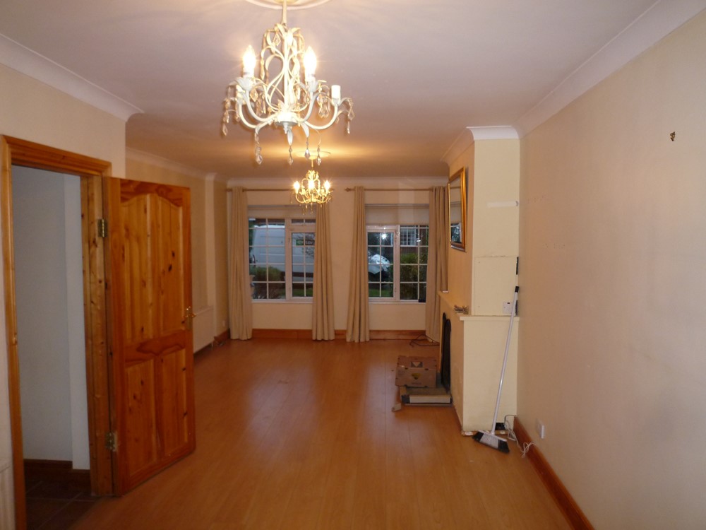
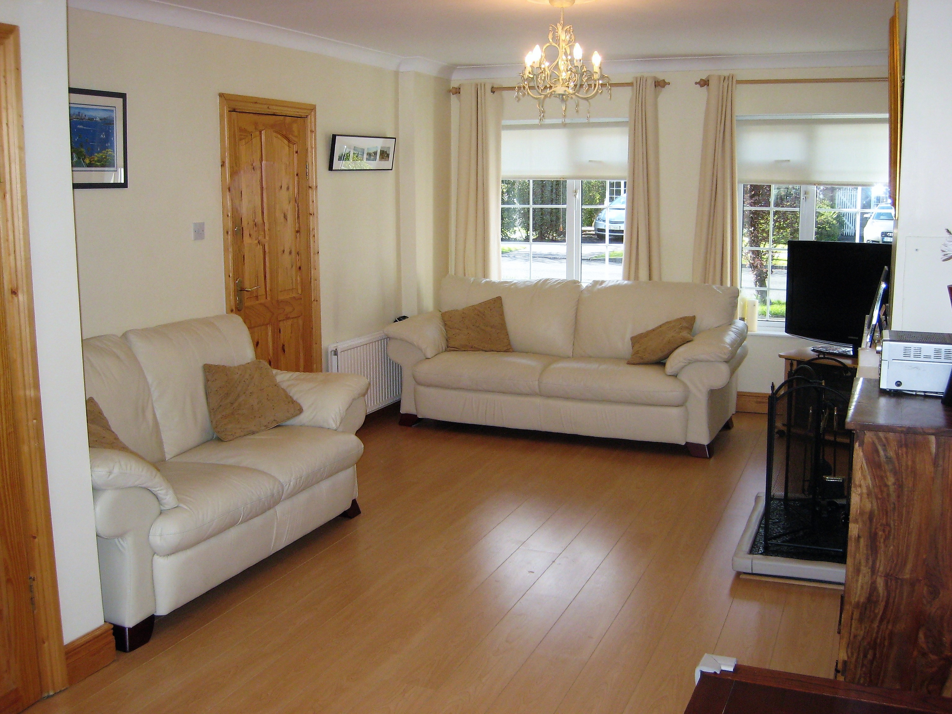 | 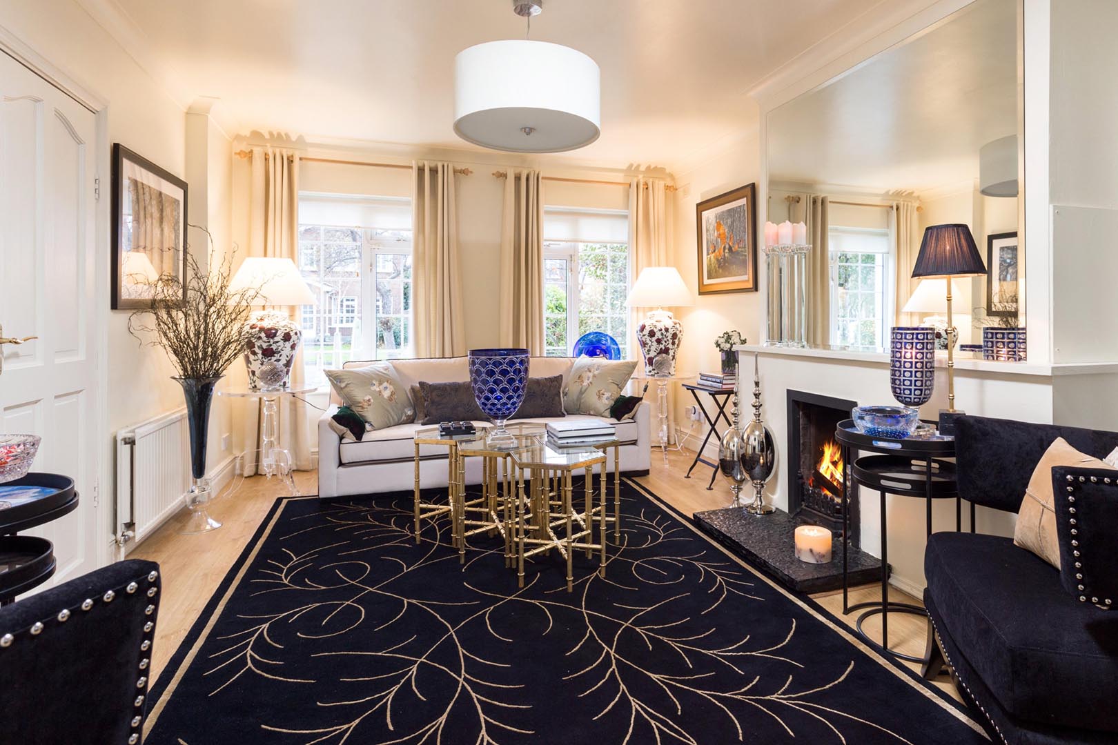 |
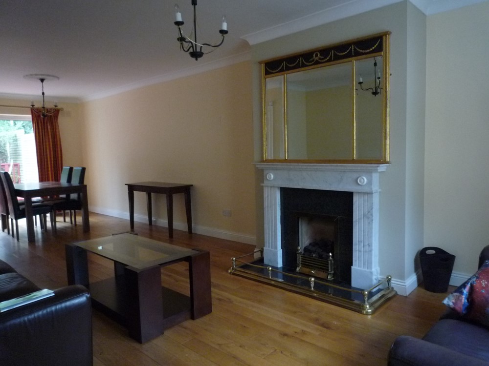
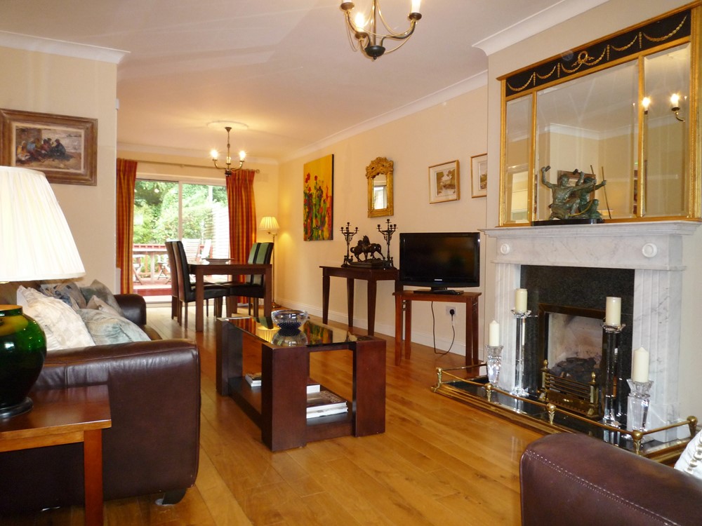
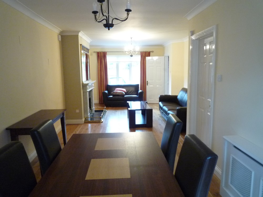
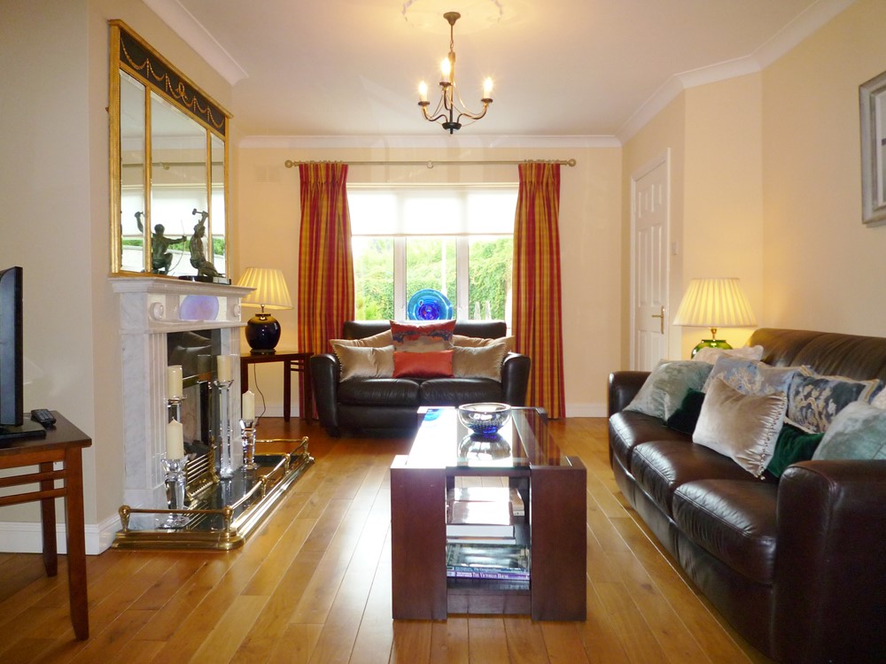
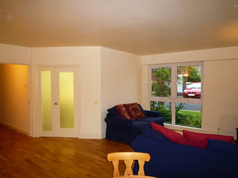
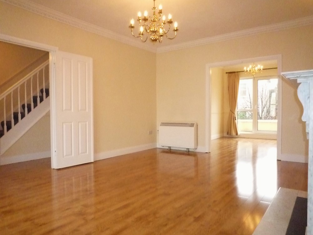
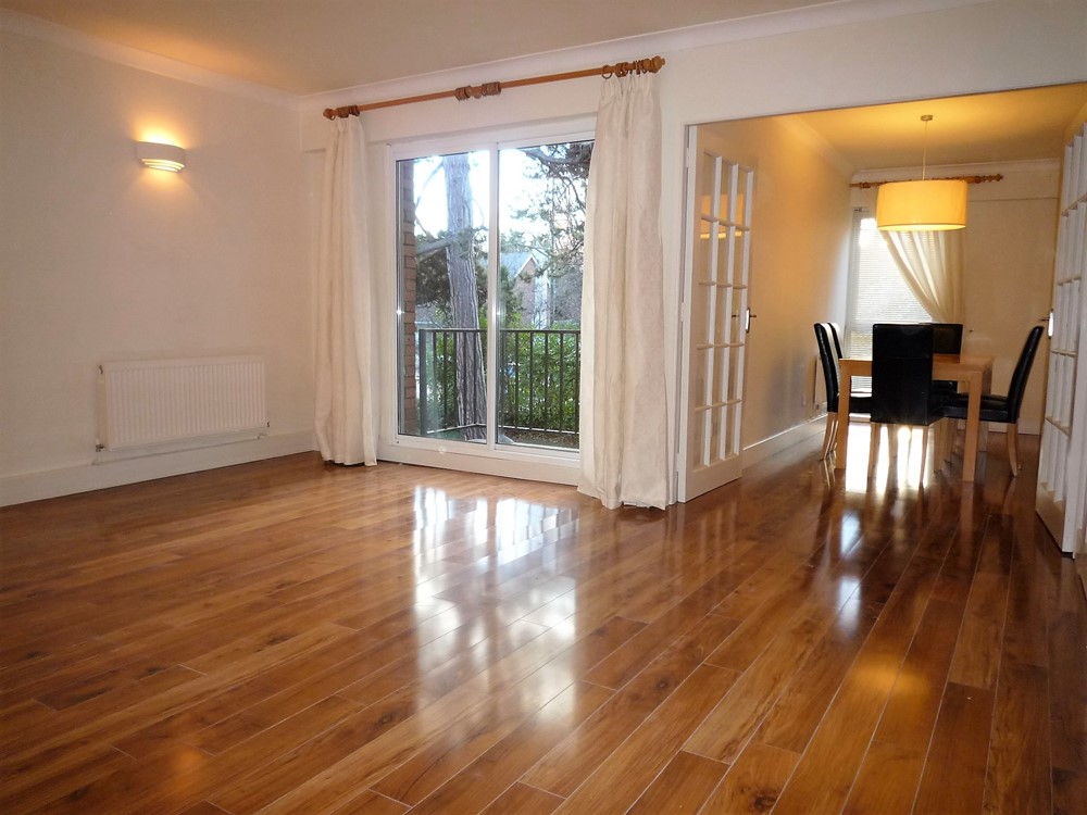
First Picture - Before: Living room, prior to being dressed for the selling campaign. Second Picture - After: The point of dressing a house is not only to show the house at its best but also to make it more memorable and to convey something of the lifestyle that the prospective purchaser might identity with. | |
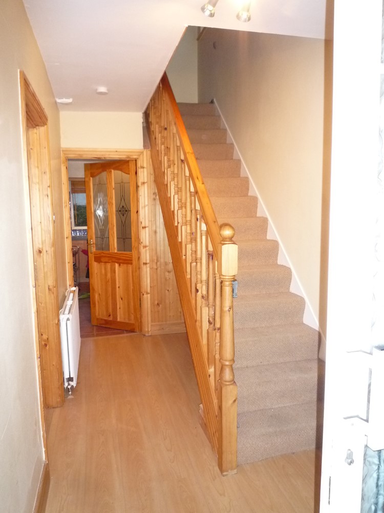
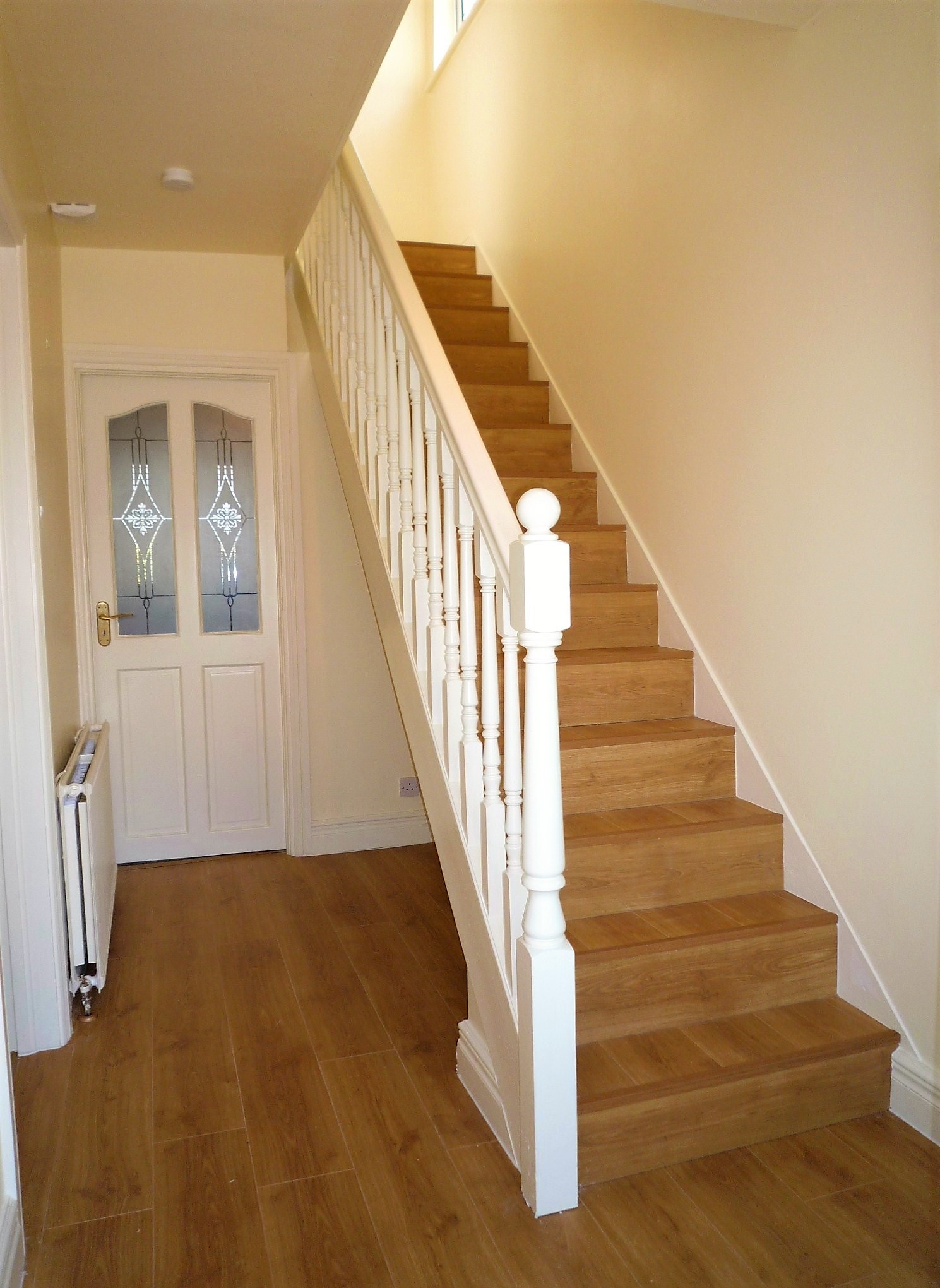 | 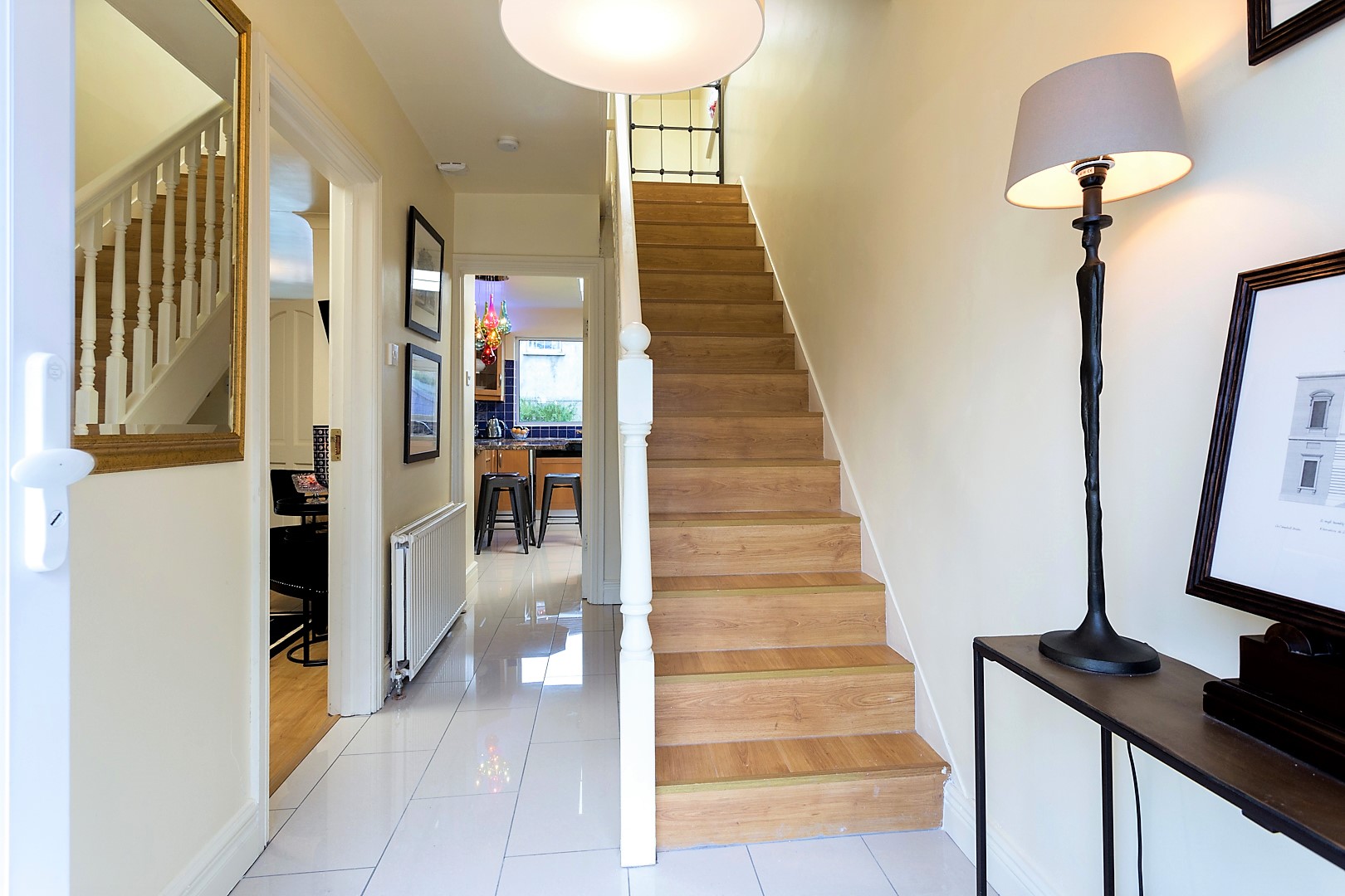 |
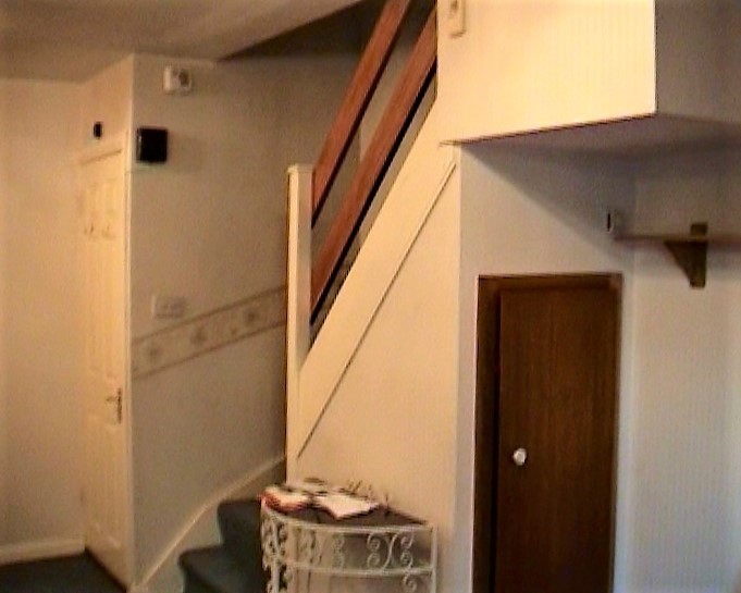
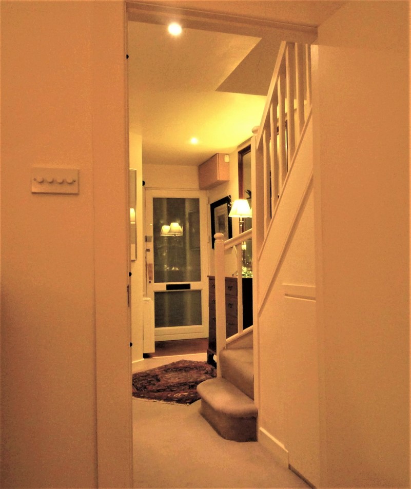
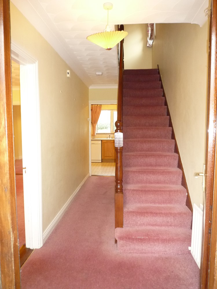
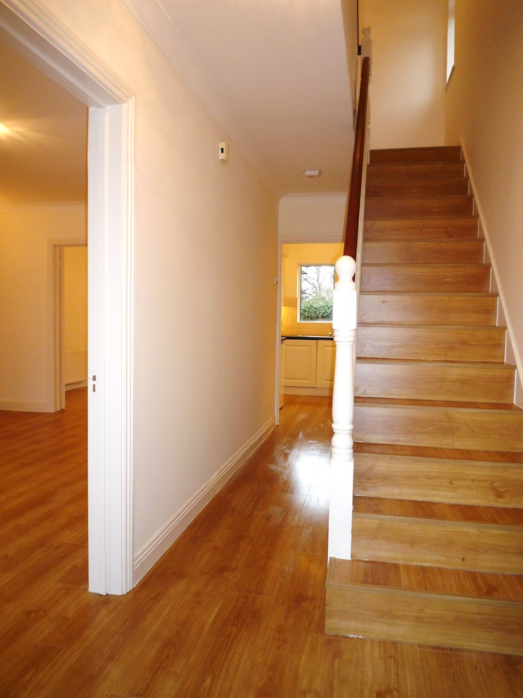
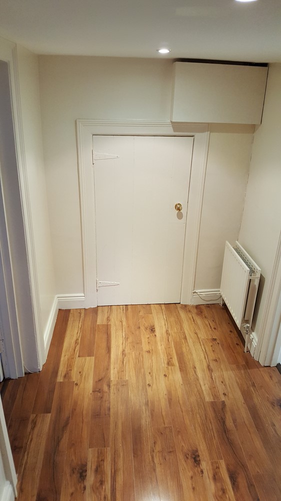
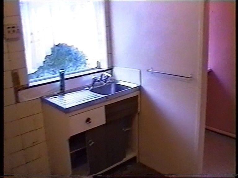
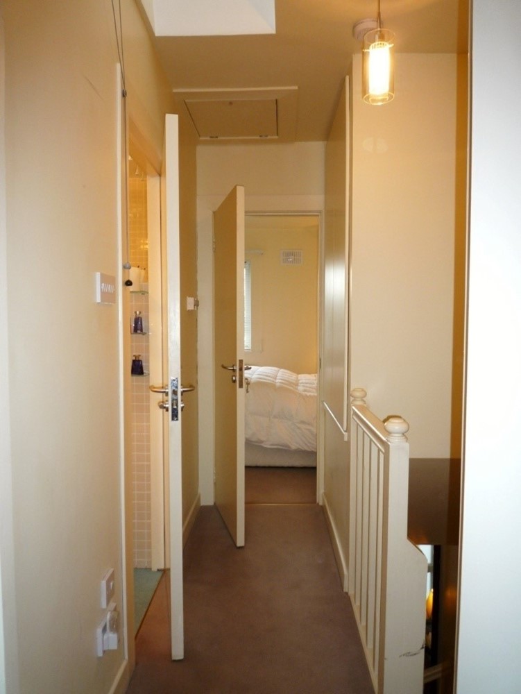
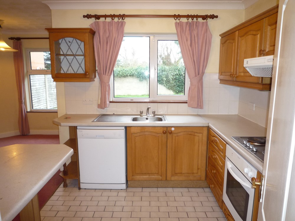
First Picture - Before: I had previously renovated this hall, by installing laminate throughout and changing all woodwork from natural pine to a cream finish. Second Picture - After: Here we see an enlarged hall (the front door was pushed out into the open porch area). The floor was redone in cream porcelain high gloss tiles which bounce the light and create a more spacious and prestigious entrance. This flooring was continued into the kitchen to brighten up what was a rather dull room. | |
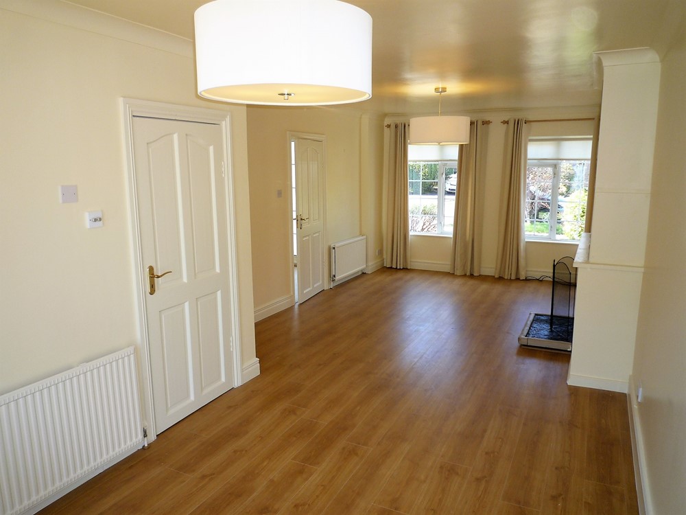
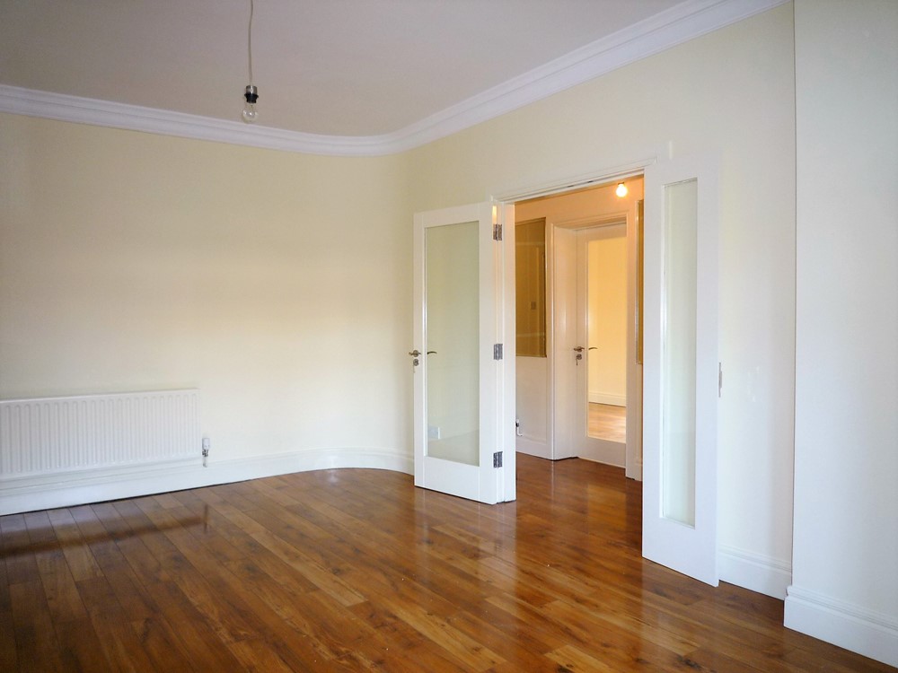
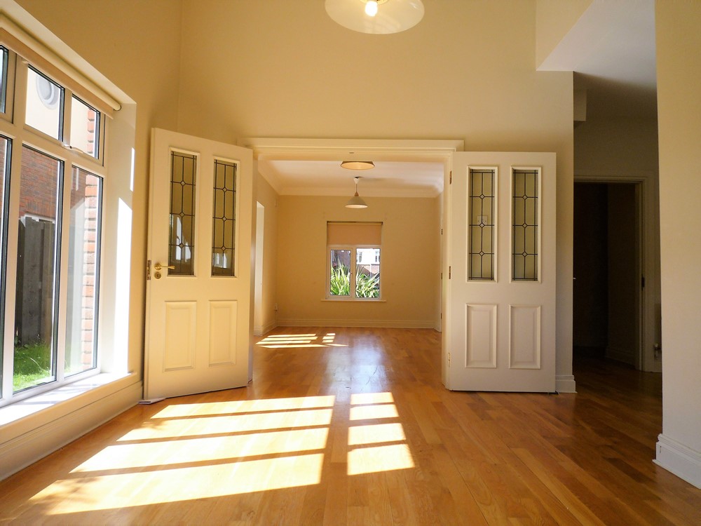
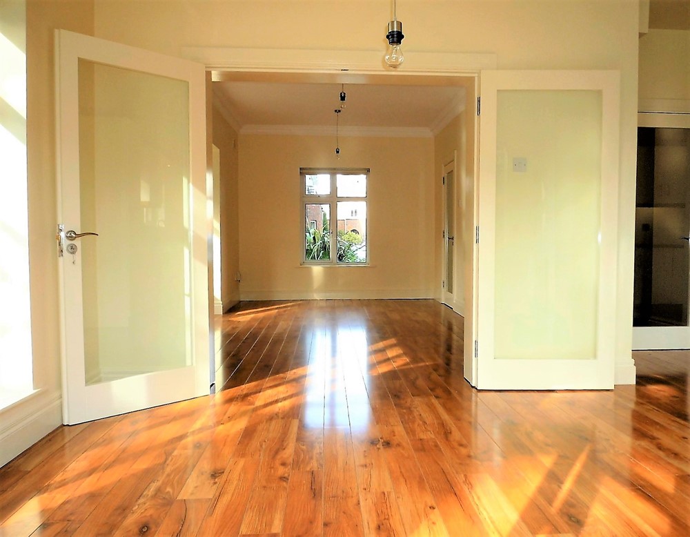
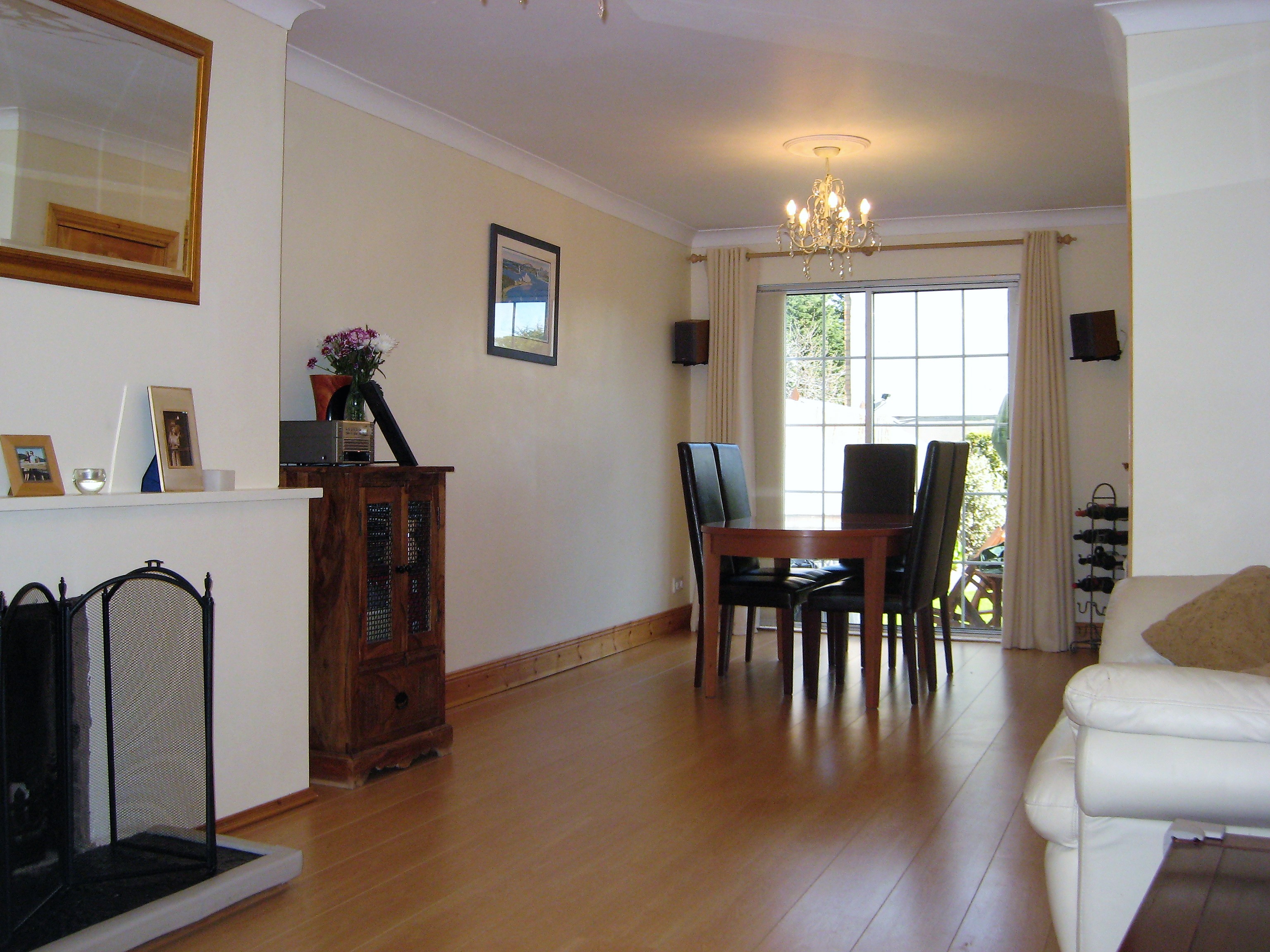 | 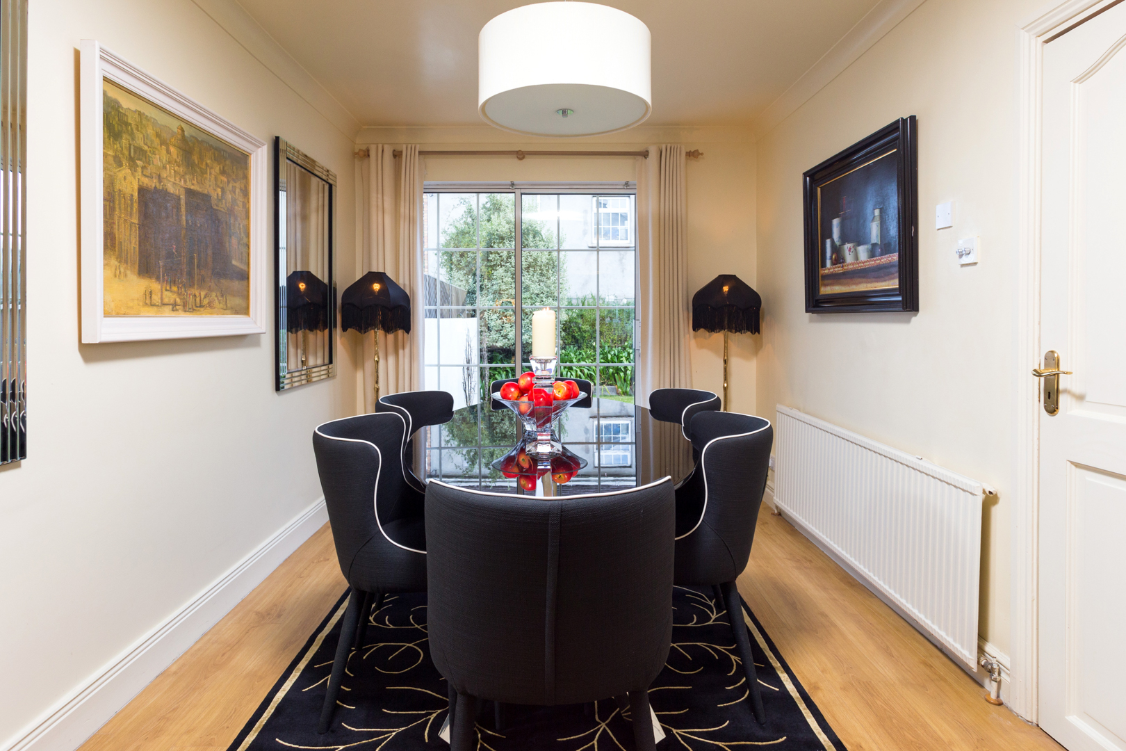 |
| First Picture - Before: Here we see the Before view of the dining room. Second Picture - After: Dining room dressed for selling campaign. Simple furniture and mirrors which reflected the garden into the room. | |
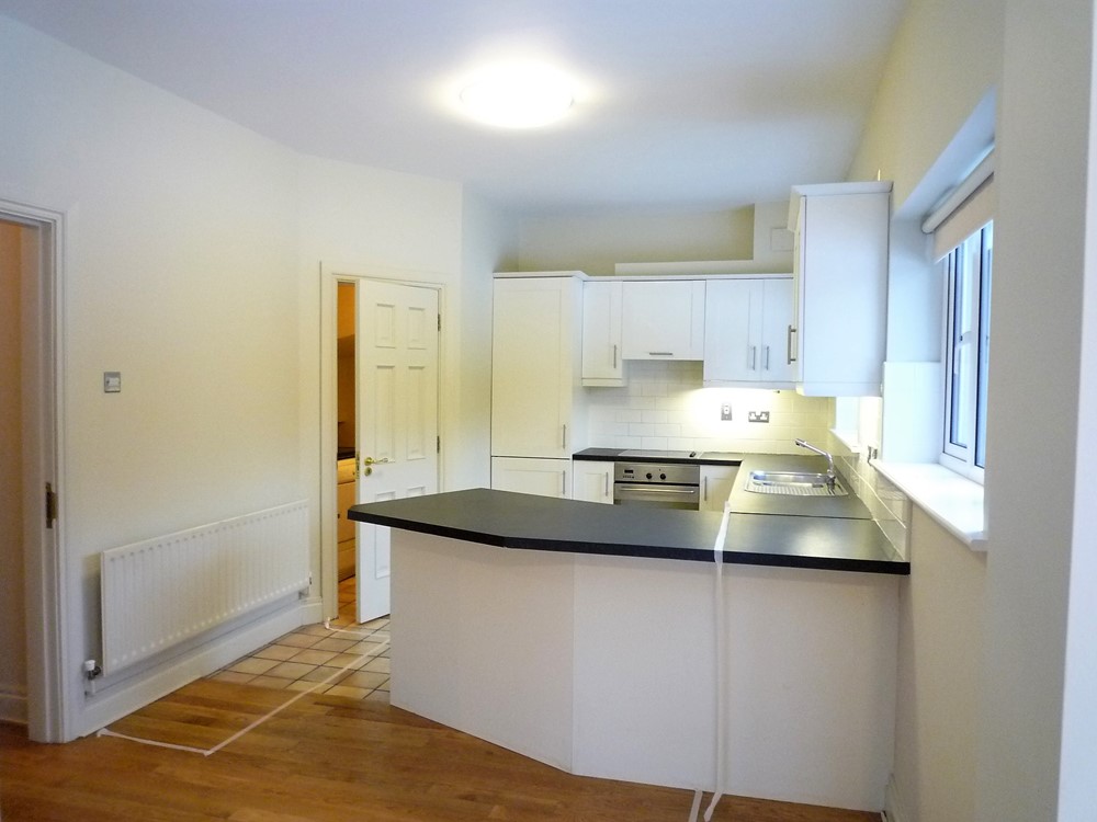
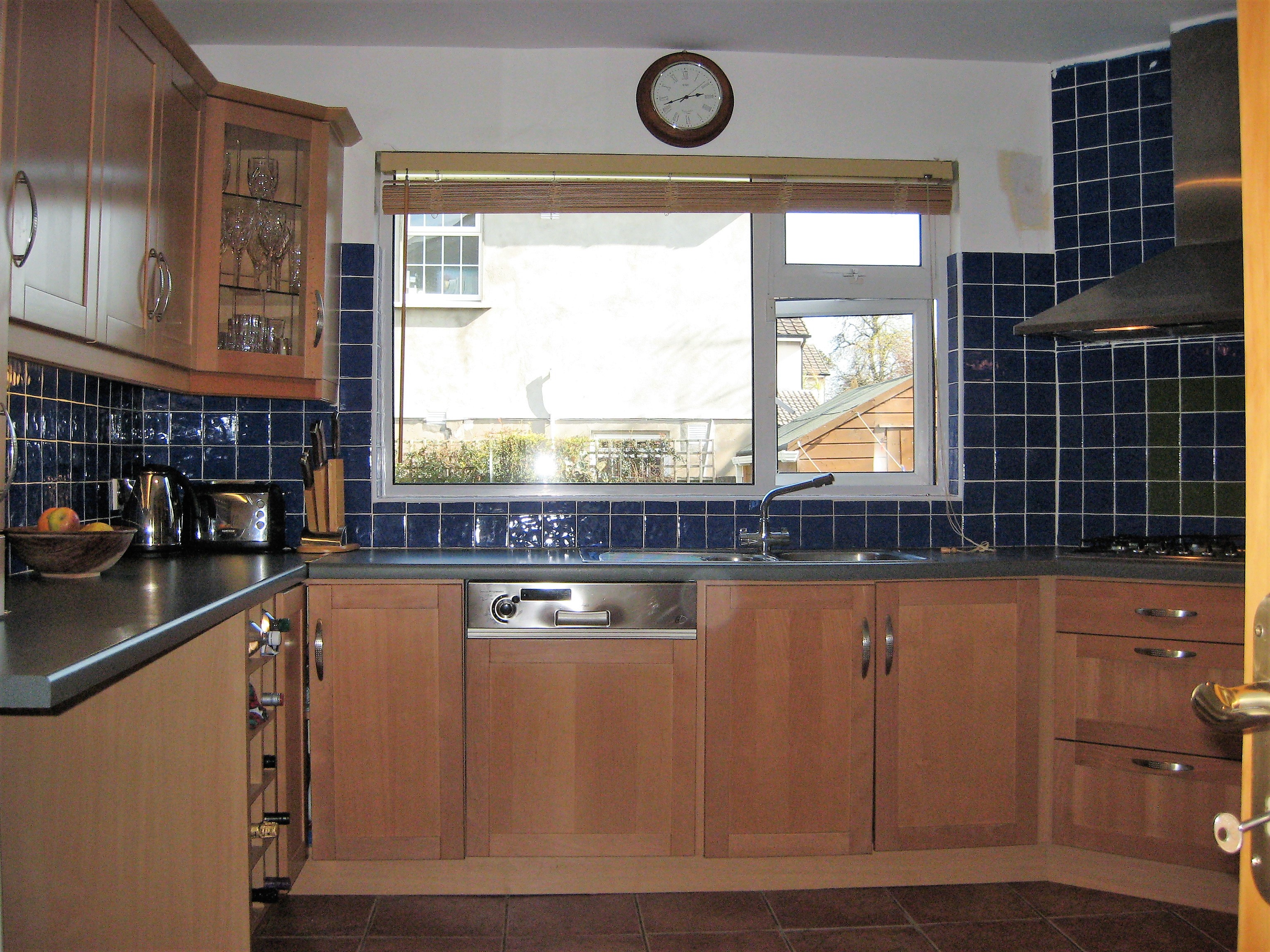 | 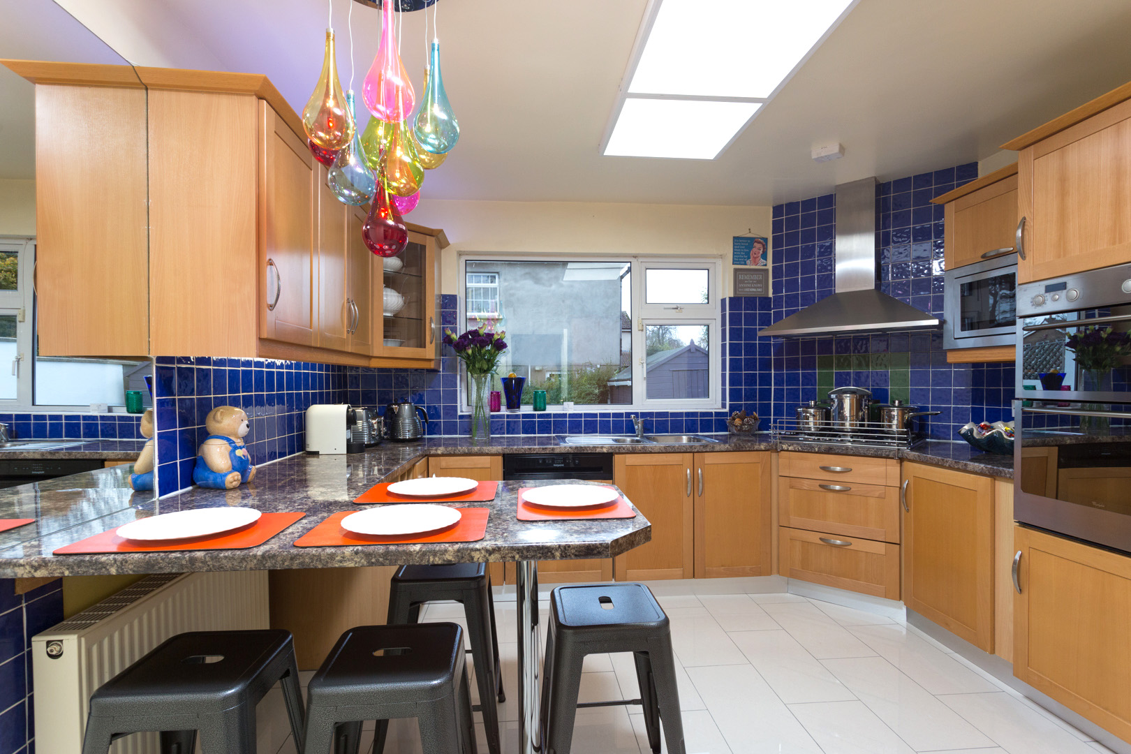 |
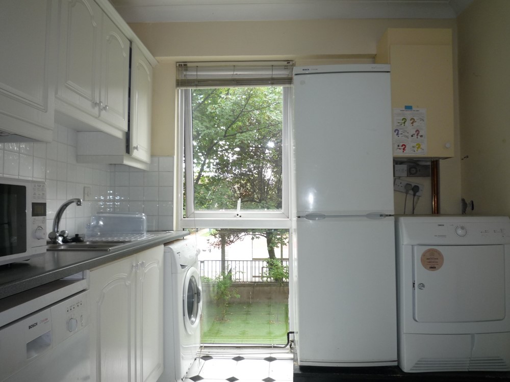
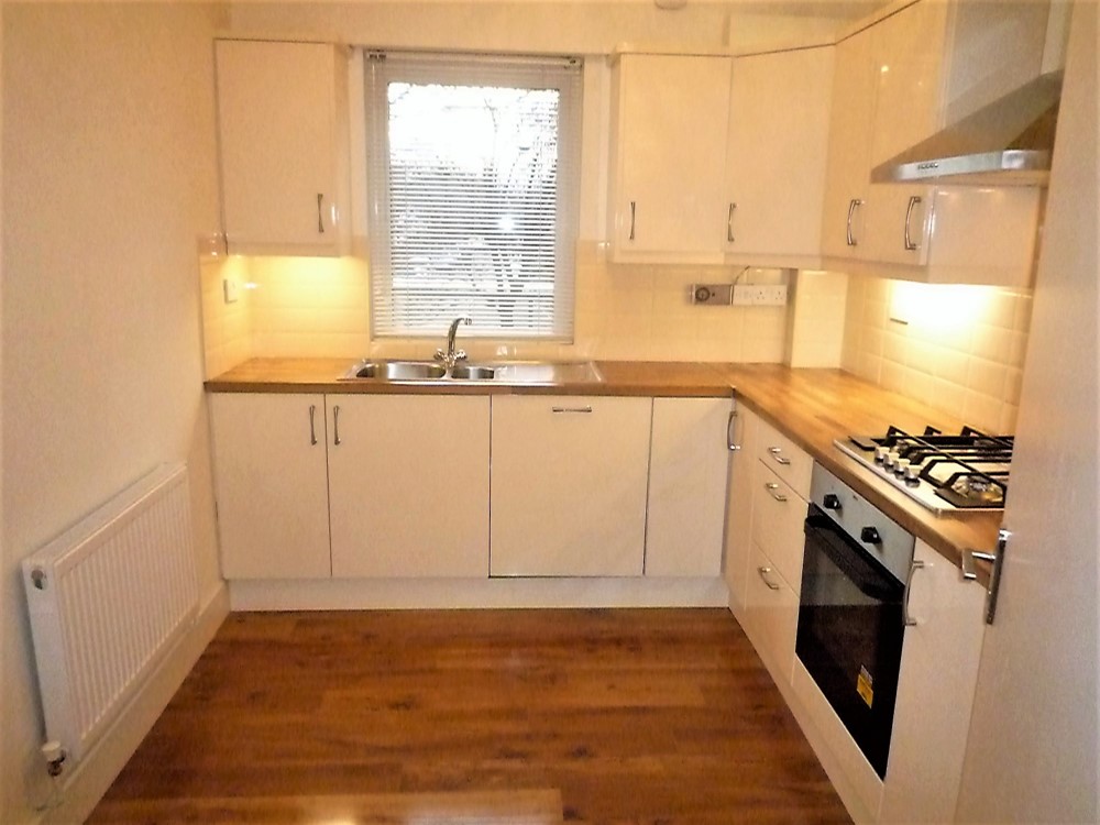
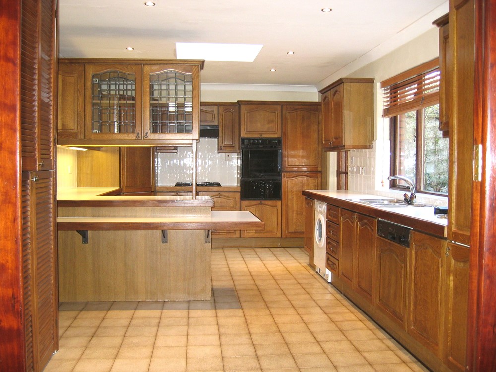
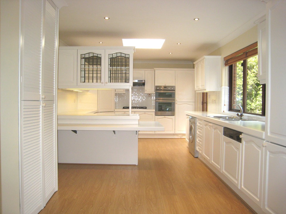
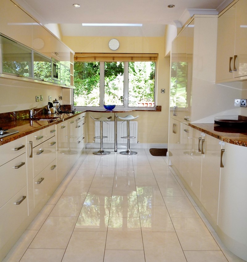
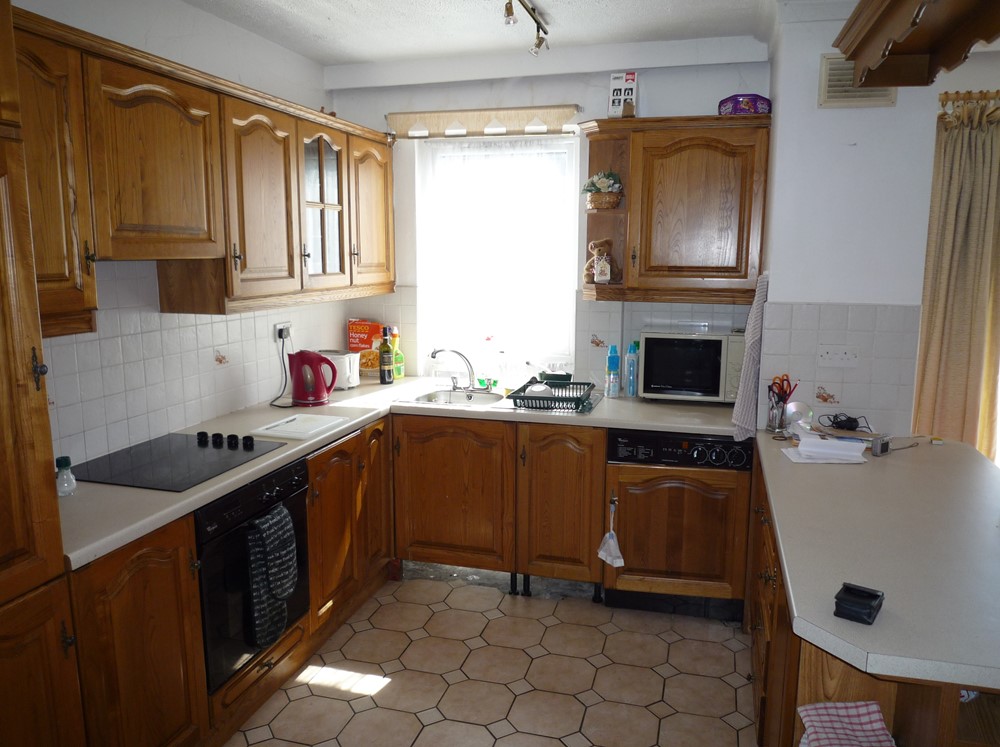
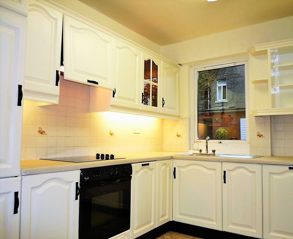
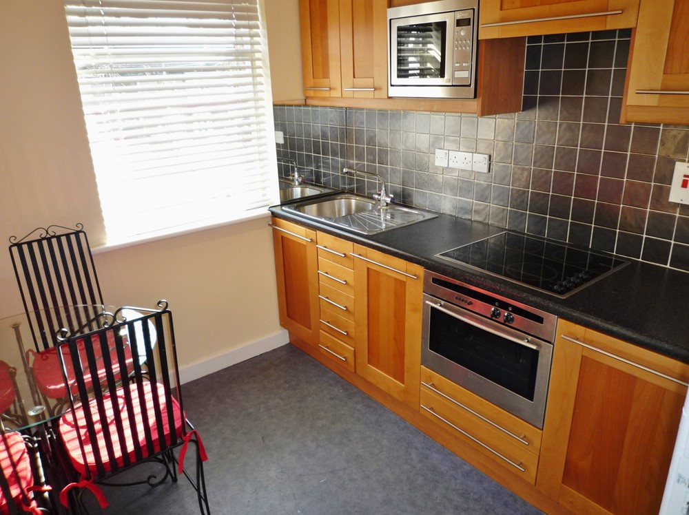
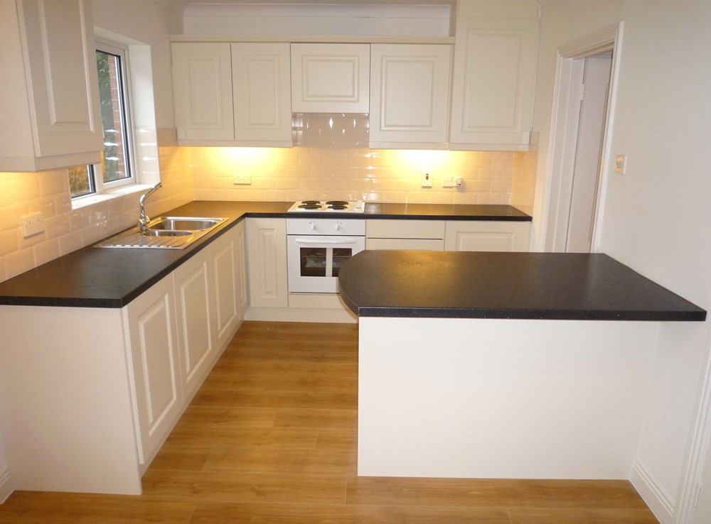
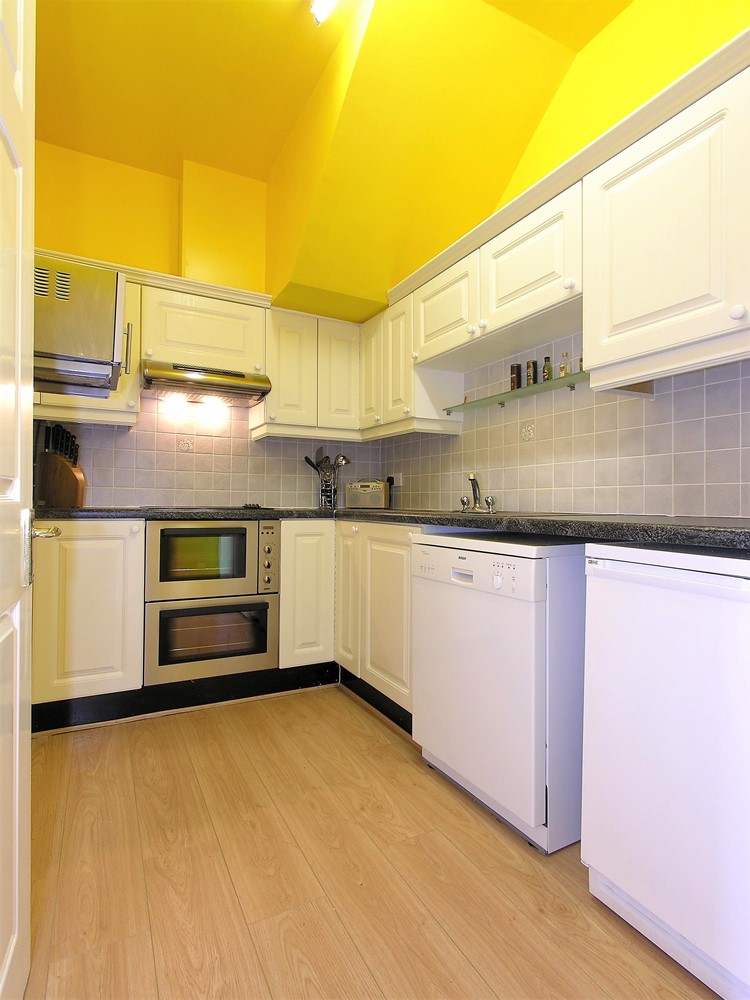
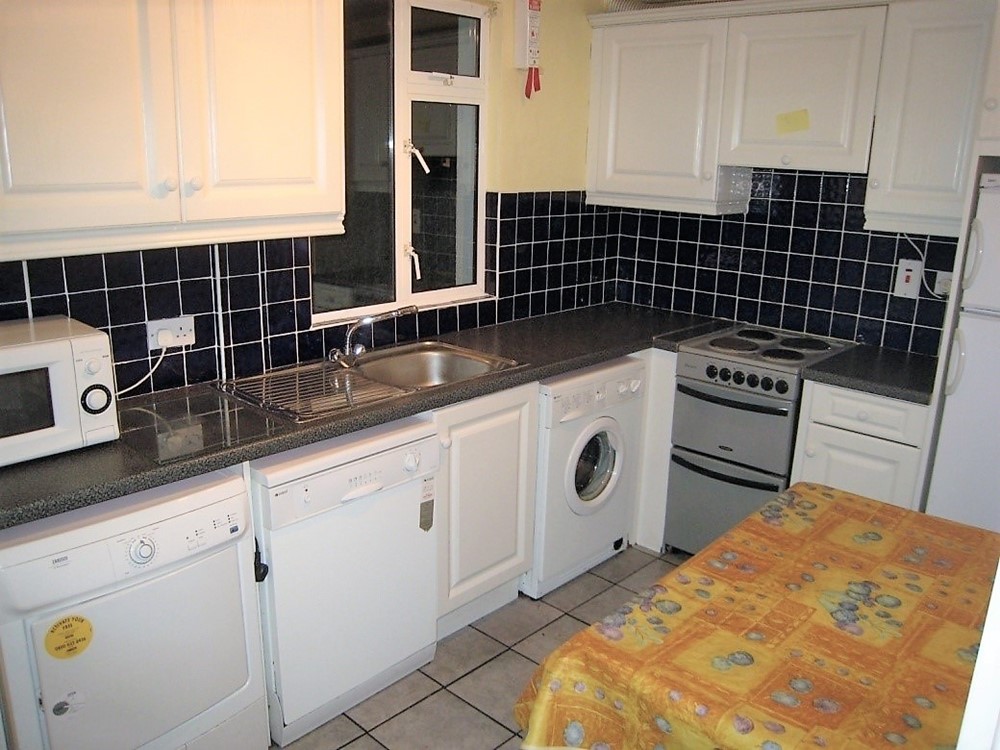
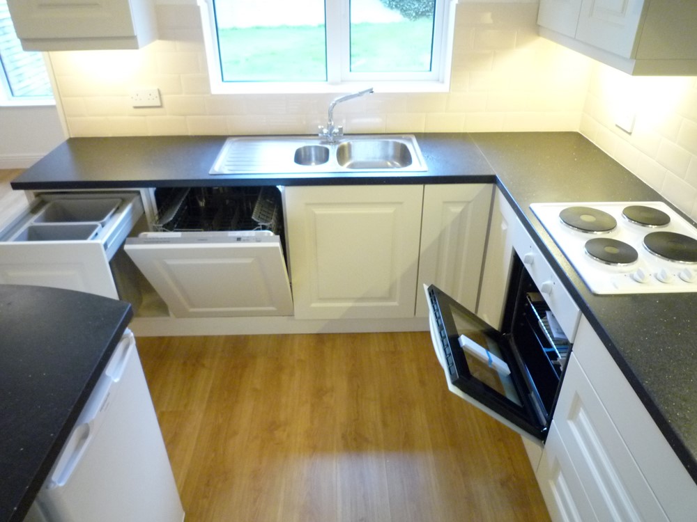
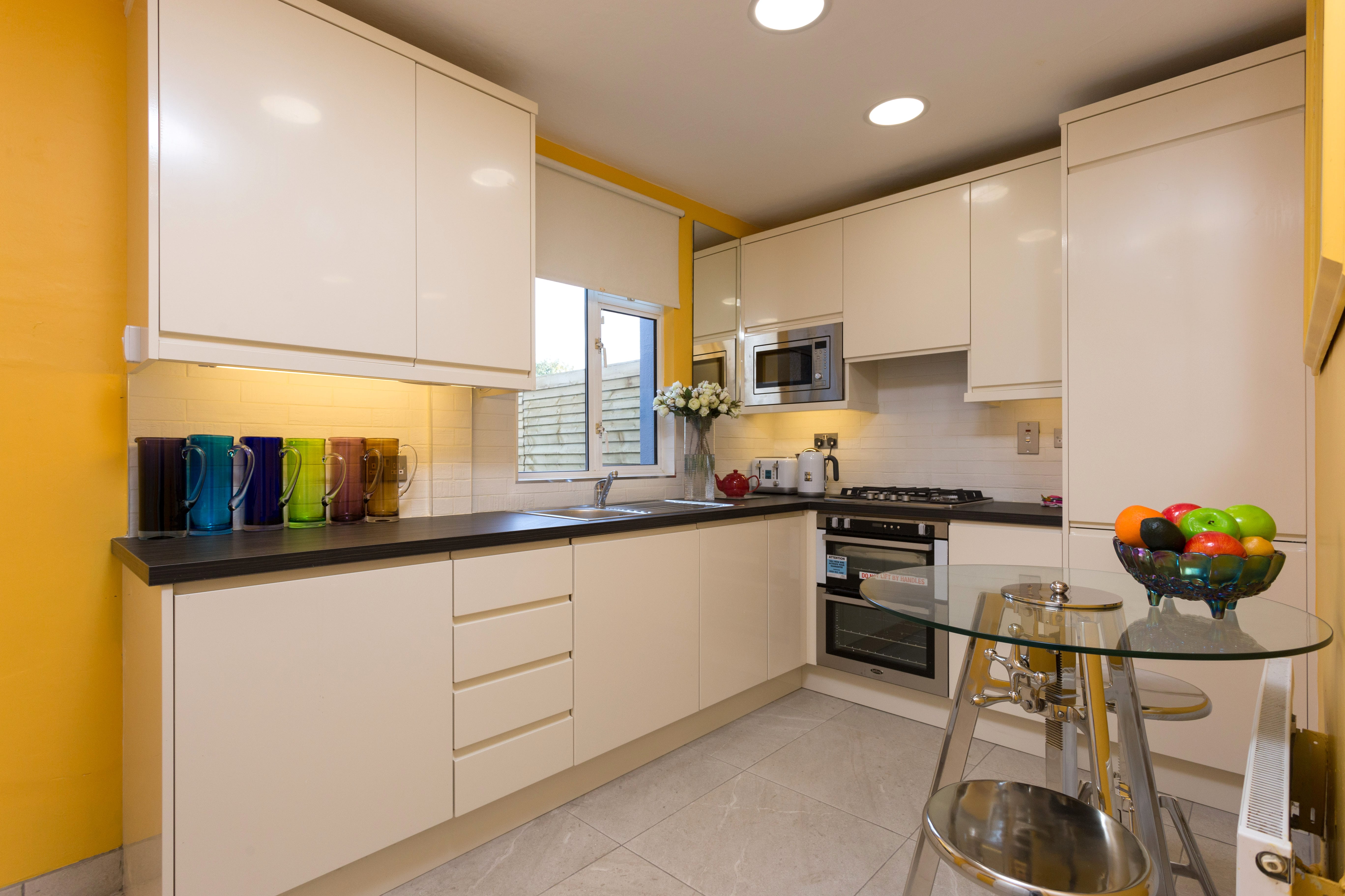
| First Picture - Before: A rather dull and somewhat dated kitchen. Second Picture - After: I replaced the entire worktop and extended it into a snack bar which now creates an eating area which can comfortably accommodate 4 diners. Simple stackable stools take up no space underneath the snack bar. My aim here was to make the kitchen work better for a small family and to brighten it up. | |
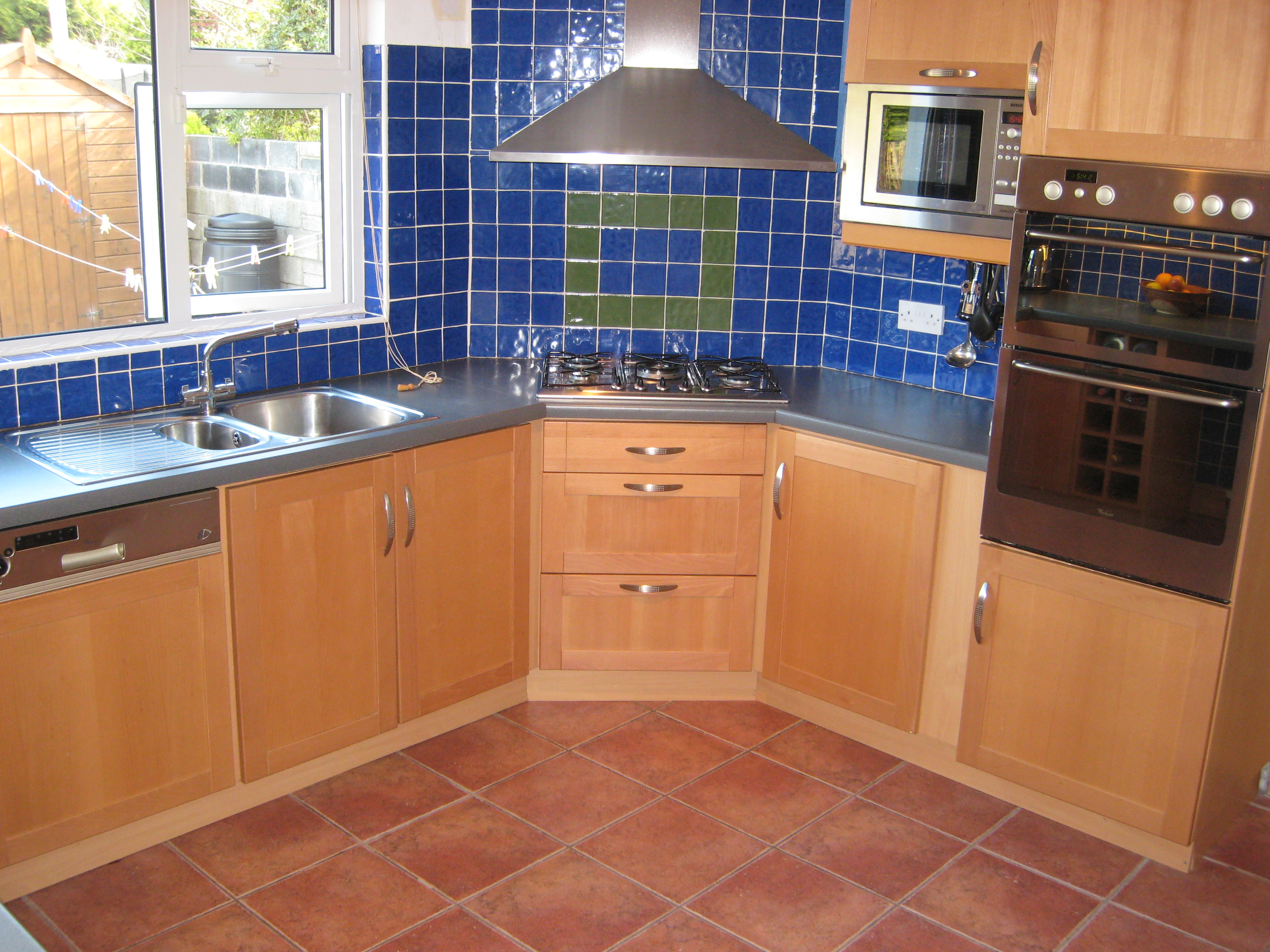 | 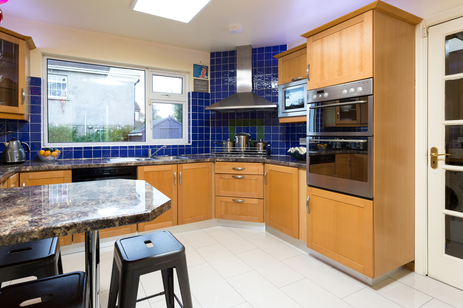 |
| First Picture - Before: Another view of the same kitchen showing the dark floor and old worktop. Second Picture - After: The brighter flooring has transformed the room. I considered respraying the kitchen units but was working to a budget so this was not done. We inserted new stainless steel kick boards. These little extras show that the job has been completed because it is important not to leave the job looking half done. New daylight coloured LED ceiling panels and extra lighting on top of and underneath the wall cupboards also helped bounce light around the room. An inexpenisve but very effective improvement. | |
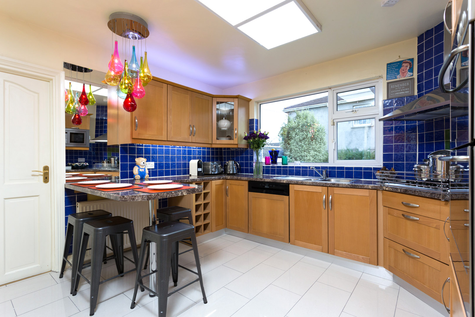 | 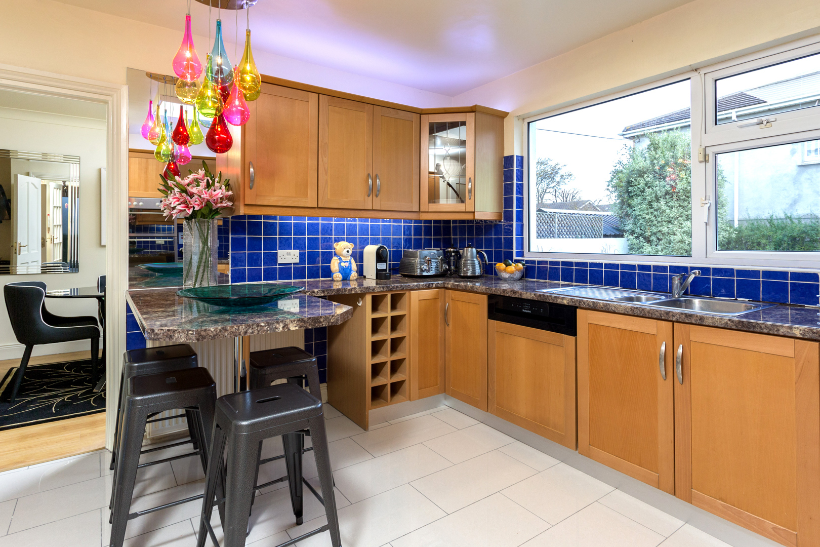 |
| Both Pictures - After: I inserted a panel of mirror at the end of the snack bar which helped create the impression of a larger snack bar and created depth in the room. | |
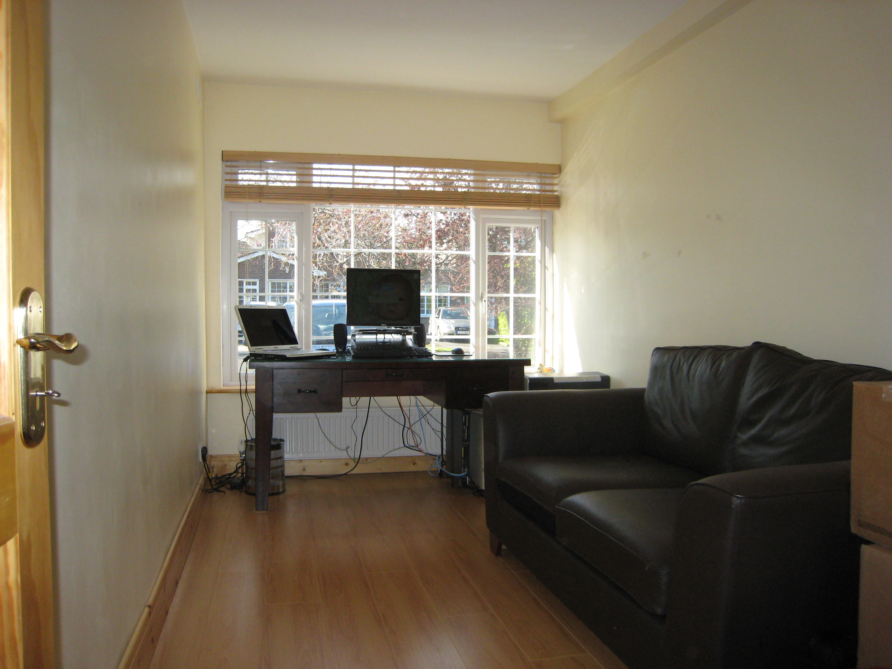 | 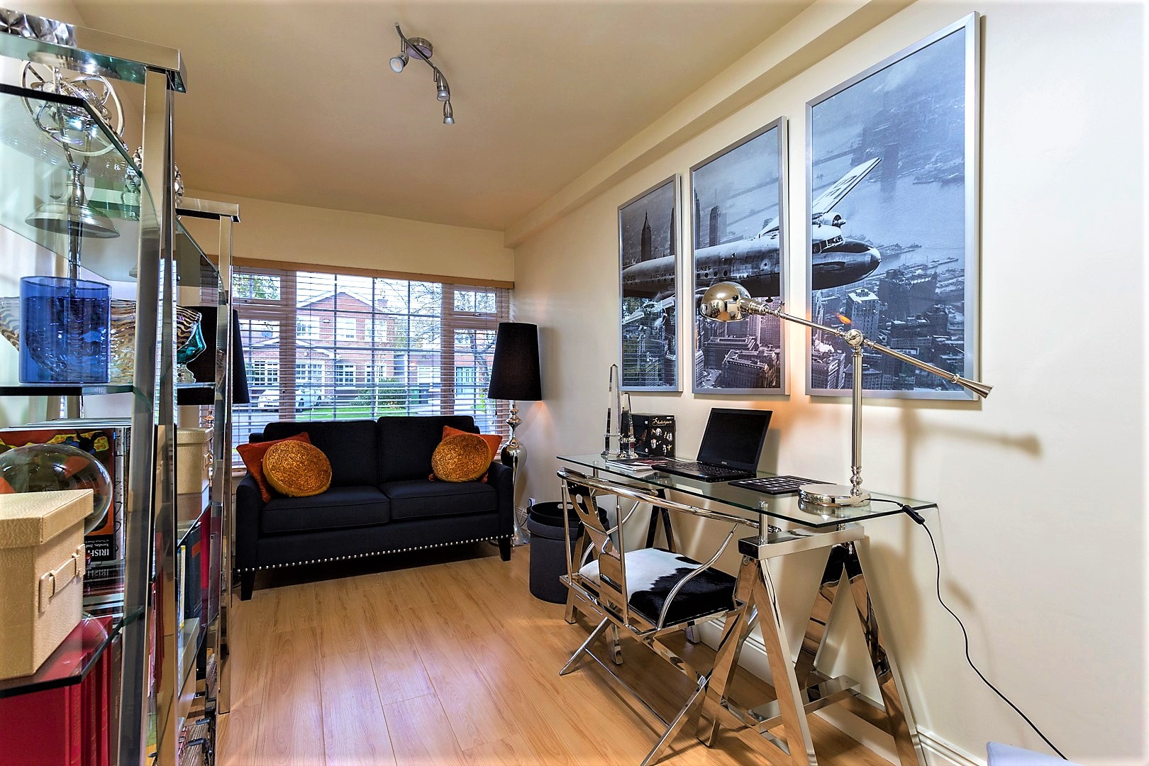 |
| First Picture - Before: The original garage had been integrated into the dwelling and had been used as an extra bedroom or study. Second Picture - After: I dressed it as a study and by the simple repositioning of glass furniture the room appears much less cramped. | |
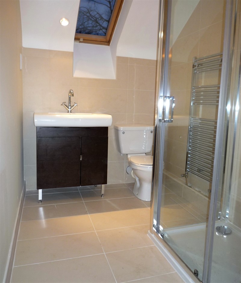
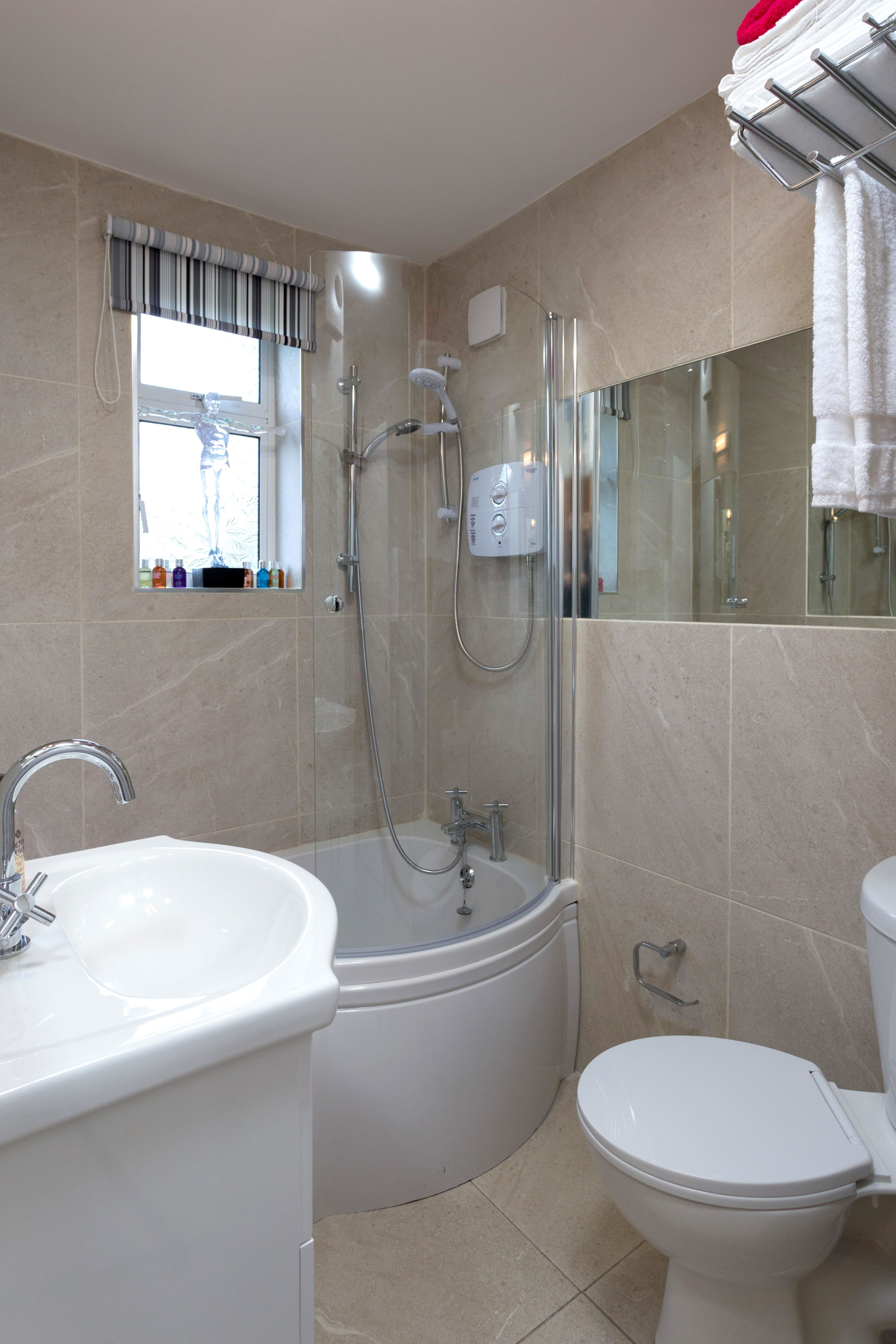
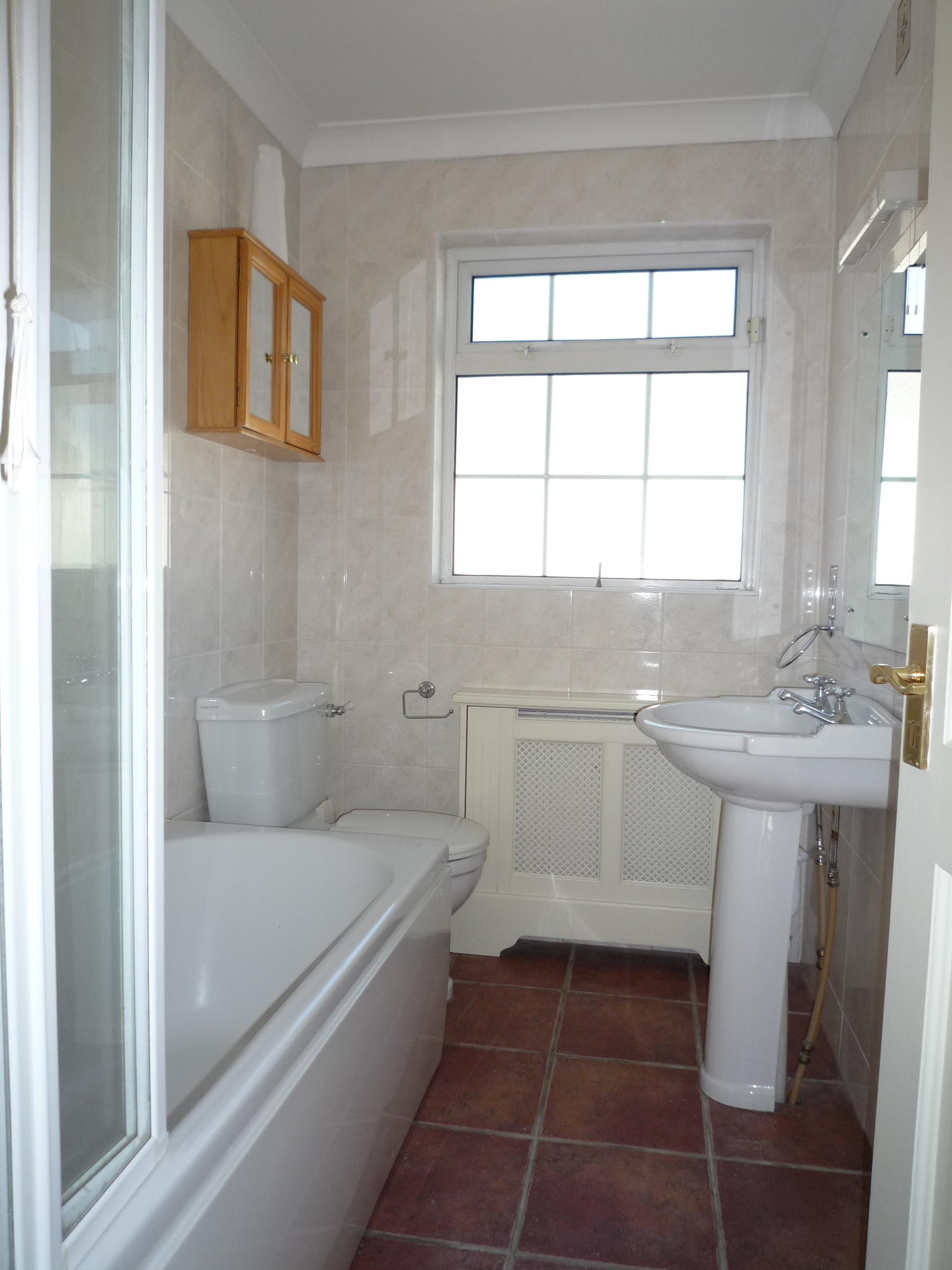 | 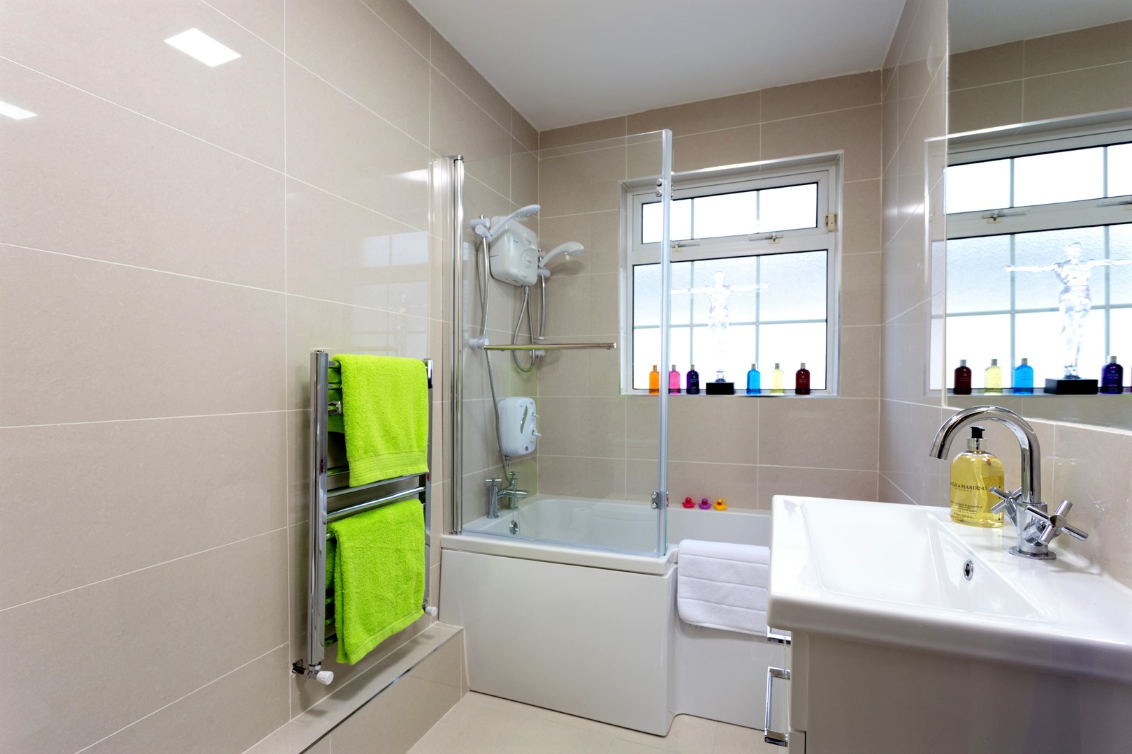 |
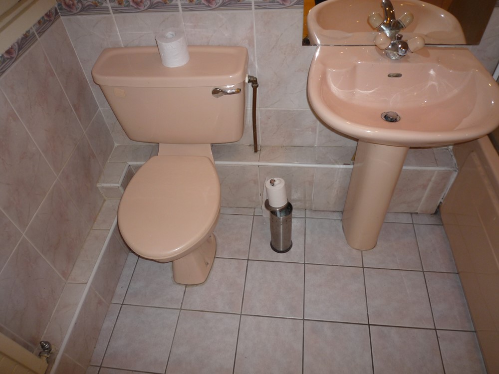
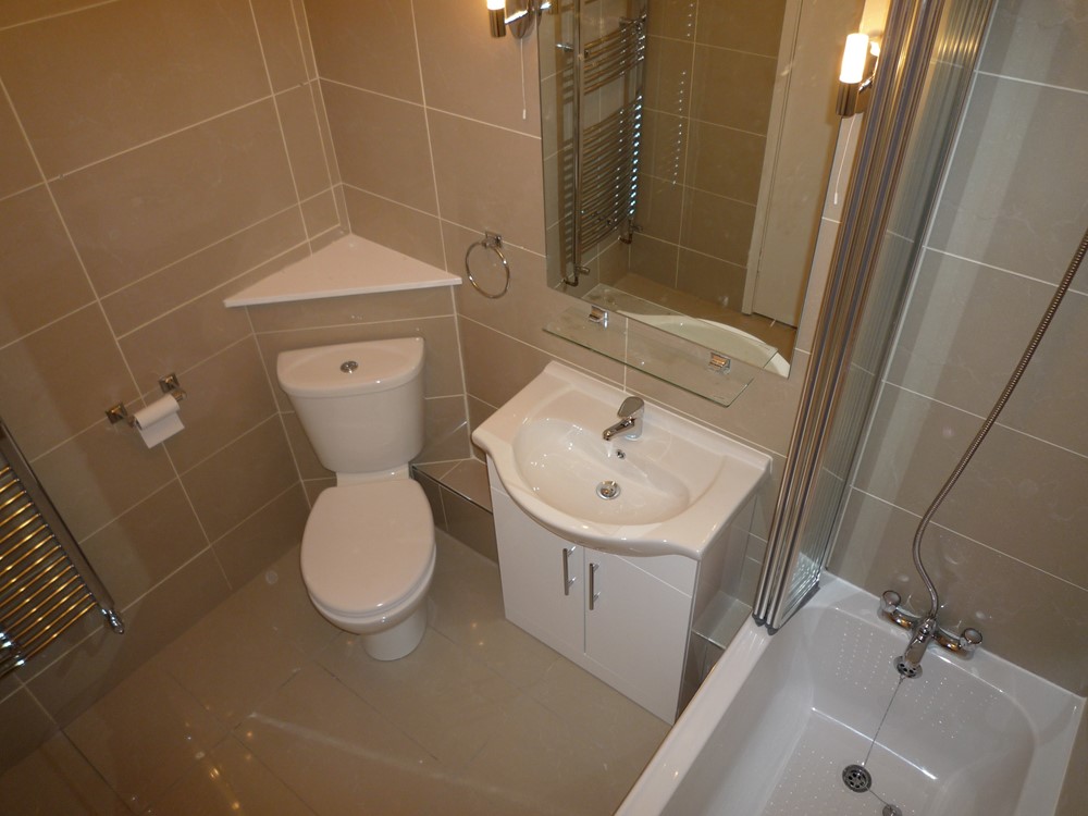
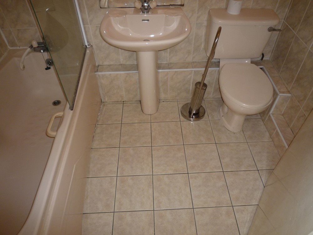
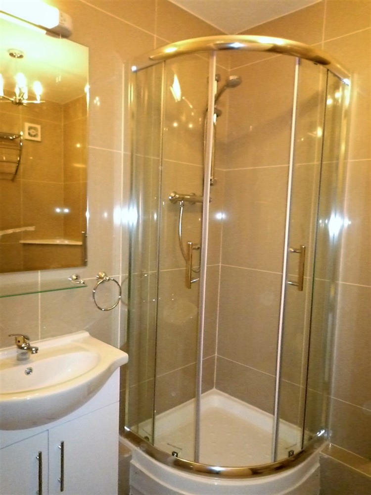
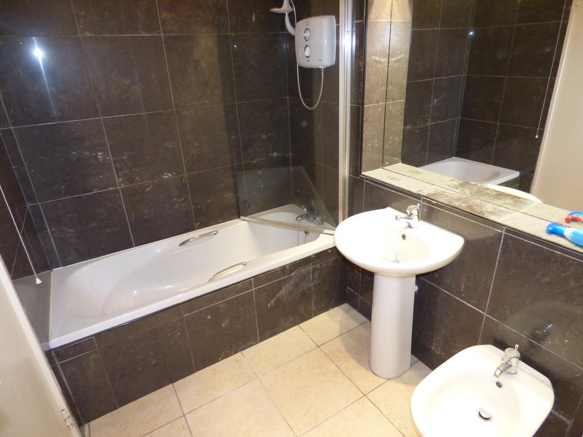
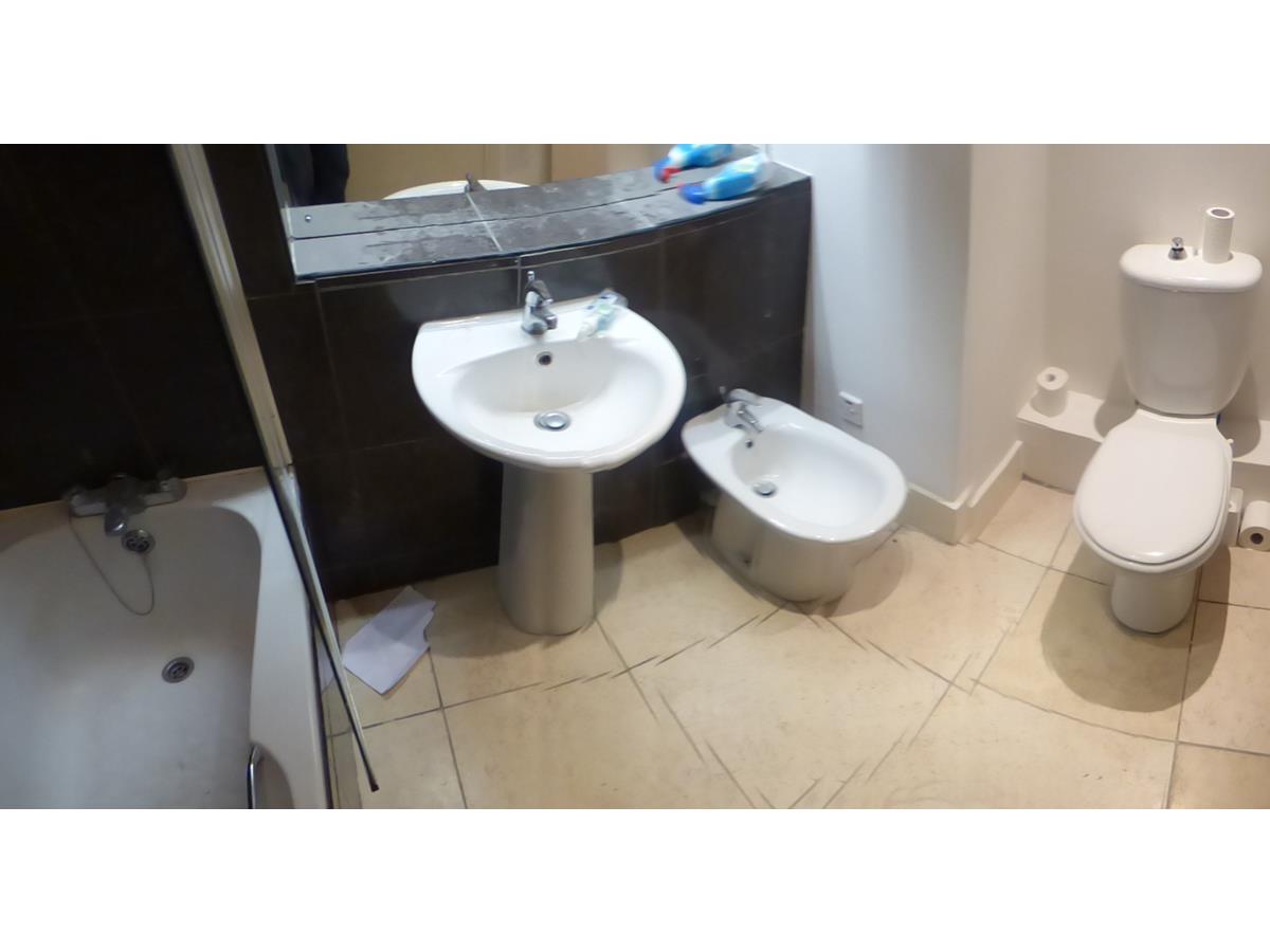
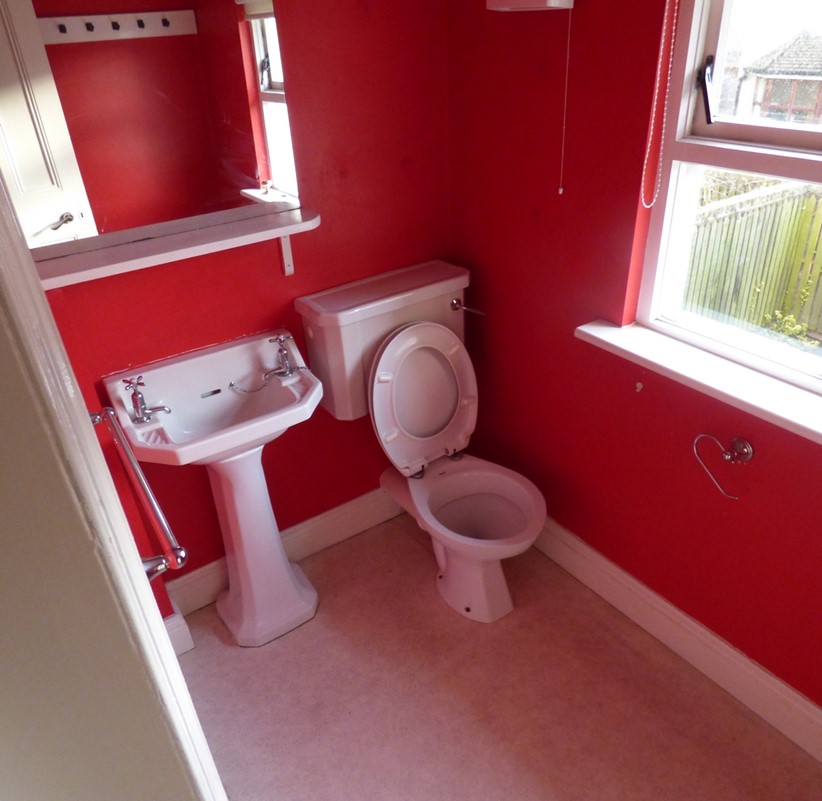
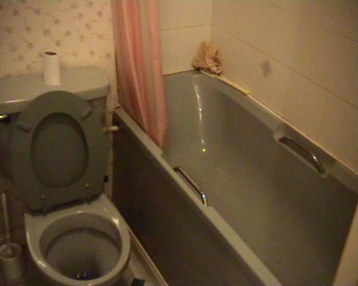
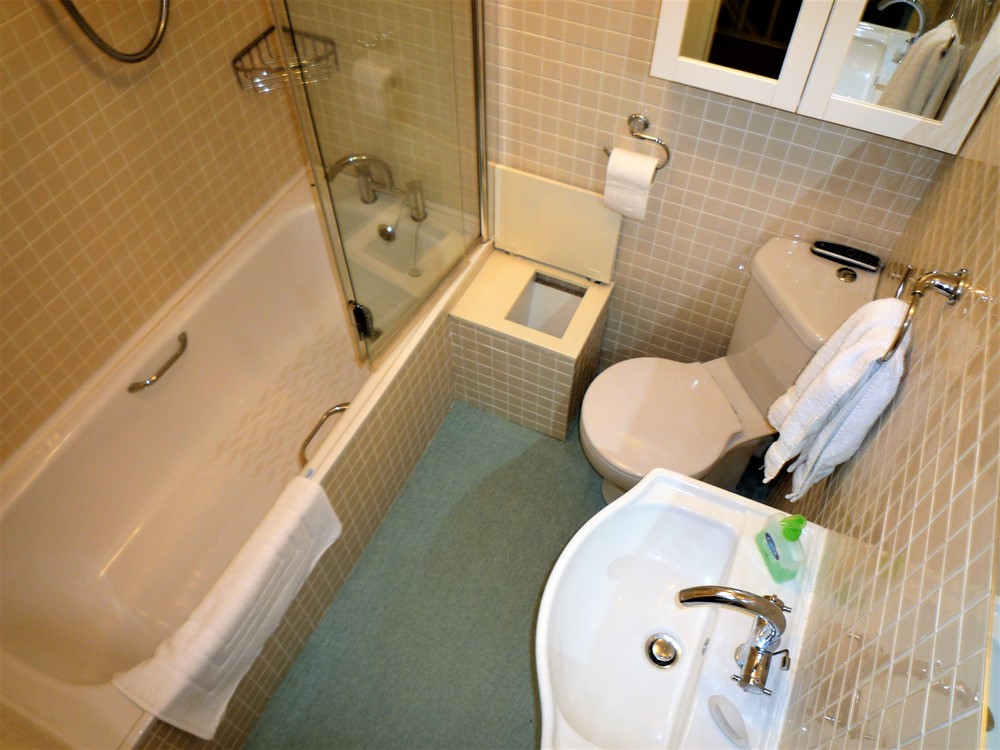
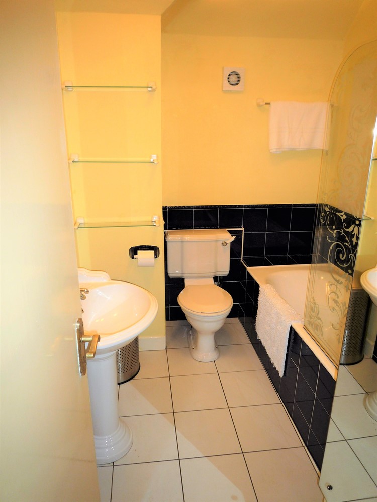
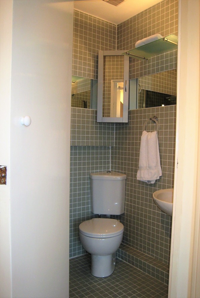
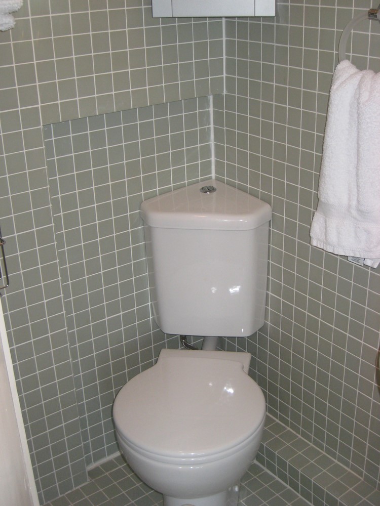
| Both of these pictures are of the same bathroom. It has not been enlarged. I simply redesigned it. The redesigned bathroom also has a lavatory - which is just out of shot to the lower left hand side of the picture. The same tiles on the floor and walls created a more sophisticated and streamlined look. I am a great believer in having an instant electric shower in the main bathroom; that way you never run out of hot water! A large mirror panel also helped create the appearance an enlarged space. Despite the foorprint of this room not having been enlarged the usable floor area is now greater than before. Hard to believe but its true! | |
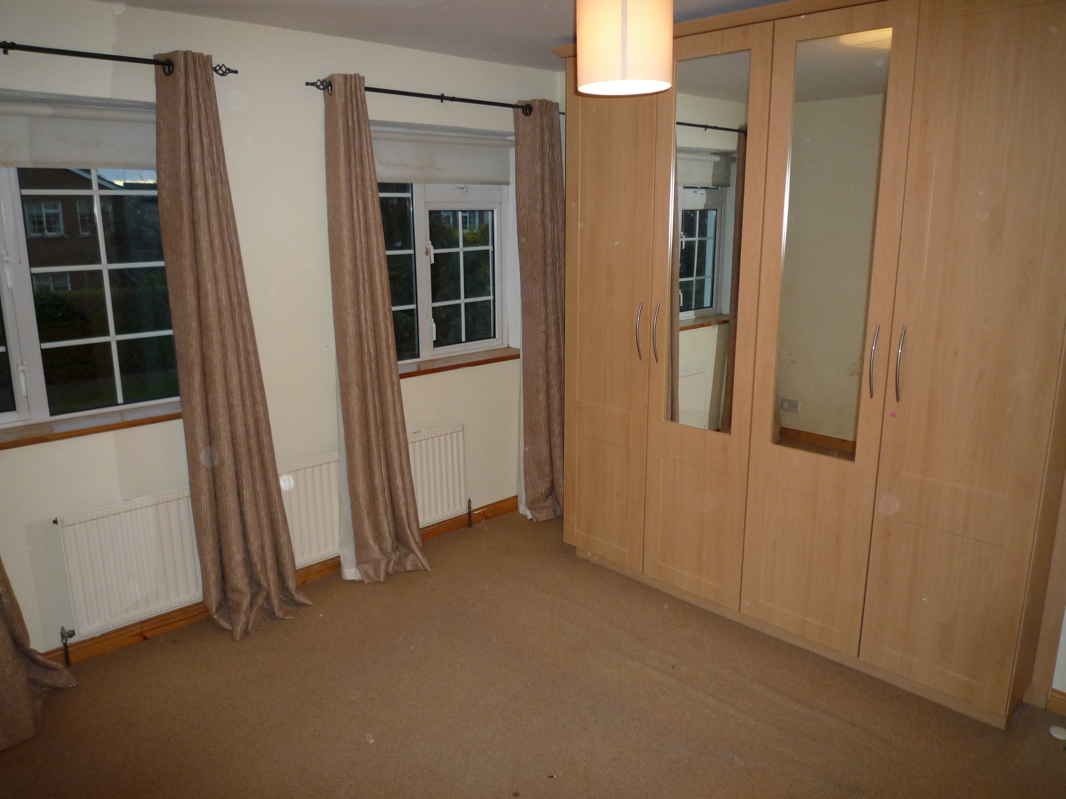 | 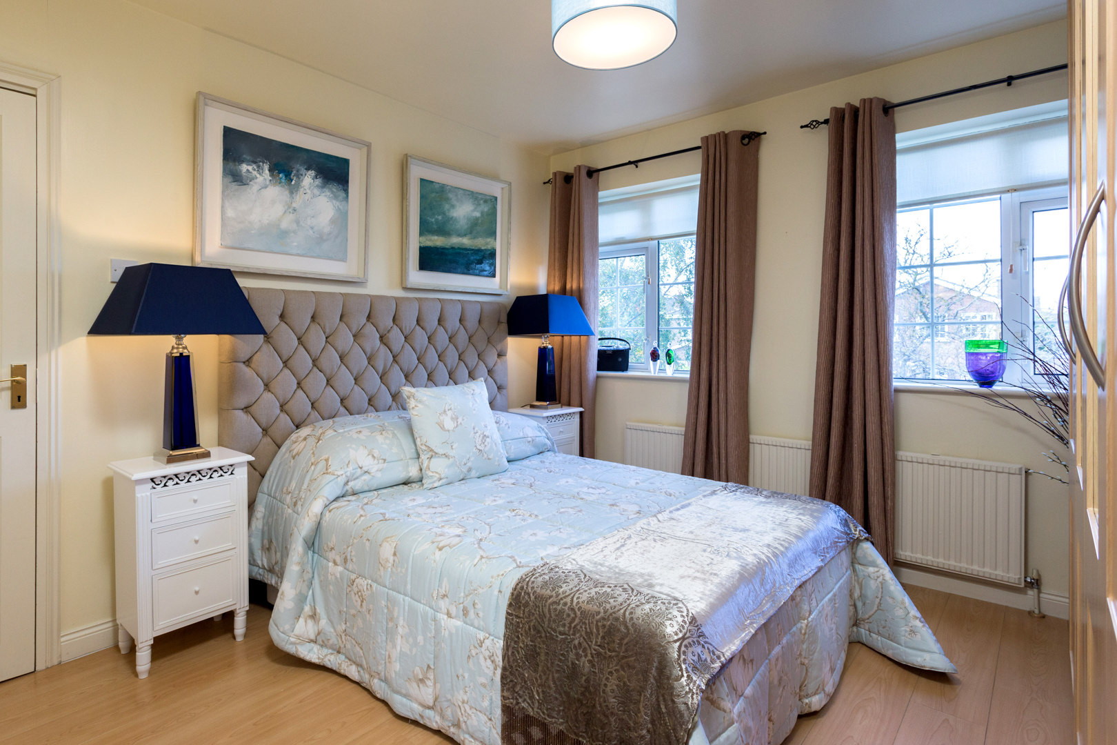 |
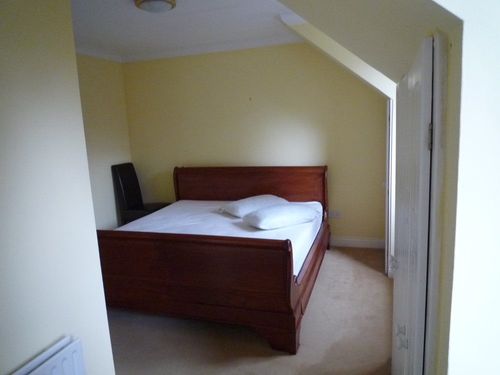
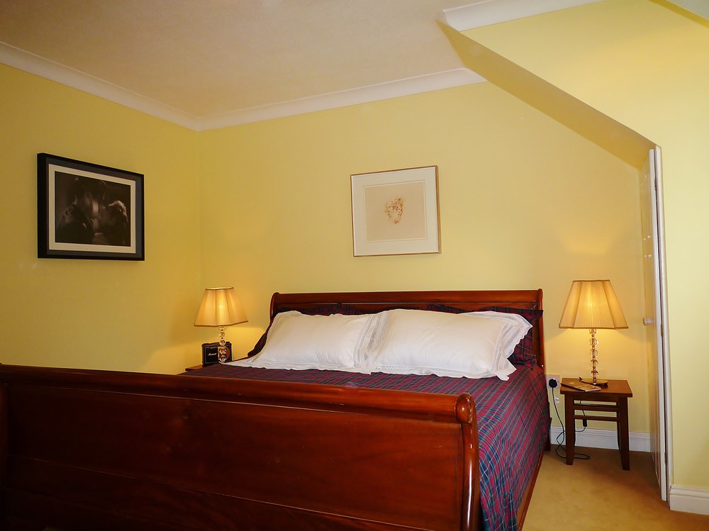
| First Picture - Before: Here we see an old picture of the master bedroom with a carpeted floor. Dark fawn carpeting was thougth to be neutral and inoffensive. Second Picture - After: The inexpensive laminate was a great improvement. The dressing involved installing simple, white painted modern furniture with some coloured glass items for interest. Nothing too complicated for the selling campaign. | |
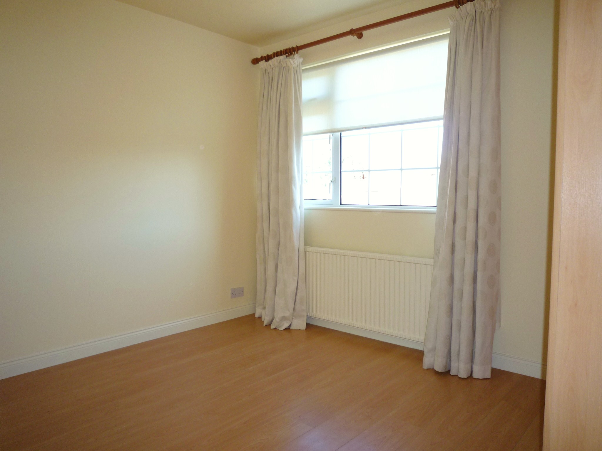 | 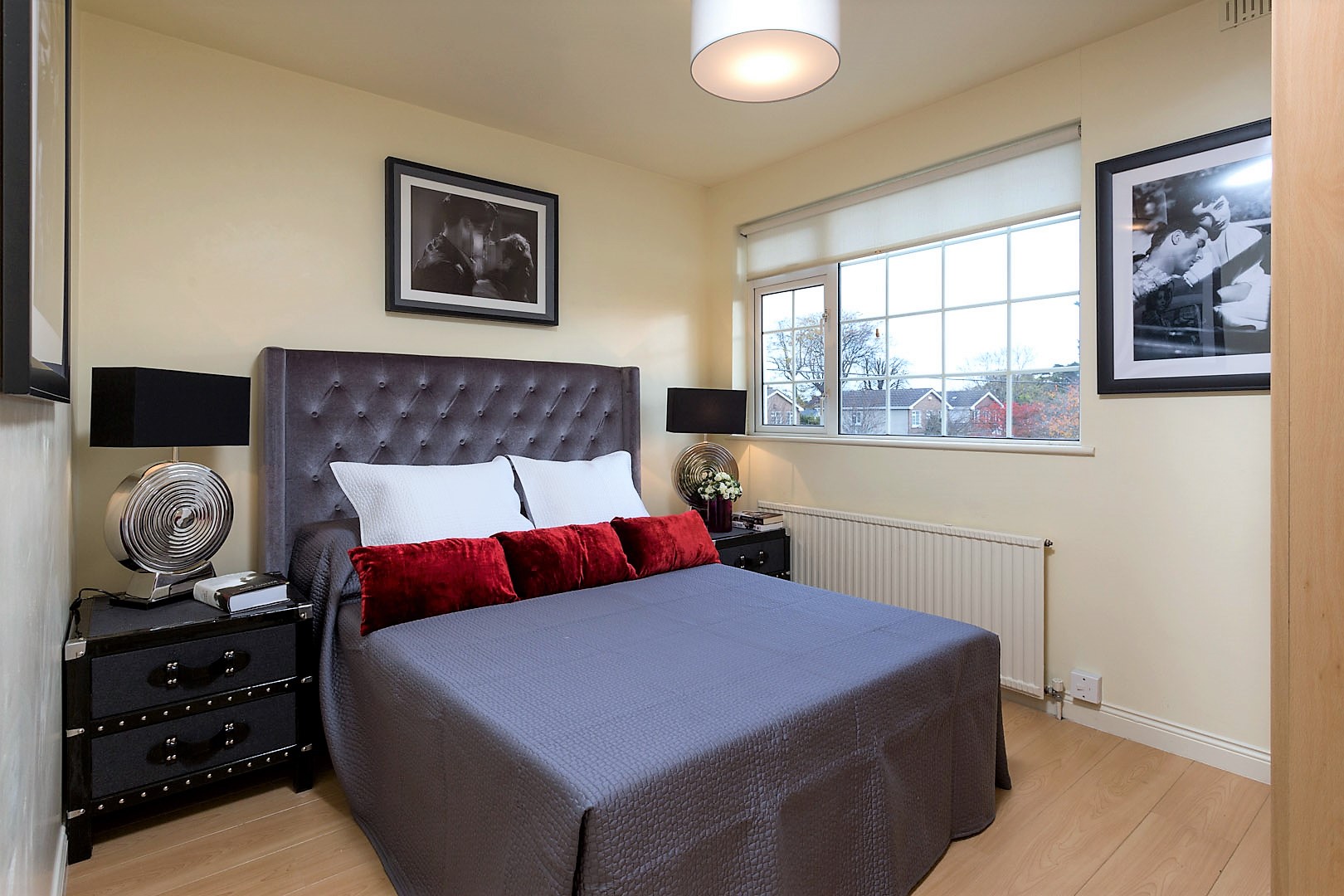 |
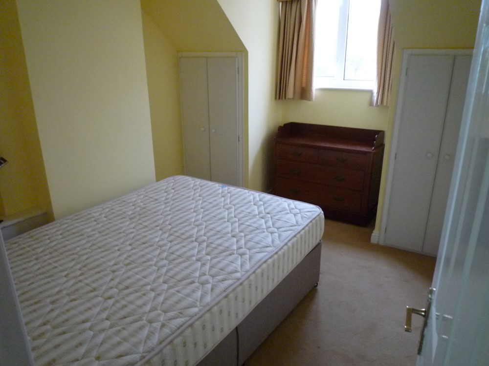
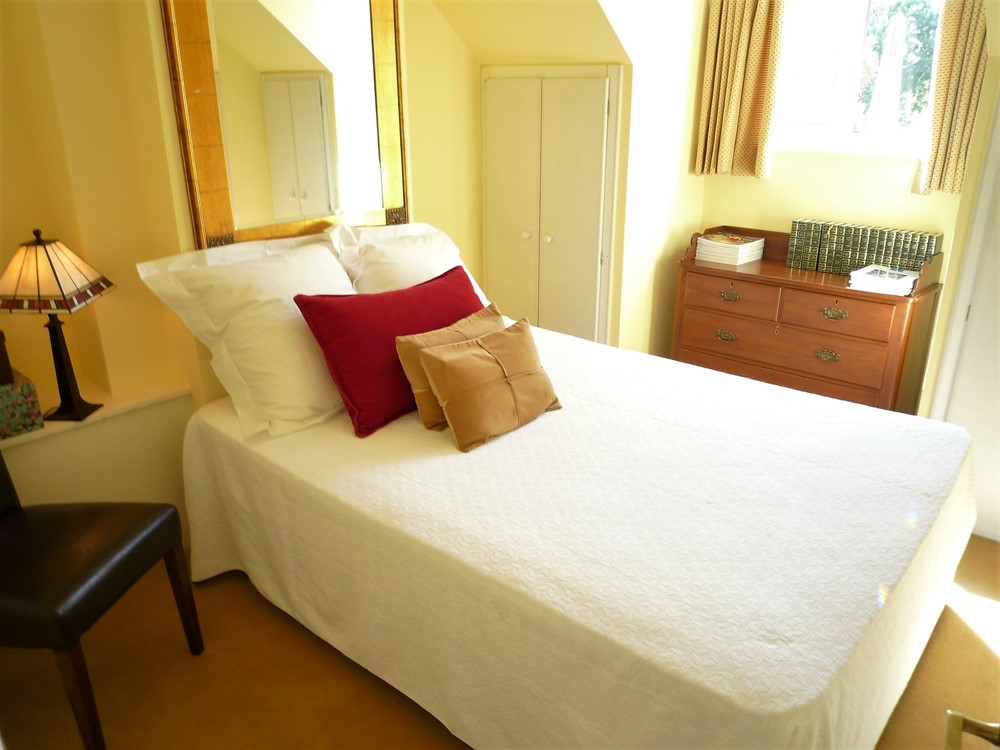
| First Picture - Before: I was anxious to demonstrate that this bedroom could accommodate a double bed and that the occupants could easily access the bed from both sides. This room previously had bunk beds which made it look crowded. Second Picture - After: I dressed this room to show that it be could be used for 2 adult guests. I felt that no curtains were better than badly fitting ready mades. | |
 |  |
| These two pictures show the benefits of brightening up dark woodwork and installing simple wooden flooring. | |
 |  |
| First Picture - Before: I'm allergic to concrete breeze block walls! I always have been. Second Picture - After: Rather than spend a fortune of fancy landscaping in front of hideous concrete walls, I had them plastered and painted. Second Picture: Instantly the garden was brightened up. We also painted the rear elevation and cut the grass. All breathtakingly expensive stuff? Actually, very far from expensive, but effective. | |
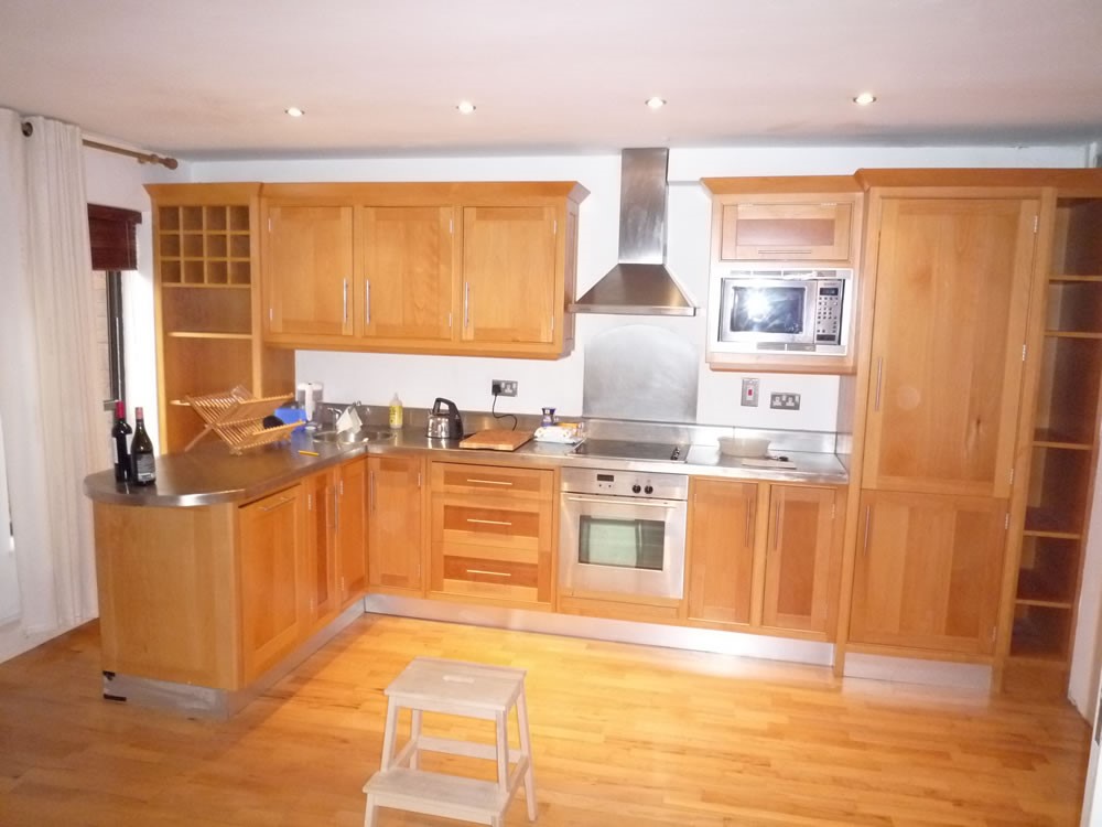 | 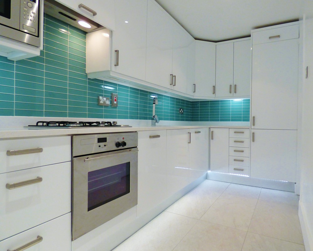 |
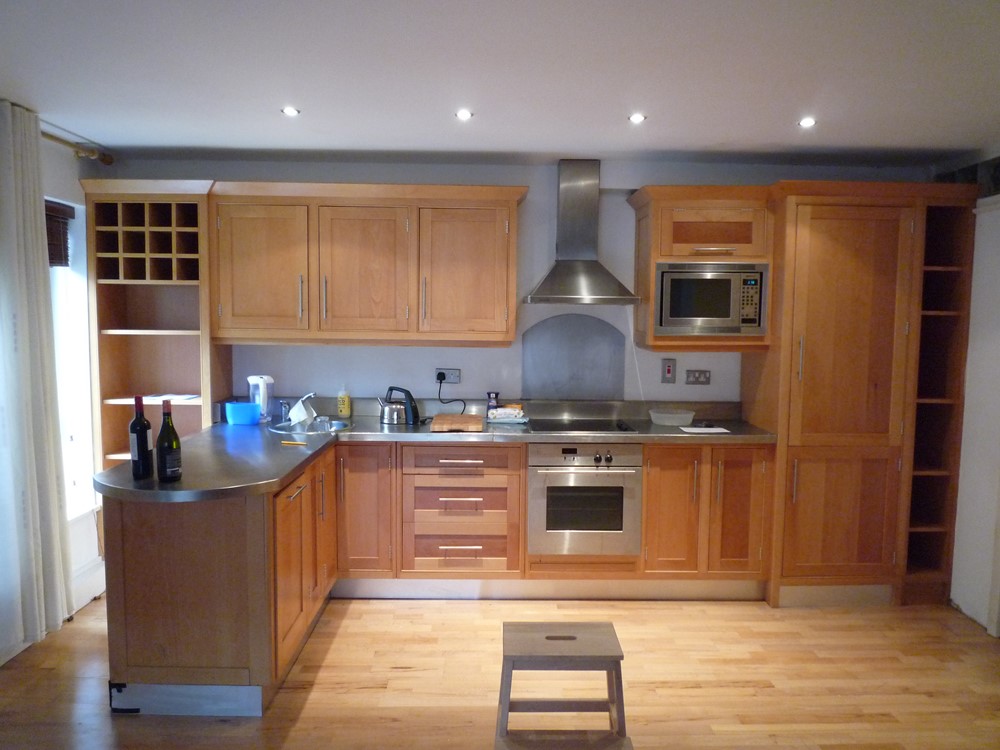
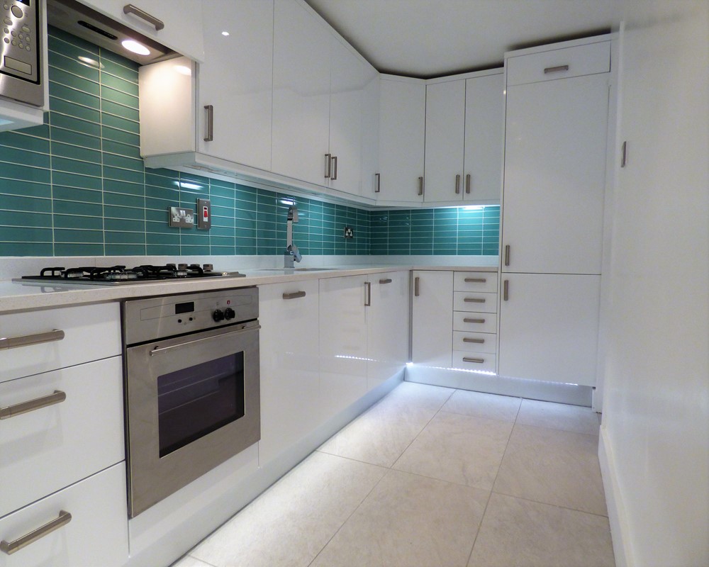
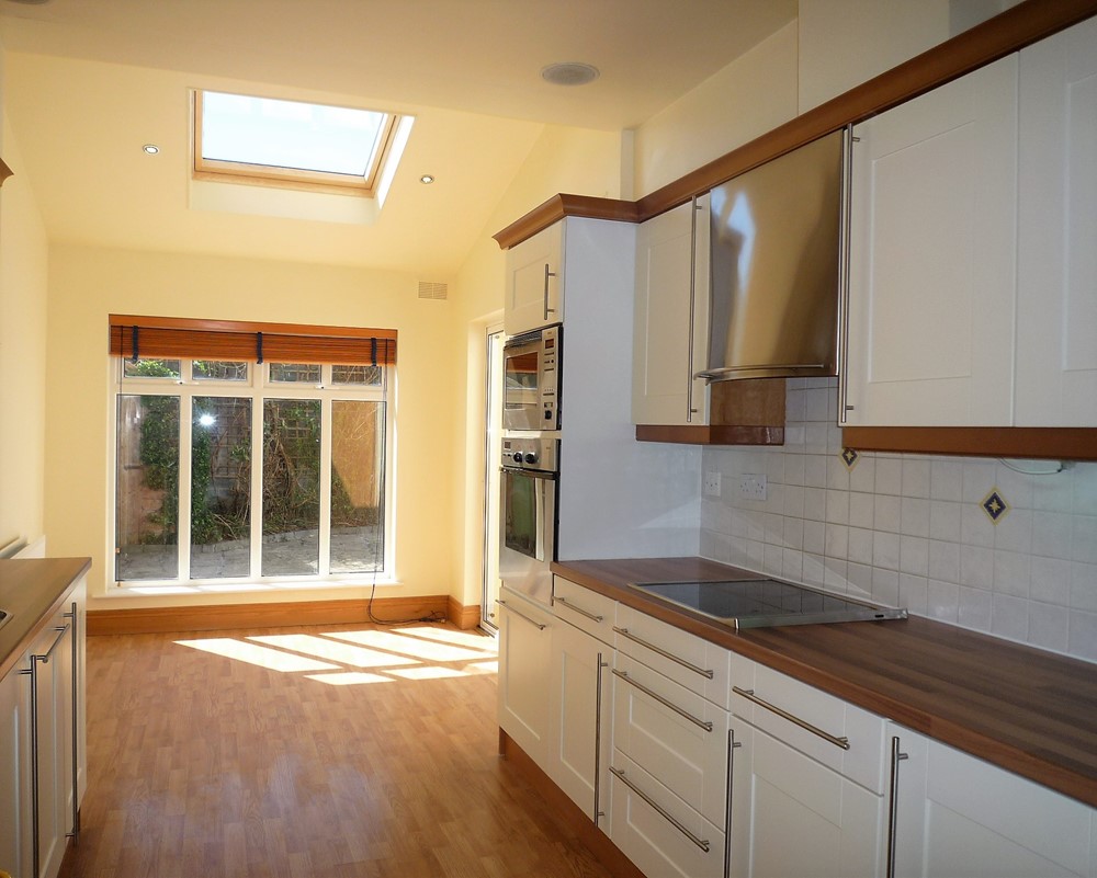
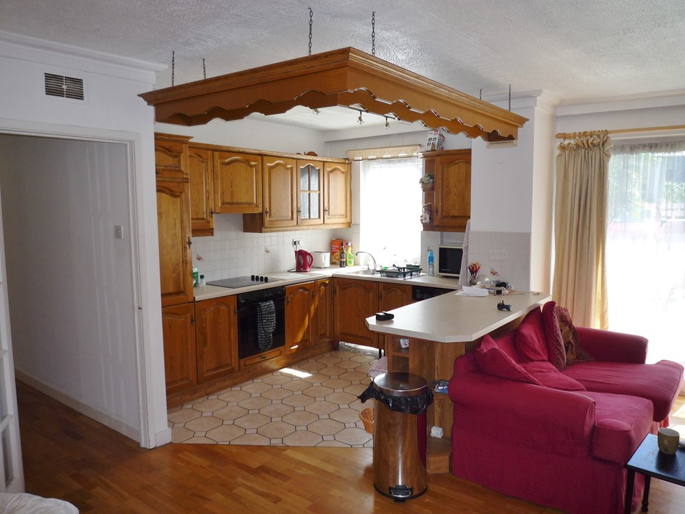
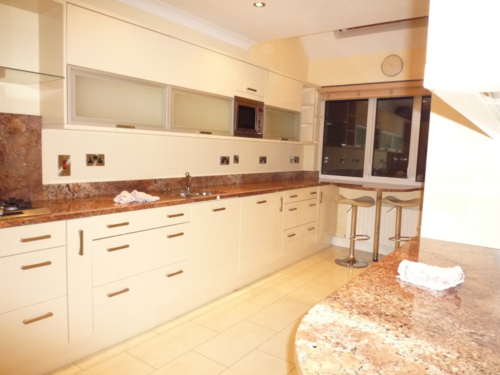
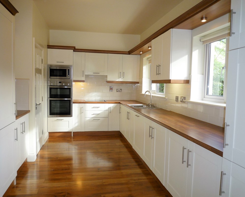
| First Picture - Before: High quality, custom made, kitchen but it was open plan to the rest of the living room. Second Picture - After: We created a new, streamlined, separate kitchen with integrated appliances and new lighting. We took advantage of an unused gas connection to change the electric hob to gas. We also installed an opaque glass sliding, pocket door to give access and we also installed a properly vented extractor hood. Brushed steel appliances, sockets and door handles. | |
 |  |
| First Picture - Before: We created a recessed dining area at the end nearest the window. Second Picture - After: We then closed in the kitchen with a new stud partition to screen it from the rest of the living room. This view shows more of the dividing partition (right) which has closed off this new kitchen area from the rest of the living room. Sadly, the dirty dishes are no longer visible from the main living room. Well, you can't have everything. | |
 | 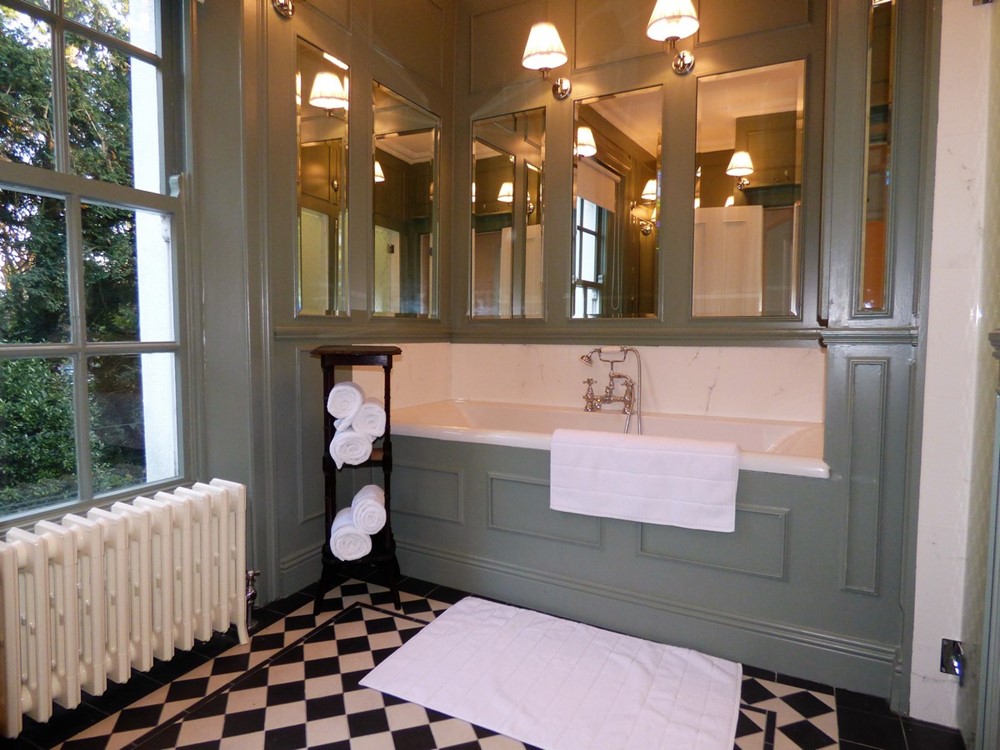 |
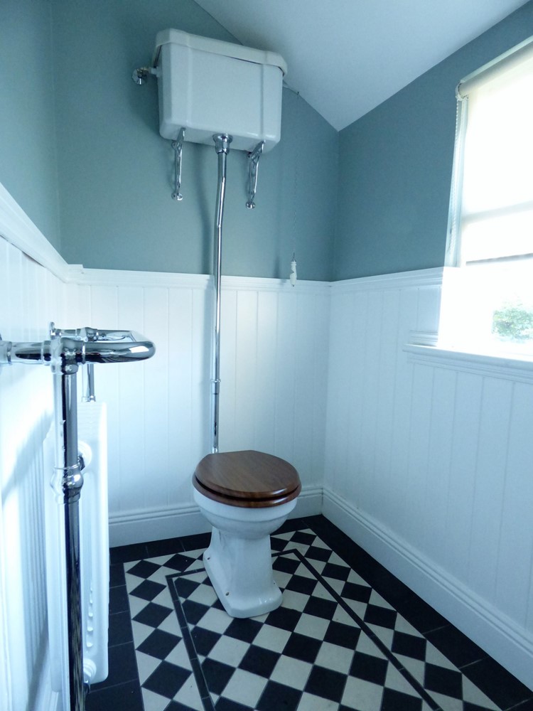
| First Picture - Before: Original bath tub in family bathroom. It was decided to revamp and upgrade this bathroom. Second Picture - After: I redesigned it in the Victorian style with wooden painted panelled walls with mirror panels and wall lights. Traditional black and white tiled floor. Heavy cast iron radiator. We separated the shower cubicle and the lavatory cubicle from the main bathroom and set them in behind etched glass doors. | |
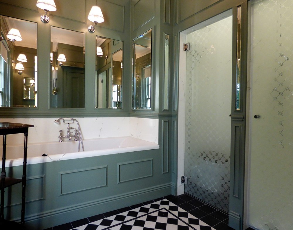 | 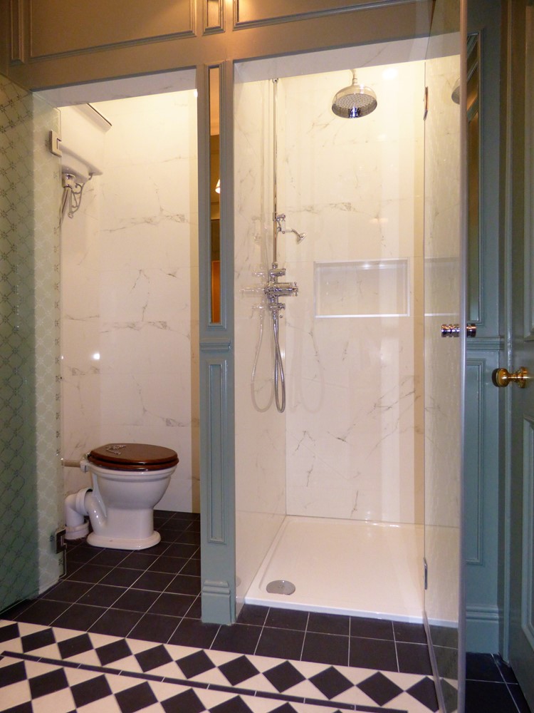 |
| First Picture - After: Here we see the separation of the lavatory (water closet) and the shower area from the main bathroom behind toughened, etched glass doors. The mirror at the end of the tub opens to reveal concealed shelves. Second Picture: Another view of the lavatory and shower cubicles with the doors opened. | |
 | 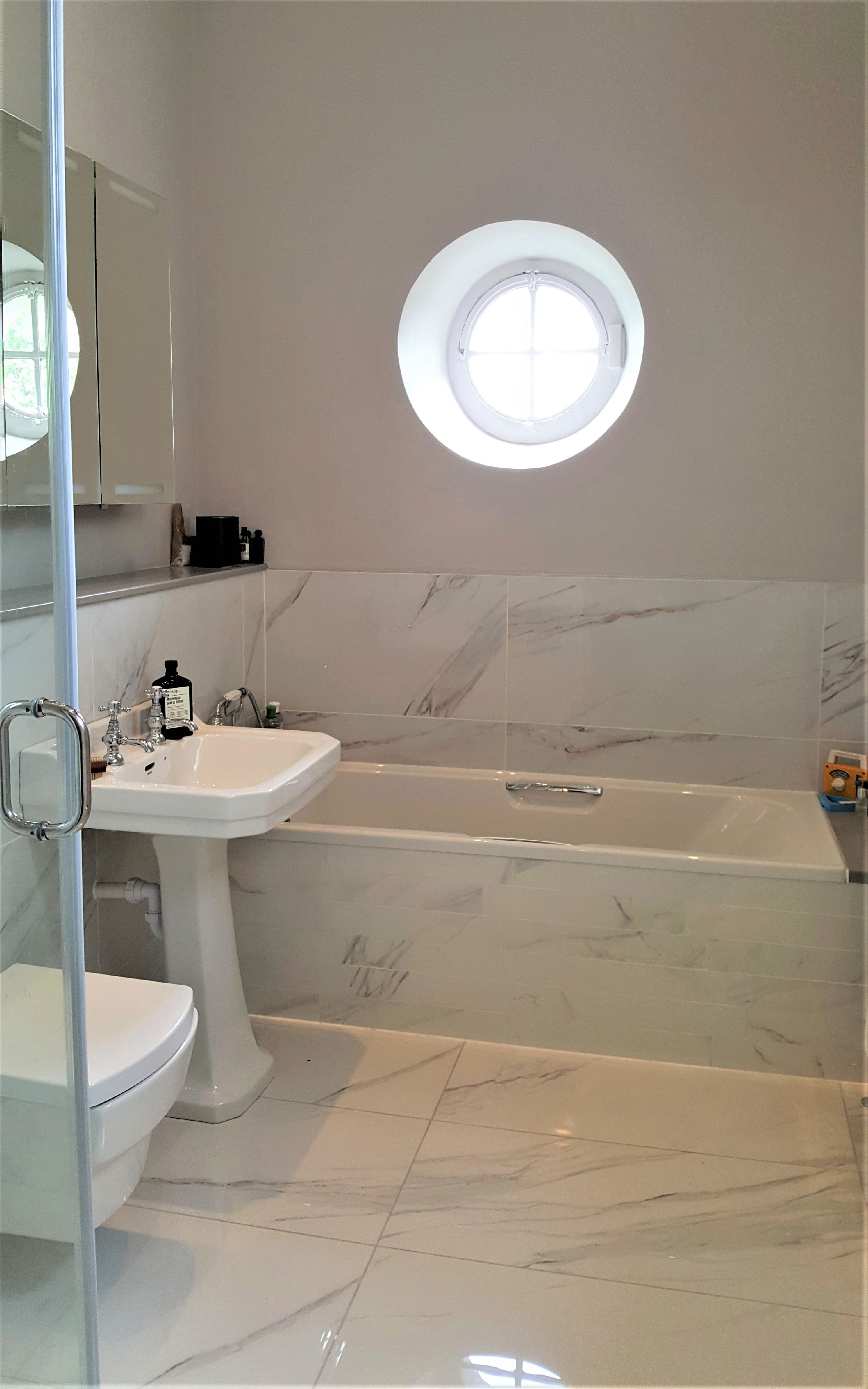 |
| I suggested that it might be better to raise the main family bathroom to an upper floor so as to be closer to the bedrooms. We took advantage of the very large first floor return landing. We kept the bathroom very simple but managed to install a separate shower cubicle as well as a full tub. | |
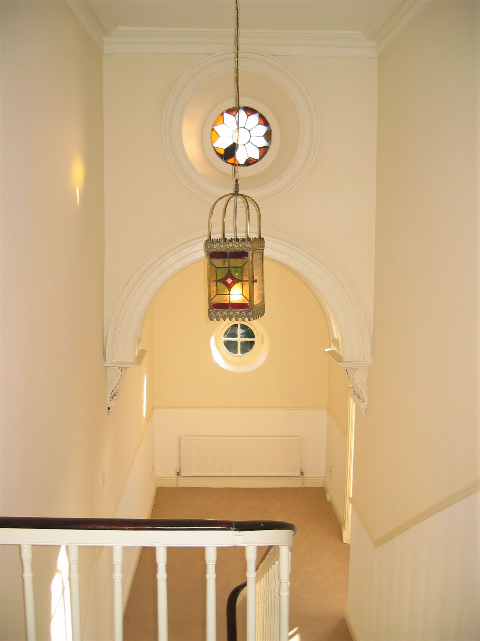 | 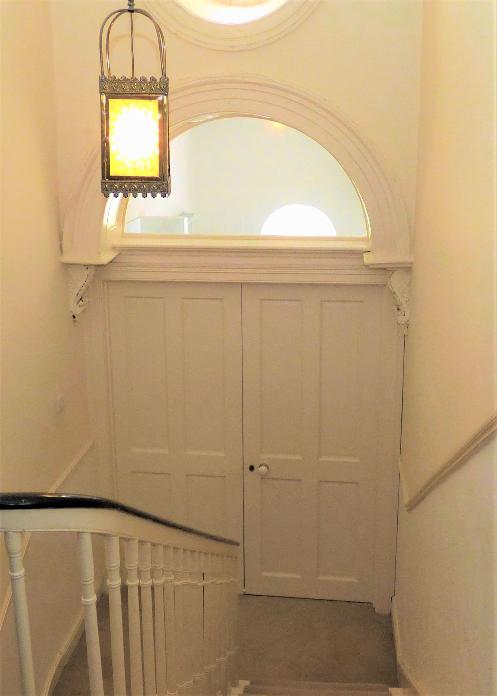 |
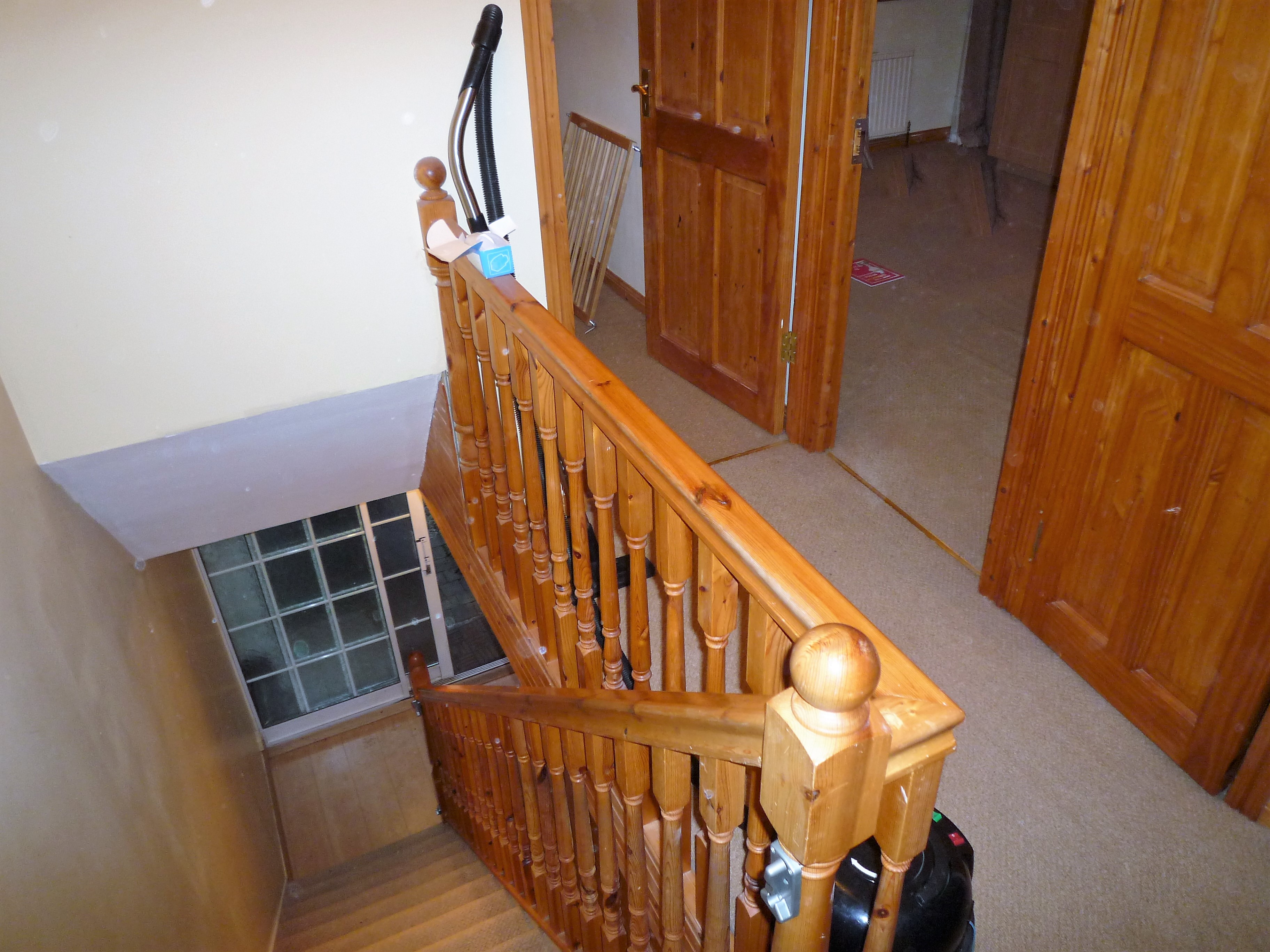
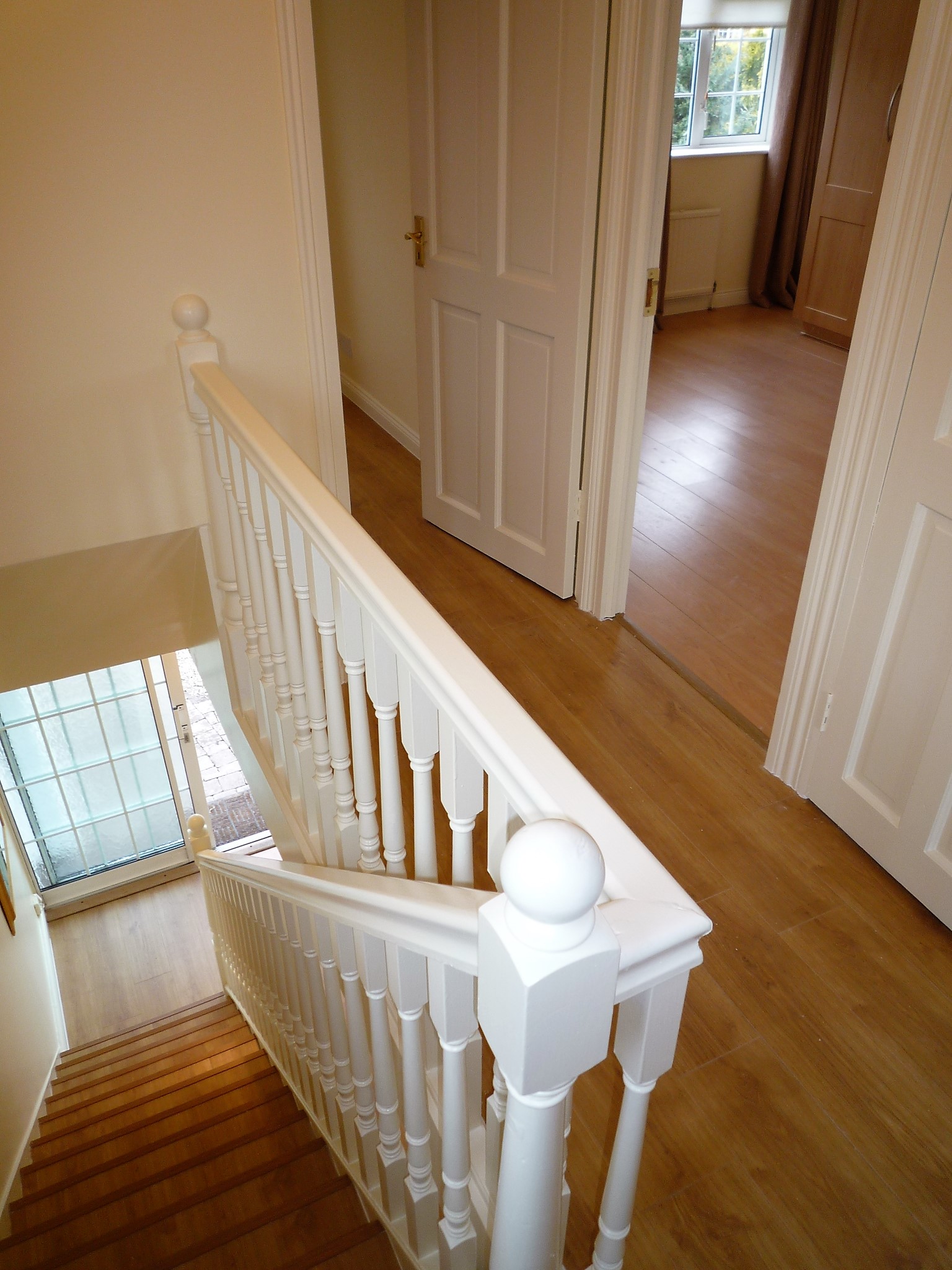
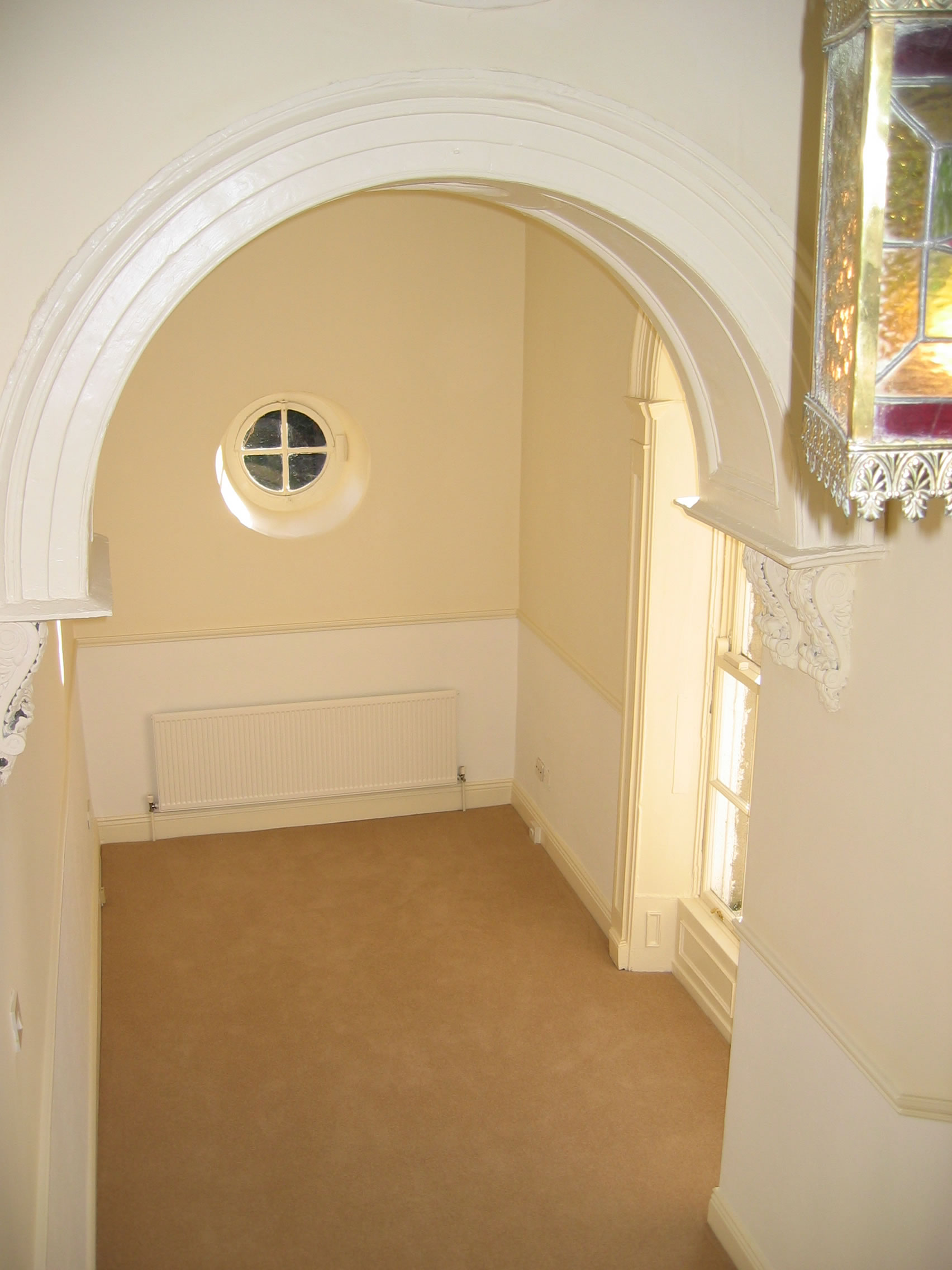
| It was imperative that the landing would retain an appearance in keeping with the age and charecter of the house. We retained the arch but glazed it to allow natural light to flood out onto the stairs. We installed a pair of doors rather than one off centre door. The second door is fixed closed and was built into the wall, but it makes the finished landing look more balanced. Nothing too complicated or expensive but very effective. | |
 |  |
| First Picture - Before: Original kitchen with full height window. Second Picture - After: Newly designed and reconfigured kitchen, closing in lower half of window. All appliances fully integrated. In case you might think the pictures are of different rooms; look at the original timer switch underneath the wall cupboards - in both photos. | |
 |  |
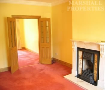
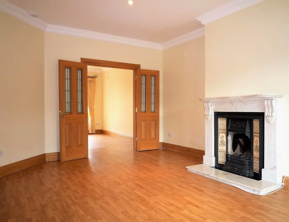
| First Picture - Before: Original stairs terminating in the living room. This meant that the entire first floor was, in essence, open plan from the living room. Second Picture - After: Redesigned hall with newly created doorway into living room, helping to create better soundproofing and all 'round privacy between the public / day areas of the house downstairs and the private / night areas of the house upstairs. | |
 | 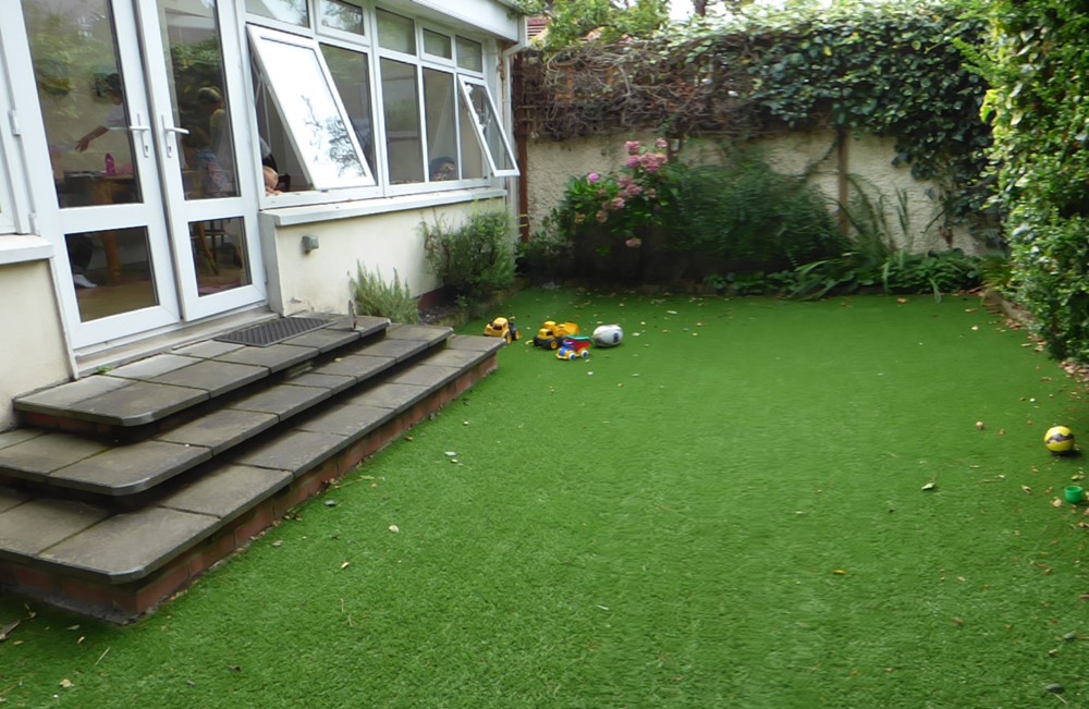 |
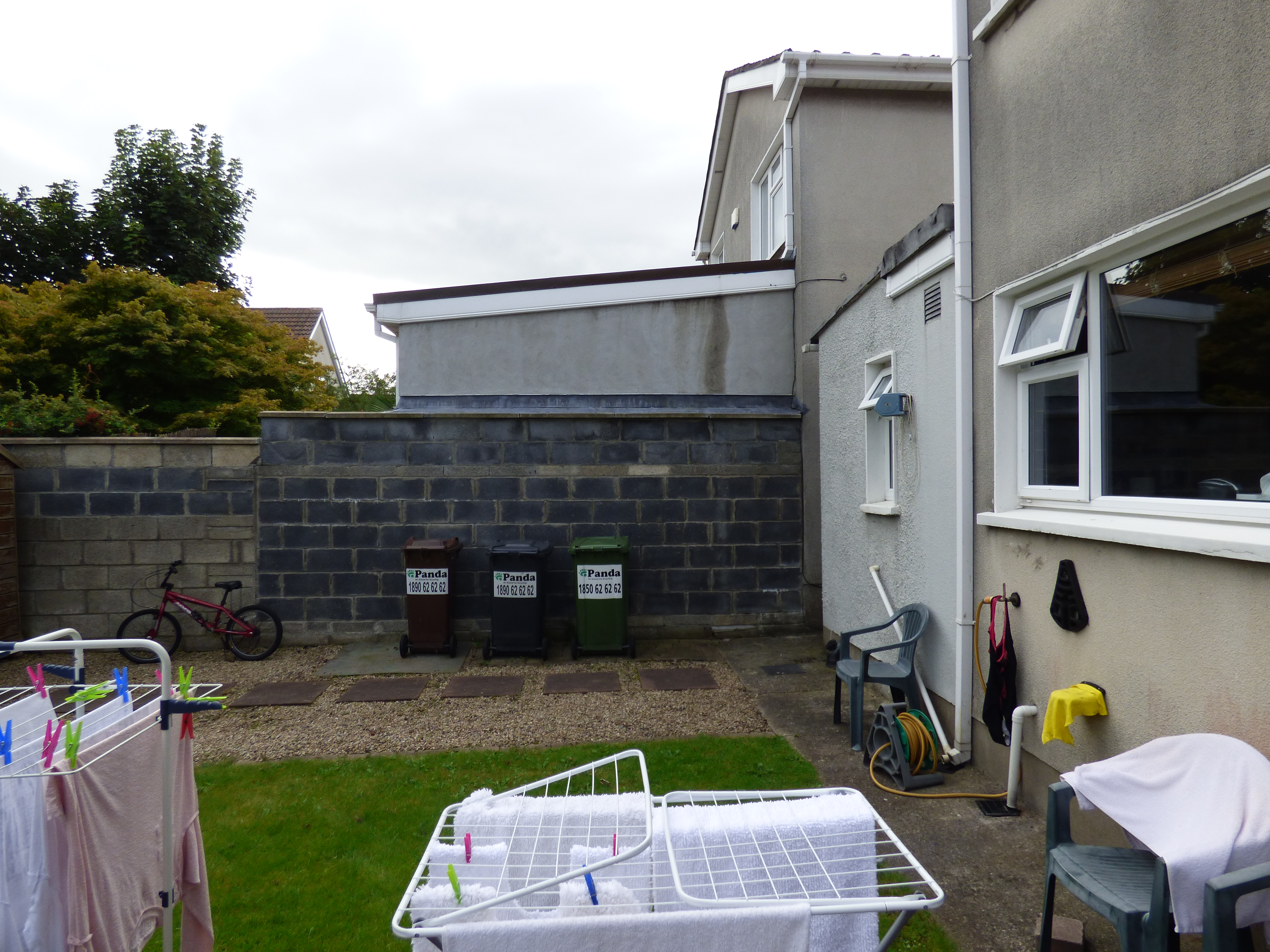
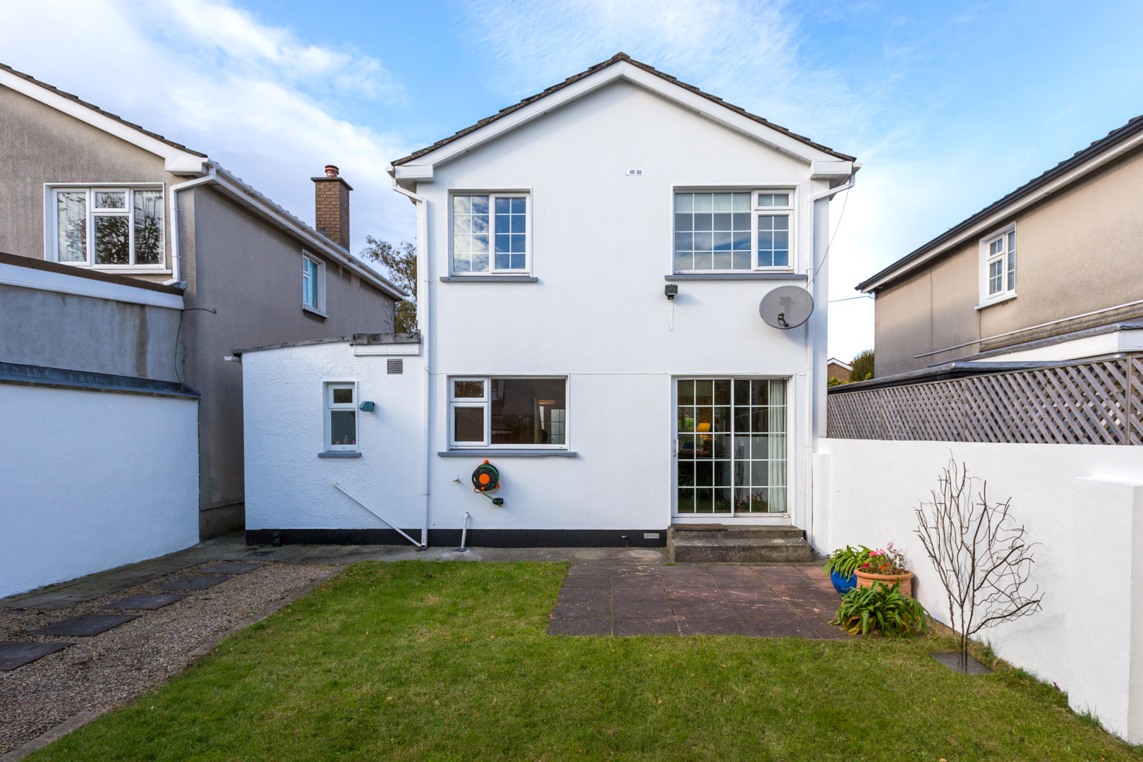
| First Picture - Before: Somewhat colourless / lifeless back garden. Second Picture - After: Low maintenance artificial grass for children to play on was installed. This instantly brought colour and life to the area. | |
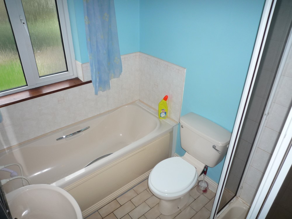 | 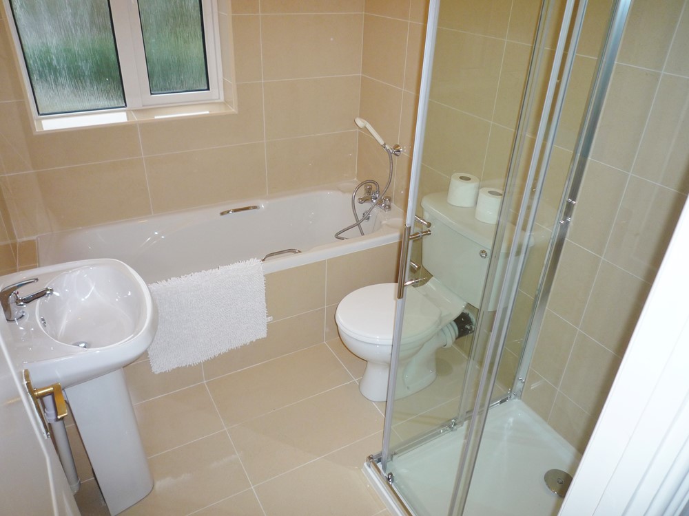 |
| First Picture - Before: Original bathroom installed in house when it was built in the late 1980's. Second Picture - After: Simple, neutral bathroom - all white with neutral tiles. Boring? Much smarter than the previous. | |
 | 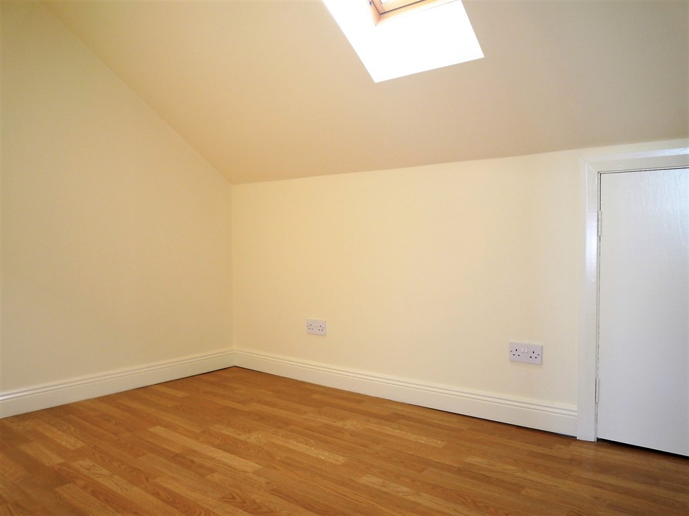 |
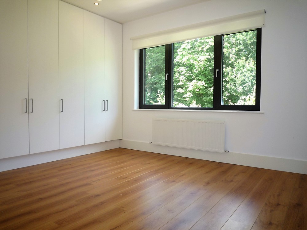
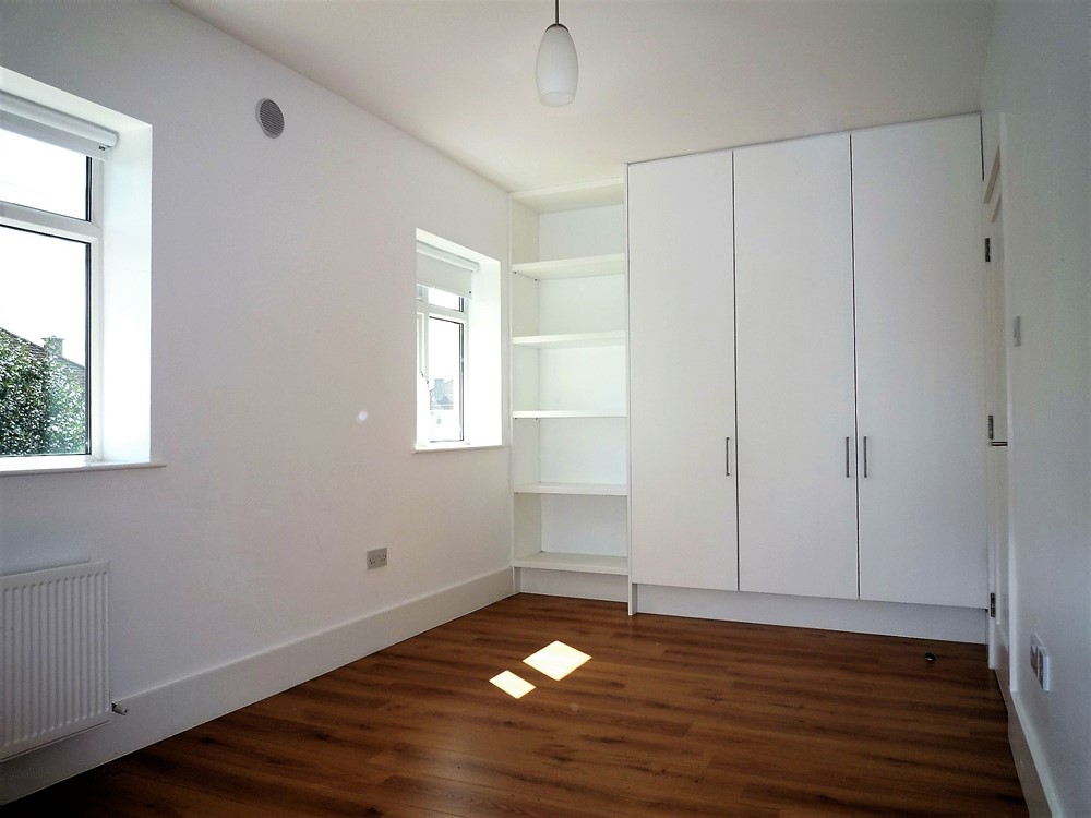
| First Picture - Before: Walk in wardrobe opening off landing. Second Picture - After: We removed the wardrobe fittings and broke through into some extra attic space to create a new, very usable extra room. We installed a Velux window and simple laminate flooring. We now have an extra bedroom with the same footprint (approx 9ft X 7 ft) as Bedroom 5 on the lower floor. We replaced the lost wardrobe space by inserting a wall of built in wardrobes across a wall in the master bedroom which had a clumsy chimney breast running up through it. This new room can now be used as a nursery, small bedroom, home office or for storage. Not a bad way (actually a very inexpensive way) to create an extra bedroom. | |
 |  |
| First Picture - Before: Plain room after tenants vacated. Second Picture - After: Dressed For Sale. | |
 |  |
| First Picture - Before: Plain room after tenants vacated. Second Picture - After: Dressed For Sale. | |
 |  |
| First Picture - before: Perfectly attractive, bright and spacious rooms. Second Picture - After: However, the fashion is for bare boards and neutral decor. Admittedly, it does appear warmer. | |
 |  |
| First Picture - Before: Darker kitchen due to colour of units and lack of natural light. Second Picture - After: Changed doors on units to lighter colour, installed a skylight and re-painted. | |
 |  |
| First Picture - Before: Rather vivid pink carpet with deep cream (almost yellow) walls. Second Picture - After: Installed simple, neutral light oak flooring and softened colour on walls. | |
 |  |
First Picture - Before: This was a heavy and somewhat clumsy open plan arrangement which was always untidy! Note the"lovely bin" - in the middle of the floor! Second Picture - After: Room is neater with closed off kitchen. Full door and an openable side panel can allow for open plan option. We removed the curtains and installed Venetian blinds. Kept everything as streamlined as possible. | |
 |  |
| First Picture - Before: Old carpeting in a cold colour. Yellow walls. Bulky double doors. Second Picture - After: Golden flooring creates warmth and with the doors removed the place is opened up. Softer cream walls. | |
 |  |
| First Picture - Before: Bright rooms that somehow appear dull. Second Picture - After: Here we see the bounce of light on the new wooden flooring. (Actually hardwearing laminate.) | |
 |  |
| First Picture - Before: Fine big kitchen but with very dark (almost coffin like) units and cold, tiled floor. Second Picture - After: Simple repaint job on units along with wood flooring to add warmth. | |
 |  |
| First Picture - Before: Unappealing "junk room" with little charm prior to be being dressed for selling campaign. Second Picture - After: With a few bright colours, this room has become an attractive child's room. Now dressed for sale. | |
 |  |
| First Picture - Before: Small double bedroom with an awkwardly placed bed right inside the door prior to being dressed for selling campaign. Second Picture - After: Repositioned double bed - easily accessed from both sides. A few accessories. Now dressed for sale. | |
 |  |
| First Picture - Before: A perfectly good kitchen - not dressed prior to selling campaign. Second Picture - After: Kitchen, cleaned and polished with some accessories. Now dressed for sale. | |
 |  |
| First Picture - Before: Plain room after tenants vacated, prior to being dressed for selling campaign. Second Picture - After: Now dressed for sale. | |
 |  |
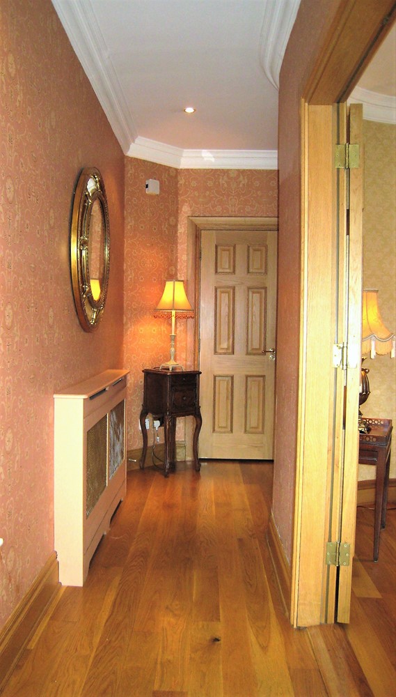
| First Picture - Before: Warm and cosy hall. Sadly, the cosy pink carpeting had to go and it was only 23 years old! Second Picture - After: We changed all the flooring to simple, warm toned, hard wearing laminate. We have found that the laminate on stairs is actually better than carpet because each tread is edged by a beading ( to close the edges of the laminate) and this raied edging gives extra grip. Actually much better grip than what is afforded by carpeting, especially on modern steeper stairs with shallow treads. | |
 |  |
| First Picture - Before: Dated carpeting. Second Picture - After: Brighter woodwork. Wood flooring - easier to maintain and cleaner for tenants. | |
 |  |
| First Picture - Before: A very spacious apartment with a separate dining room; a rarity nowadays. Second Picture - After: Simple refurb. Polished wood flooring to bounce light and simple light fittings to complete the look. | |
 |  |
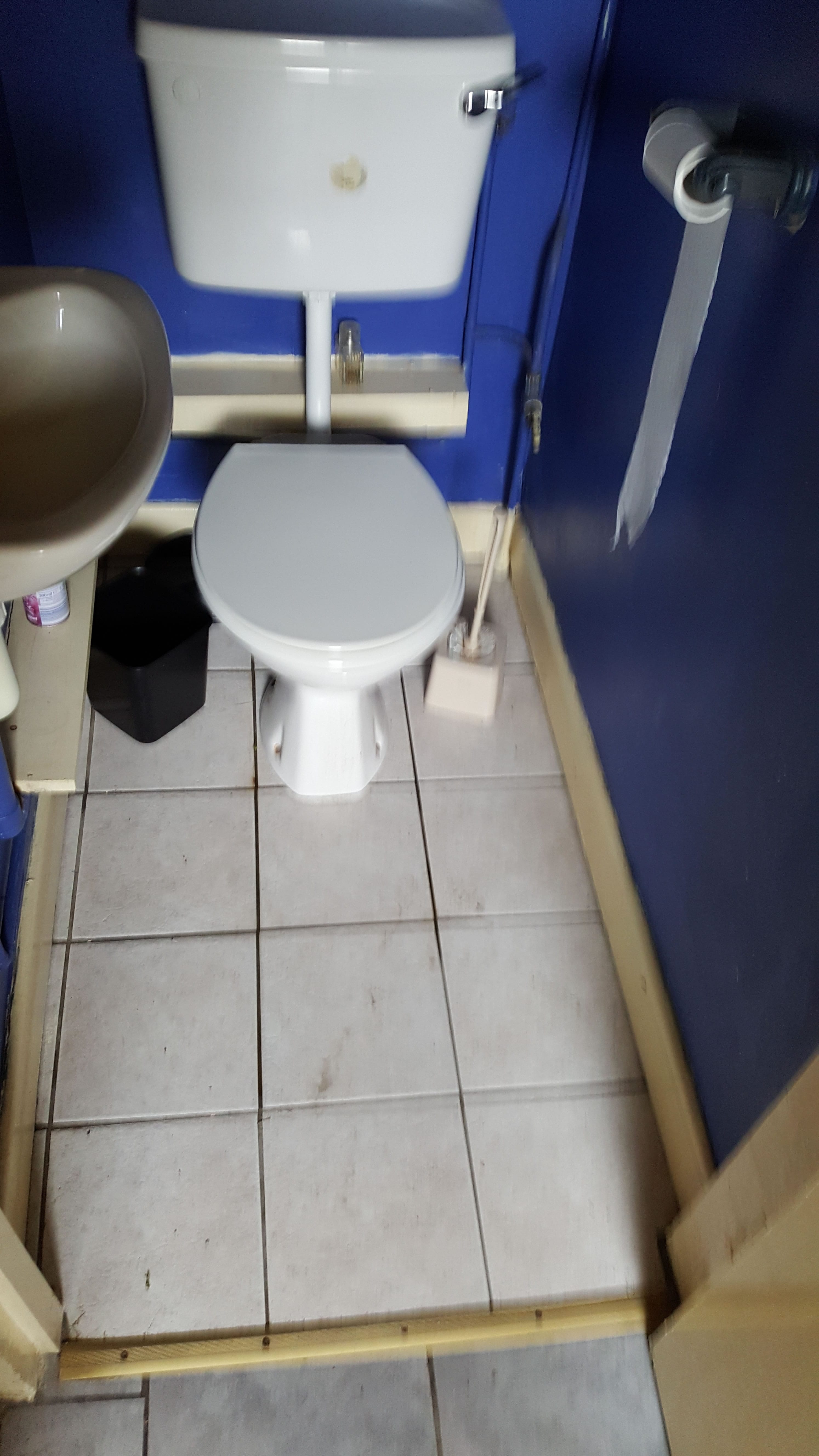
| First Picture - Before: 30 year old bathroom with lots of clumsy boxing-in of pipework. Second Picture - After: Simple, inexpensive refurb with more streamlined boxing-in of the pipes. (The communal pipework had originally been installed in a very clumsy way and at awkward angles and could not be interfered with - because it was communal. Hence the lavatory being set at a 45 degree angle in order to cover up some of the cumbersome pipework.) | |
 |  |
| First Picture - Before: 30 year old bathroom. It was a sad day, the day we had to say goodbye to the pale pink bathroom suite. We all had to be very brave about that. Second Picture - After: Inexpensive refurb into a streamlined and spacious shower room. | |
 |  |
| First Picture - Before: Large hall with cheap flooring. Second Picture - After: We created a new, very useful, separate laundry room by enlarging a built-in cupboard in the hall. We placed the door into this new laundry room at an angle so as not to cut off too much of the hall space. Large mirror on the right of picture helps create depth opposite entrance door. | |
 |  |
| First Picture - Before: Clumsy chimney stack going up through bedroom. Second Picture - After: We covered the chimney stack with built in wardrobes painted in same colour as walls. | |
 |  |
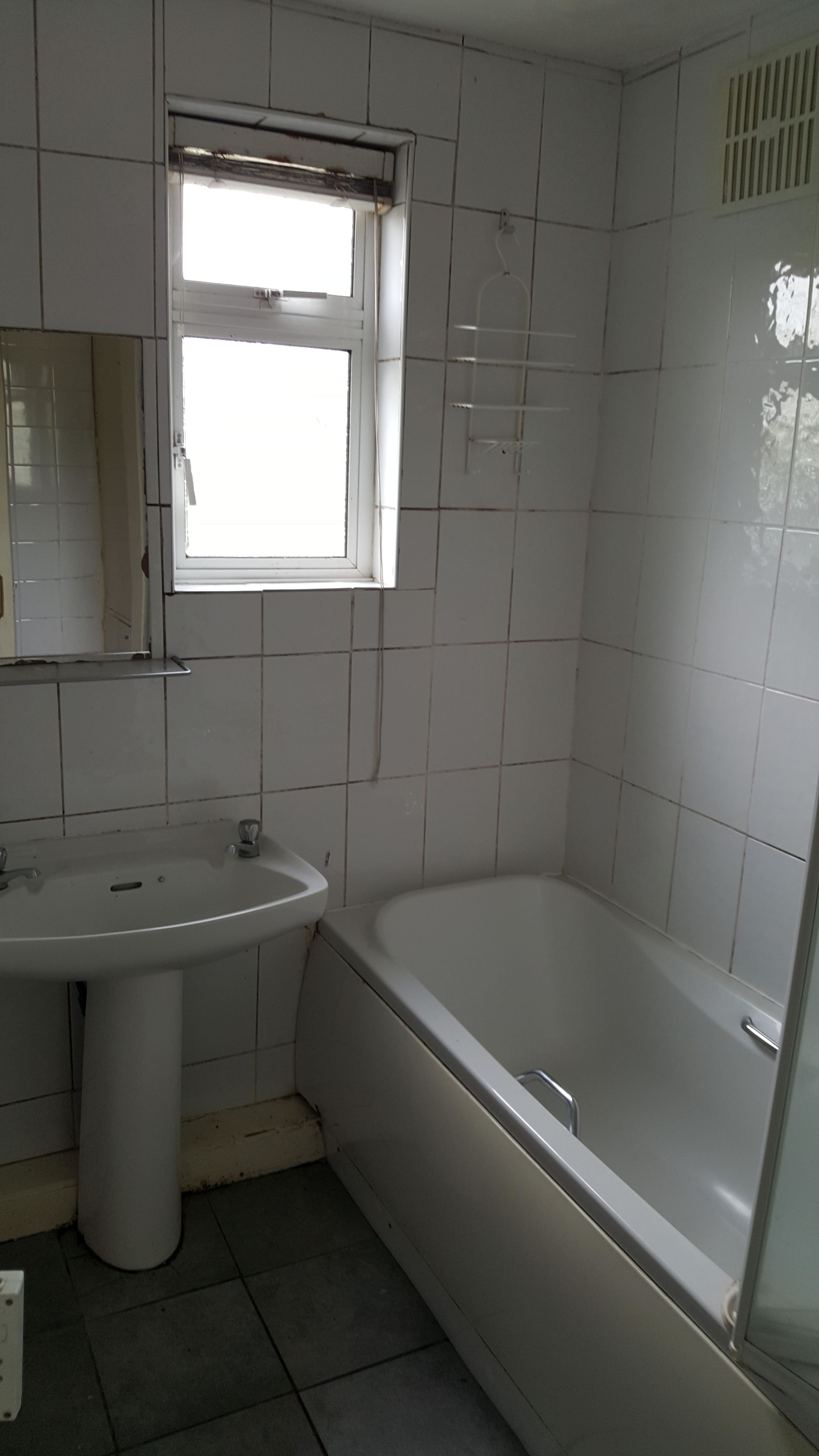
| First Picture - Before: Original builder's bathroom - separate hot & cold taps and flat wall mirror - half tiled walls. Second Picture - After: We built out this wall and installed new mirrored doors over concealed shelving. Total refit of bathroom. Fully tiled walls, wall hung lavatory and wall hung whb to create the impression of space. "Shower" bath tub and new built in shelving behind mirrored doors set into recess. Now wall runs flush. Bathroom door now opens outwards to create more space. New heated towel rail. | |
 |  |
| First Picture - Before: Original builder's ensuite with an access door into attic storage. Small shower cubicle. Second Picture - After: Total refit of en suite with larger shower cubicle, new wash hand basin and cabinet and we re-used the original lavatory. | |
 |  |
| First Picture - Before: Dark woodwork and fussy light fittings on a low ceiling. Appeared crowded. Second Picture - After: Simple cream, sheen, emulsion on walls and ceiling to bounce light and new better quality laminate flooring + simple ceiling lights. | |
 |  |
| First Picture - Before: Dark woodwork and dark carpeting - created a dark and smallish looking hall. Second Picture - After: New cream decor on all walls and matching cream on woodwork brightened this space along with better quality laminate on floor and stairs. | |
 | 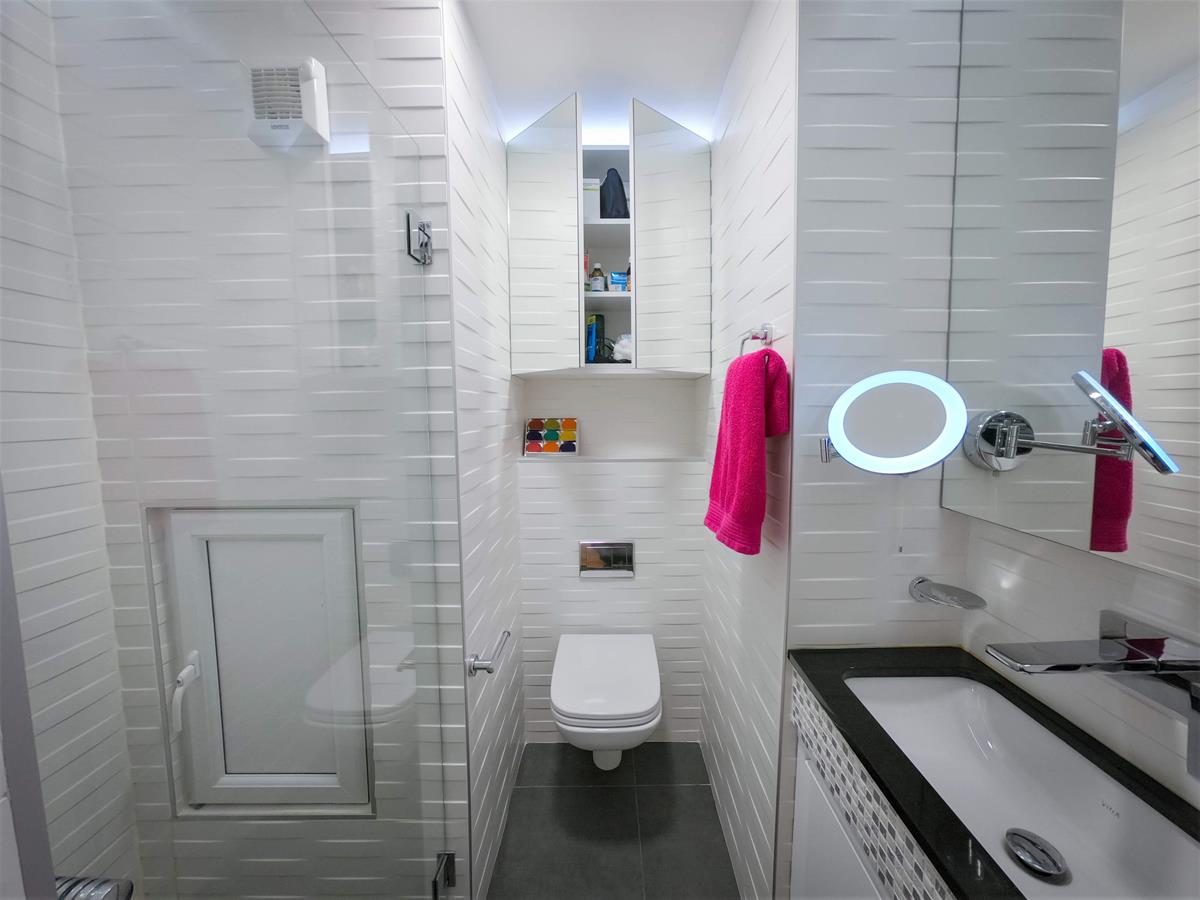 |
First Picture - Before: Very spacious bathroom. But we wanted to create 2 in its place and on the same footprint. Both new rooms have adequate space, due to clever design. Second Picture - After: Admittedly its hard to photograph in narrow spaces, but hopefully you'll get the idea. This shows the "Square" shower room - with ample space for its purpose. (Square lavatory, square flush plate, square whb, square tap, square shower heads and square patterned tiles.) This covers the footprint of the original bath tub + an airing cupboard which was to the left hand side of the this room. The shower cubicle was installed in the footprint of the former airing cupboard and is a very spacious 1200 X 800 (minimum). Wet room style floor. Masses of concealed storage behind mirrored surfaces. 2 pull out bins for clean towels and used towels underneath whb. (The ugly waterproof uPVC door was obligatory to provide access to the service shaft.) | |
 | 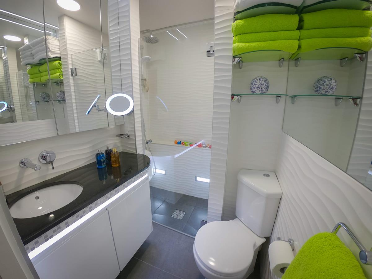 |
| First Picture - Before: This distorted image shows the other half of the original bathroom where the lavatory and bidet were located. Second Picture - After: This next picture shows the "Round" shower room. (Round whb, round edge to vanity unit, rounded lavatory, round shower head and curved patterned wall tiles.) The proper rounded heavy glass shelves which provide storage for folded towels etc above the lavatory were subsequently installed to replace the ugly thin, sharp edged square glass shelves seen in this picture. This new shower room covers the footprint of the second half of the original bathroom where the lavatory and bidet had been located. Again with a full size shower cubicle with a downpour shower head and a separate hand held shower (+ an instant electric shower in case the gas boiler should stop working). Shower screens were installed despite it being said that these weren't necessary. The corner lavatory sits into the corner where the toilet paper sits in "Before" picture. Concealed LED lighting, hair dryers, shaver sockets, magnifying illuminated mirrors, automated radios and 2 lighting options complete the facilities in each of the new shower rooms. | |
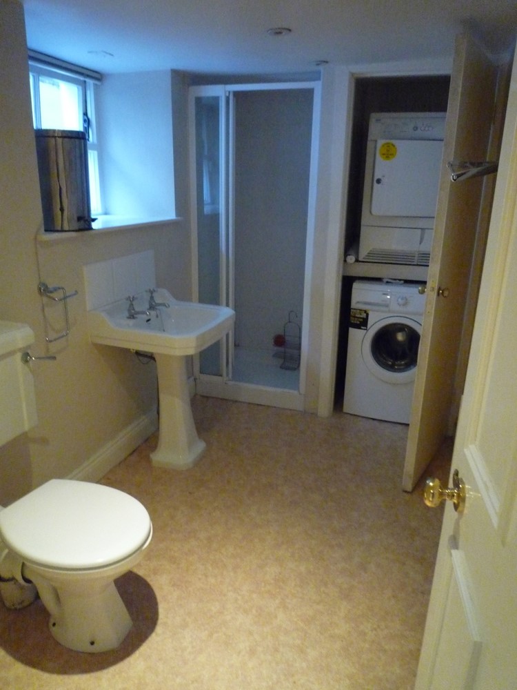 | 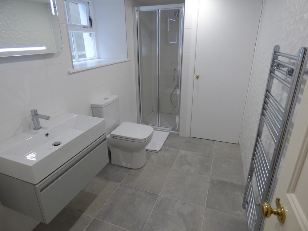 |
| First Picture - Before: Ugly basement bathroom. Second Picture - After: Relatively inexpensive refurb using the currently fashionable grey floor tiles (which I confess look no better than cement to my eye). New floating wash hand basin with illuminated mirror over. Lavatory pushed back from entrance door. Washer & dryer permanently wired via spurs in cupboard. | |
 |  |
| First Picture - Before: Original developer's shower room. We decided to increase the size of this room by borrowing space form the neighbouring bedroom to create a deeper shower area. Second Picture - After: We went for an ultra modern finish. Floor and walls in the same tile. Concealed storage in behind various sets of mirrored cabinet doors. Floating whb to create the appearance of space. All electrics - hair dryer, shaver's plug etc are inside the cabinet. Much tidier. | |
 |  |
| First Picture - Before: Very sad guest lavatory. Second Picture - After: Installed a larger Victorian whb with half panelled walls, black and white checkerboard flooring and a high level, pull chain cistern, in keeping with the overall look. Cast iron heated towel rail & radiator combined. Feature large circular "clock" mirror to cope with angled ceiling over new wash hand basin, now located opposite lavatory. Those of you with a keen eye for "detail" will notice the appalling flaw! But there came a point where I had to say; leave it and move on. What was even worse was the fact that this project was far from inexpensive; quite the reverse in fact! | |
 |  |
| First Picture - Before: Dark oak open plan kitchen. Second Picture - After: Simple cream paint job (+ some other minor refurb works) after kitchen was closed off from main living room. | |
 |  |
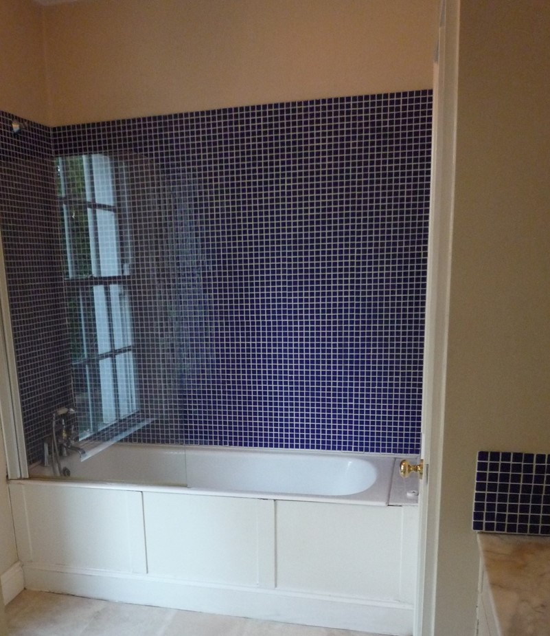
| First Picture - Before: Delightful avocado green bathroom! Very fashionable, once upon a time. Note how the end of the tub was squashed up into a recess beside the chimney breast coming up from floor below. That lovely shower curtain was an inspired touch! Given that shower screens can be purchased for as little as €100 - why would anyone put up with a sour smelling shower courtain? Second Picture - After: Tiny space, redesigned and completely refitted to create a fully functioning bathroom with fully tiled walls and non slip vinyl floor covering (warmer and softer underfoot than tiles). The shower screen used here is double length to avoid any possibility of splashes onto the floor and it swings in over the tub to allow more elbow space in the bathroom. If the tub is being used for a traditional bath, the screen swings out and sits flat against the wall over the toilet roll holder. That peculiar looking square box in the corner beside the tub is the laundry chute! This was a clever addition which saves a lot of labour by not have to carry bundles of laundry down a flight of stairs. The finished bathroom is not much more than the width of the tub + the width of a standard door. That's why every inch (okay, centimeter) was counted and then recounted - to make sure that the end result would work. | |
 |  |
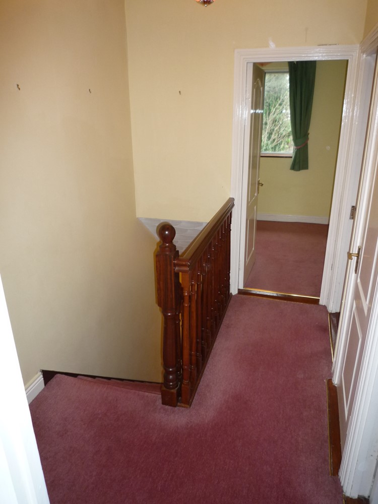
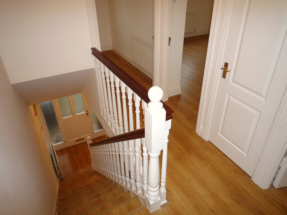
| First Picture - Before: Original small hall. The original design had the staircase terminate in the living room. Second Picture - After: The redesigned hall has now been extended back into the centre of house. The stairs now terminate in the hall. The increased size of hall, far from being a waste of space, actually creates the impression of more space and greater depth. The bedrooms and bathroom now have better separation and resultant privacy from the living areas. | |
 |  |
| First Picture - Before: Rather dull and gloomy basement hall. Second Picture - After: Simple streamlining of fittings and colour scheme with new warmer tone wood flooring. | |
 | 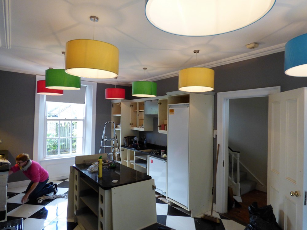 |
First Picture shows the completed job after we renovated a small kitchen in a flat. Here we see a perfectly functional and attractive little kitchen in a 1 bedroom flat. It has fully integrated (starting at the window) under sink waste bin, stack of drawers, slimline dishwasher, oven / grill with a deep saucepan drawer underneath, and a small fridge / freezer. (Remember the times when this size of fridge / freezer served an entire family?) On top of this we have the sink, a 4 ring hob and worktop space. Above this, we have a wall mounted microwave (great space saver) and the extractor hood over the hob. The mirror on the end wall helps create the appearance of extra depth. Simple vinyl floor covering (not tiling) on the floor. Tiles can be hard and noisy underfoot when laid on hollow wooden floors and are simply not as hygienic as smooth surfaced vinyl. Second Picture - During Works: Sometimes it's as well to leave well enough alone! This second picture shows where I had the "bright idea" of introducing some colour into what was otherwise going to be a monochromatic kitchen. Our efforts with the multi-coloured lamp shades made the place look as though the circus had just hit town! We quickly reverted to the original ceiling halogen spot lights. We subsequently inserted some Murano glass multi-coloured "Tutti Frutti" tiles in the splash back areas to bring in some colour - but not too much! | |
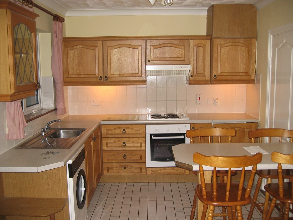 |  |
| First Picture - Before: 20 year old kitchen - due for an overhaul Second Picture - After: Refurbished with brighter units and warmer wood flooring throughout. | |
 |  |
| First Picture - Before: Here we see the original old kitchen with the shower room opening directly off it (in the pink area). Second Picture - After: We basically gutted everything and knocked the two areas into one. We installed cream units with butcher block patterned work tops. This choice of colours created more warmth in this room, than might have been the case with white units. We had the luxury of being able to section off a separate area (not seen in this picture) for the laundry facilities which helps to keep the kitchen tidier. | |
 |  |
First Picture - Before: Very, very old photo taken from a video film. This shows the corner of the largest upstairs bedroom which had a large built in wardrobe. Second Picture - After: We ripped out the wardrobe and sectioned off a small area of the bedroom to create this new bathroom. Not a very expensive project but it meant having a bathroom upstairs rather than having to rely on a downstairs bathroom. | |
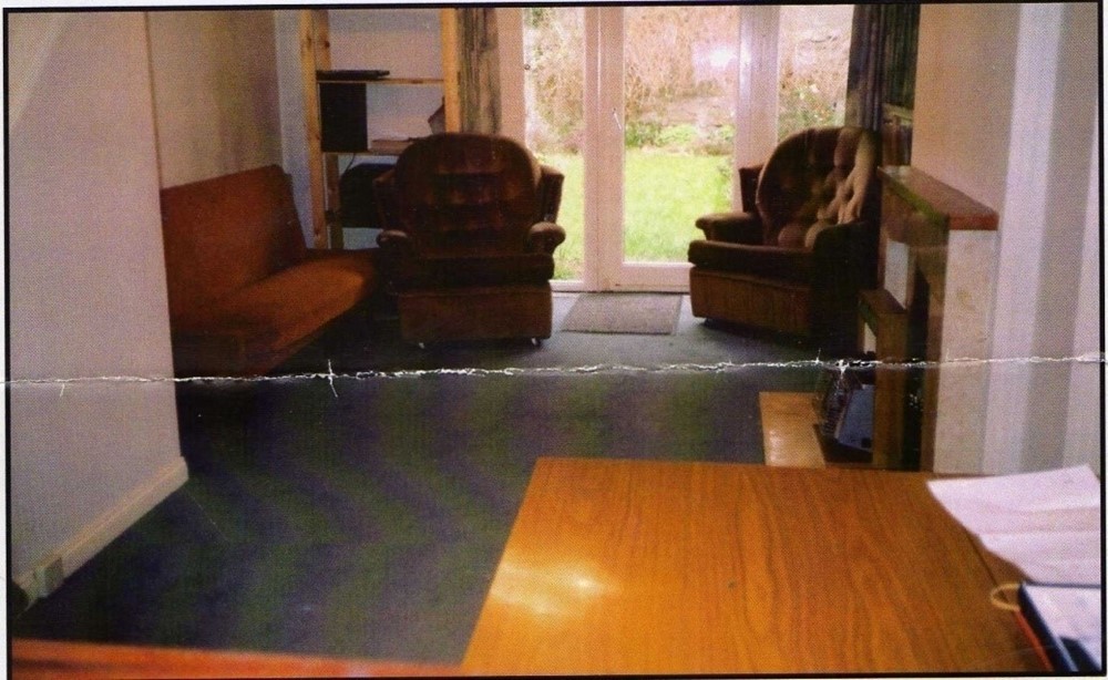 | 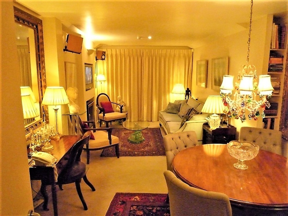 |
| First Picture - Before: The above is the picture taken from the auctioneer's brochure. It shows a somewhat smaller living room with a large chimney breast on the right and to the left you can see where the staircase took another chunk out of this, already, very narrow room. Second Picture - After: We pushed the living room out into the garden in a new extension. I was anxious not to have a lintol showing below the level of the finished ceiling - as this would highlight where the original part of the house finished (and the new part started). We would have had half the room "inside the house" and the other half of the room "outside - in the new extension". I didn't want that. I disguised where the extension area started by installing some shelves for books. Again, I did not want the obligatory Velux roof lights, nor did I want to extend the ceiling in the extension area up to the apex of the new pitched roof. Yes, it might have created a feeling of space with more light but the end result would have looked like 2 very small areas squashed together. At least now there is one reasonably sized room with a clearly defined seating area, dining area and a desk area. Oh, my God, all that colour! Take a closer look. 2 traditional rugs, a Murano glass chandelier and 2 red cushions. Remove these and what have you got? A plain and boring neutral box. Change the rugs and add a few more coloured cushions to dress it up or remove these to tone it down. Easy enough to do when you have a good neutral base. | |
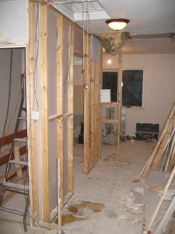 |  |
| First Picture - During works: This is the part of the job that I like. Everything gutted, where we can start from scratch - but only after we have measured and measured again and then measured again - to be sure that what we want to fit in, will actually fit in. We demolished one small bathroom and created 2 new bathrooms! We borrowed space from where the foot print of the hot press, a built in wardrobe and chimney stack had been. With clever design and a few doors opening outwards, we managed fine. Seond Picture - After: This after picture doesn't really convey that much - other than the fact that we finished the job. We borrowed some vacant air space from over the stairs and inserted a huge and very valuable cupboard, but with no projecting handles. As you can see, we didn't have the space for projecting handles because the bedroom door would not open out if we had. Nows, that's what I call a tight space. Yes, one where every inch counted. | |
 |  |
| First & Second Picture - Shows completed en suite. This must be the smallest en suite I ever encountered. Originally it had a chipboard wardrobe door to close it off from the bedroom. This wardrobe door matched the other wardrobe doors, so no doubt the builder thought he was doing a great job. But this wardrobe door didn't even extend to the floor. I removed that stupid piece of Melamine coated chipboard and installed a solid door with no architrave but with a skirting board and painted it the same colour as the rest of the wall which made it invisible in what was already a tiny bedroom. You may notice the panel of mirror. I ran this around the entire bathroom in an attempt to push the wall back and it worked. I tiled the walls and floor the same to open up the area. I removed the original "delightful" fitted carpeting from this en suite and also removed the original bulky lavatory pan and the huge boxed-in area which ran along the floor and contained nothing more than a 2 inch whb waste pipe. You can see the boxing-in reduced to just the width of 2 small tiles. This created extra foot room which allows the bathroom occupant to move more freely without always kicking such a clumsy arrangement. Normally we would endeavour to sink the pipes into the wall or the floor but such options are limited in apartment buildings. I also cut into the hollow 4 inch stud partition and recessed the cistern - just a few inches. Hardly worth the trouble? Believe me, those few inches made a world of difference. The space-saver corner lavatory is also a superb option for small areas. I managed to install a full size corner whb in place of the former silly cloakroom style of basin that was previously in situ. The shower cubicle was a massive 700 X 700 (he said sarcastically). This could not be enlarged. However, I moved the shower fixtures up higher on the wall so as to avoid banging into them and I installed a bi-fold door which took up little or no space when opened. This redesign wasn't about expensive fittings. It was about getting the most out of a tight space. | |
 |  |
First Picture - Completed job: Here we see a 15 year old builder's kitchen where the white doors were decidedly dullish white - almost grey in fact. I was not going to rip out everything. So I decided to paint the walls and ceiling a vivid colour and as a result the kitchen looked whiter. (This was before we could have kitchens re-sprayed at a relatively low cost.) I also extended the wood flooring into the kitchen to create a bit more warmth. I also got 2 full ovens in under the worktop. Second Picture - Completed job: Another very inexpensive and simple kitchen. The floor tiles cost about €20 per square meter. Admittedly grey is not the warmest of colours but they look tidier than curled up linoleum! The kitchen units were bargain basement. But as you see, I installed a washing machine, a separate tumble dryer and a dishwasher along with a full cooker with 2 ovens and a full fridge / freezer. This is more than many tenants can expect to find - even in expensive apartments. I also vented the cooker hood out through the wall. | |
 |  |
| First Picture - Before: Dated kitchen. Second Picture - After: Refurbished kitchen showing integrate appliances and warmer wood (laminate) flooring. If you are going to refit a kitchen you might as well integrate the bin. Who wants to look at an ugly bin, slap bang in the middle of your nice new kitchen? | |
 |  |
First & Second Picture - Showing After shots: This house was completely renovated by the owners based on my advice. The owners were slow to accept my advice. You really mean we should not put up any curtains and no carpeting - anywhere? That's right! They took my advice and the architect who oversaw the works lived in it for a year after it was completed. Everything painted white. The same laminate flooring everywhere - except in the bathrooms and kitchen where we have tiled floors. | |
 |  |
| Here we see a rather tired hallway in what was a neglected rental property. Next we see it repainted with new carpeting and some artwork. | |
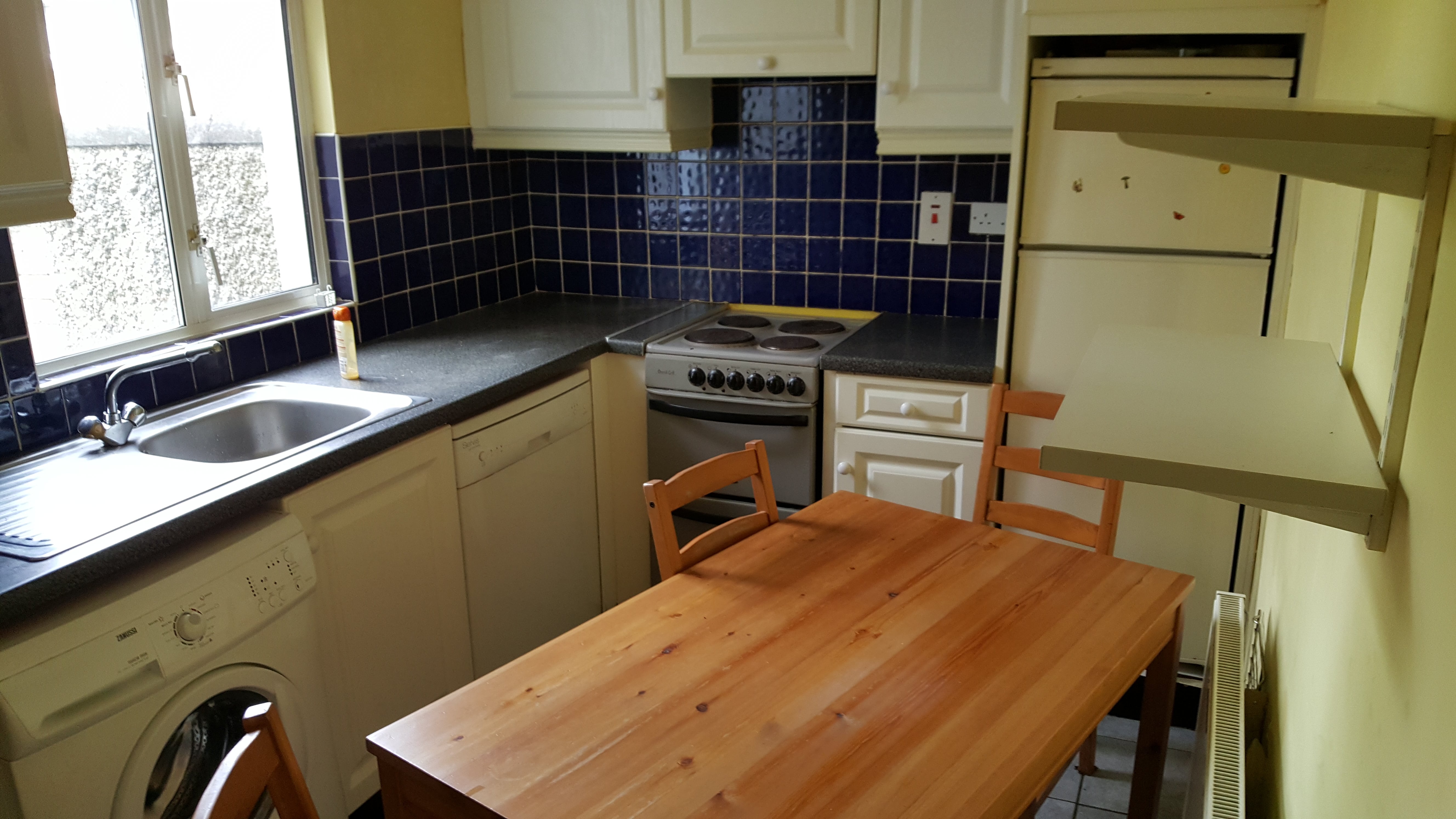 |  |
| Here we see what was a very rundown kitchen in a former rental property, measuring less than 8 feet wide. We gutted it and streamlined everyting into a fully integrated kitchen with daylight LED ceiling lights and strip lighting over the worktops. Within the kitchen we have an integrated fridge freezer, double oven, gas hob, extractor fan (vented out through an exterior wall) wall mounted microwave (a great space saver) integrated pull out bin (who wants to look a bin full of rubbish in the corner of a kitchen?) integrated dishwasher and integrated washer / dryer. The units are actually high gloss cream (good to bounce light). However, the photo shows the units still covered in their plastic protective wrap. A warm, sunny orange on the walls brought more warmth to the room, paired with a darker worktop for some depth. | |
 | 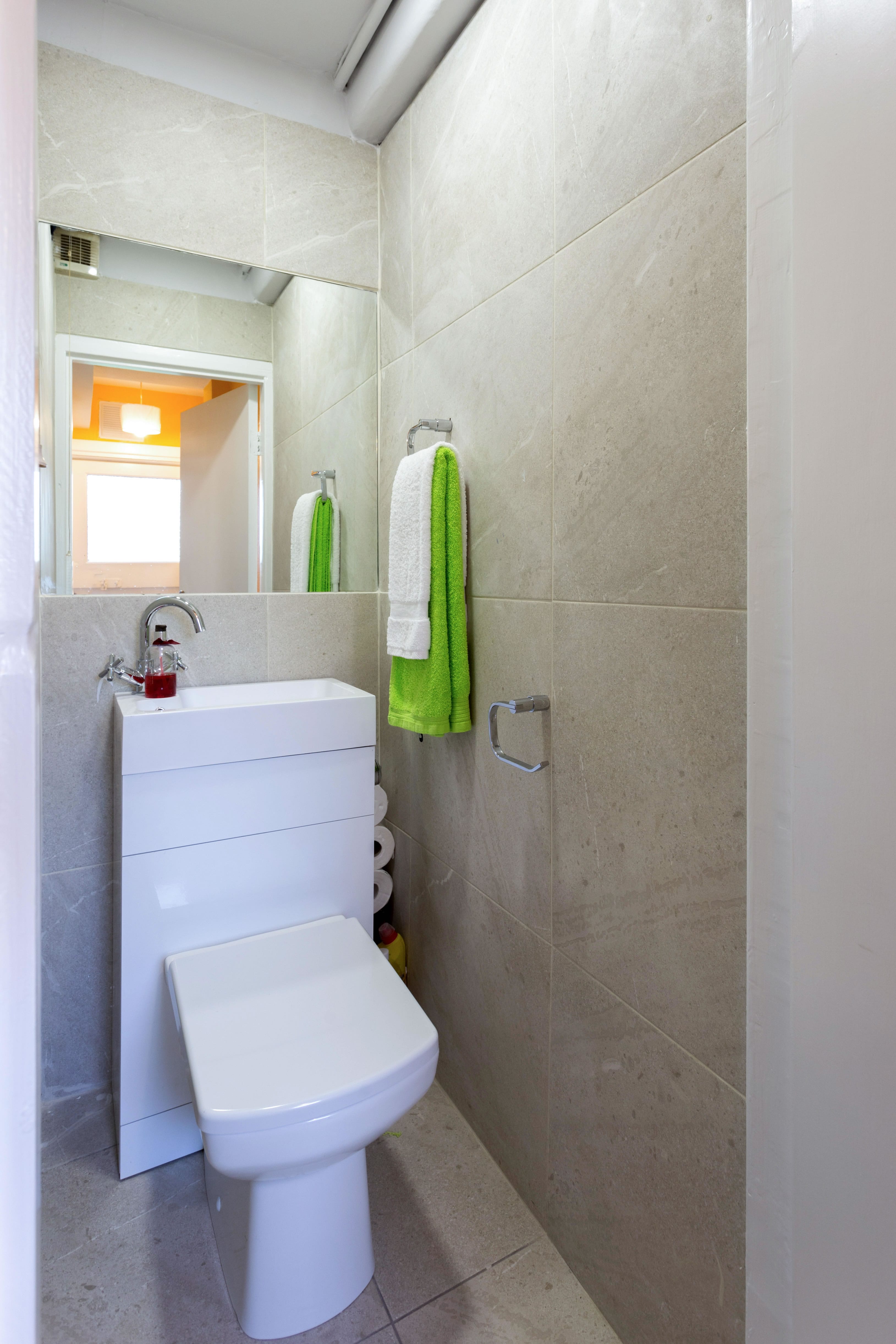 |
A delightful guest lavatory! For some strange reason this was regarded as "not the best". So, with great reluctance we decided to revamp it. All that charecter lost forever! Simple neutral tiling on the walls and floor with a wall mirror which helped create a sense of depth and a very unusual combined wash hand basin and lavatory - great space saver. A bright LED ceiling light also helped brighten and improve the atmosphere in this smallest room in the house. | |
 |  |
| Here again it was decided to revamp this perfectly lovely bathroom. Such extravagance! Firstly, I measured the entire space and then re-measured it and then measured it again! (Not forgetting to measure up and down as well as from side to side.) Then with all my "little coloured boxes" I redesigned the entire to include the lavatory in the same room (which had previoulsy been located separately).We now have a full length shower-bath with curved screen. To allow for extra elbow room this screen folds in completley over the bath and when the tub is being used for a traditional bath, the screen folds out completely. The wall mirrors on opposing walls also created extra depth. We insulated all the walls and upgraded the extractor fan (because most people will not open the window) and installed LED ceiling lighting, a shaver's light, heated towel rail and various racks for towels etc. We also installed a high capacity pre-insulated hot water cylinder. And, yes, we have my "must-have" bathroom accessory - the instant hot water shower. | |
 |  |
| Landlords Beware!! Here we see how tenants left this bedroom. Our good friends in the RTB decided that this was "reasoanble" wear and tear and that the remainder of the house which was filthy, was left "clean" in their opinion. It being perfectly in order for a landlord to have to come into a house and clean up the former tenants' filth and dispose of their accumulated rubbish and dispose of overflowing wheelie bins. How embarrassing that an Irish State Agency should describe such filth as "clean". We gutted the place and did a lot of washing and scrubbing before the painter would start. Once the place was redecorated, I dressed it in a traditional style for the selling campaign. | |
 | 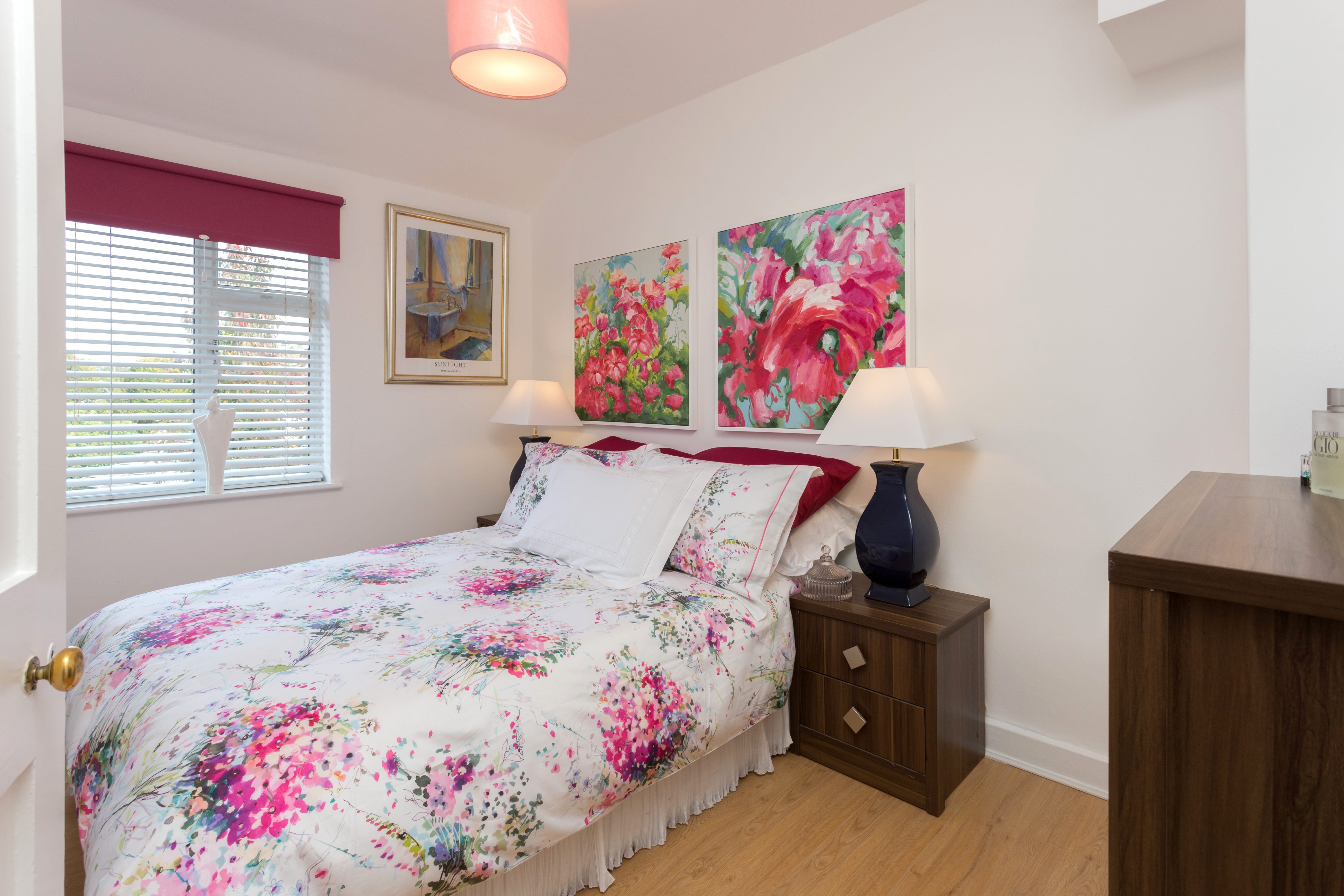 |
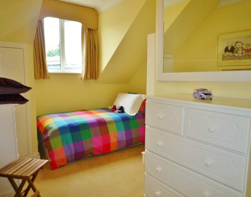
| Small, dull bedroom with no atmosphere. After we redecorated, I staged it with some powerful splashes of colour and I think it looks more inviting and cheerier. Also, wherever possible, it is good to show that one can walk around the the bed, unless the bedroom is a single room. | |
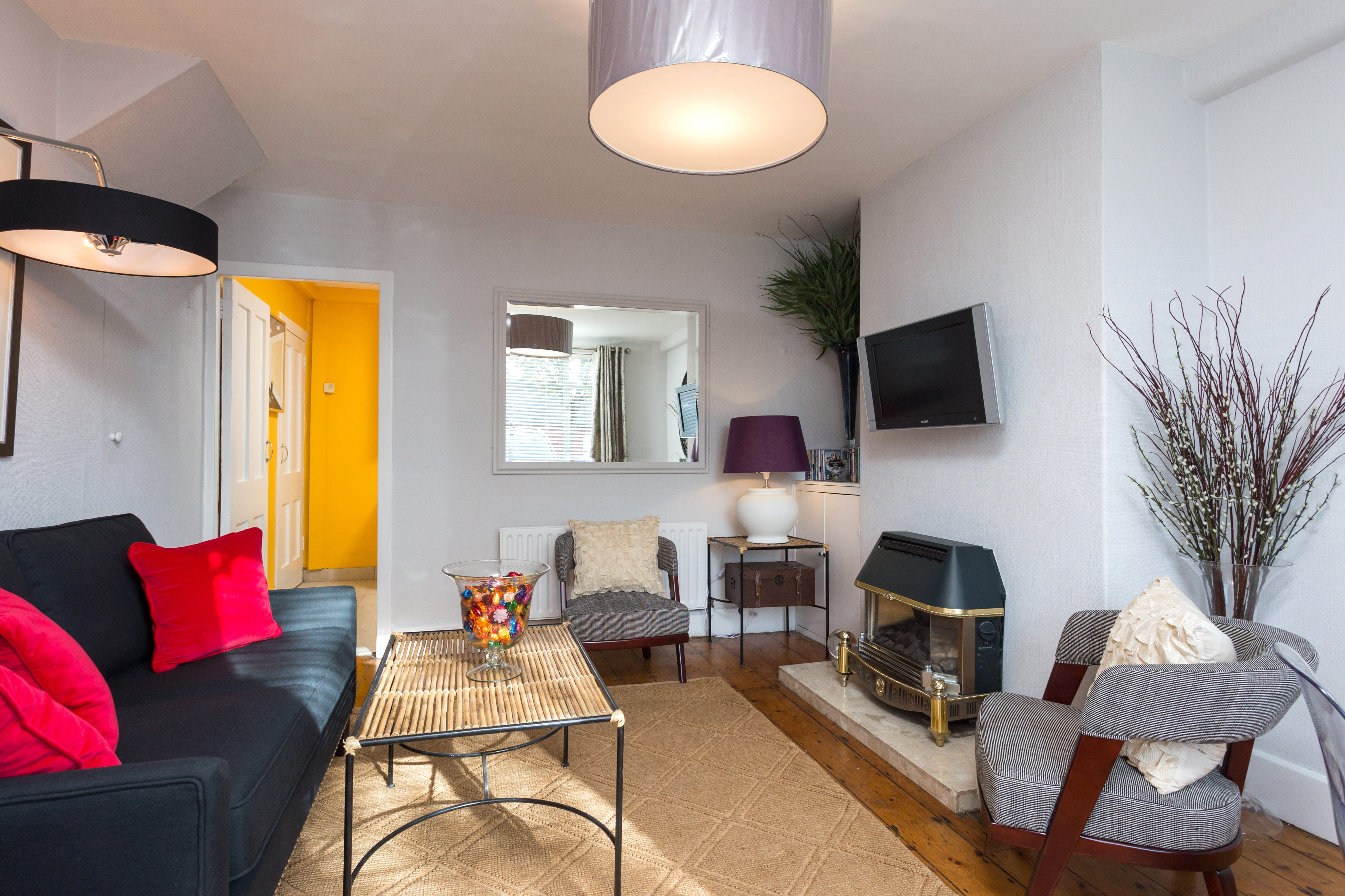 |  |
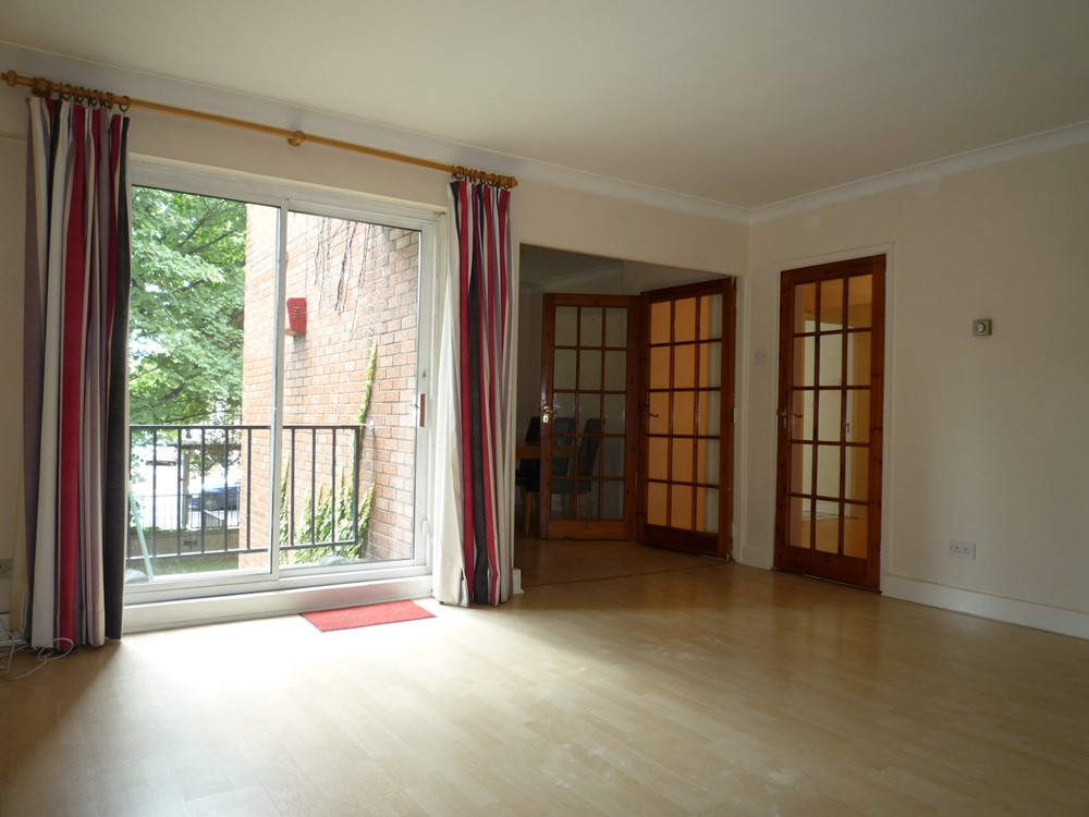
| Simple living room dressed for the selling campaign. Soft grey walls, a wall mounted tv and original varnished floorboards with simple understated furnishings. Here we see what is a very small bedroom. While this was empty, it looked as though it could hold nothing more than a cot! I decided that it would need to be staged to show how it could function. I put in a double bed, bedside chest of drawers and a wardrobe (behind the door) and a simple window treatment to show that it could function very well as a bedroom. | |
 |  |
First Picture - After: Every time this house comes onto the market there is a battle and a bidding war amongst various would-be tenants breaks out. However, we prefer to never rise above the asking rent. In fairness part of the desirability of this house is due to its location and its proximity to good schools but the interior styling does help. This has been especially obvious when there have been other houses close by which, on occasions, no viewer expressed any interest in. Everyone wanted this house. Second Picture - After: Here we see, what was a rather dark, modern house which originally had oak woodwork throughout the ground floor. It made the house feel very dark and somewhat funereal - visions of oak coffins always came to mind! A coat of paint on the woodwork transformed the whole place into a much brighter home. Maybe the dark oak was more durable than light coloured paint. I suppose it comes down to personal preference - darker, easily maintained woodwork or a brighter home. | |
 |  |
| First Picture - Before: Even with the woodwork transformed from dark oak to light cream, some rooms still appeared small. This is not unusual in newer properties. Most new builds have smaller rooms because their footprint is smaller in order to get more houses onto a site. Usually these modern homes are built vertically (upwards) rather than outwards. Second Picture - After: In a subsequent renovation we changed the heavy panelled doors to clear glass. (Yes, we return to houses every so often to make major and sometimes minor changes just to keep the properties looking their best.) These clear glass doors really opened up the whole house. We also changed the flooring to a polished finish which also bounces light. Sorry about the missing lampshades. These were installed later. Large, simple, cream drum shades with diffusers. | |
 |  |
| First Picture - Before: Here we see the original layout of the kitchen. Previously we had changed the kitchen unit doors from their original dark oak finish to the white you see above. You can see the angled wall with the partially opened door. This is where the utility room was located. A very tight space. We opened this out in line with the tape on the floor and these few inches made a huge difference. We also dug into the studwork which had boxed-in the underside of the staircase and we found enough extra inches to fit in the original fridge /freezer from the kitchen which we replaced in the reconfigured kitchen with a full height larder fridge. Second Picture - After: We subsequently redesigned this kitchen to open it up into the breakfast room and to provide more storage. We also continued the wood flooring into the kitchen area and installed 3 higher level ovens which are always preferable - if you have the space - to having an oven shoved in under the worktop. We also enlarged the laundry room (in the corner beside the ovens). We see a total absence of colour apart from the shades of the woodwork and the background cream. Inoffensive. Very important when one is trying to appeal to the rental market. What the Americans call "apartment beige". Sometimes it can look good. | |
 | 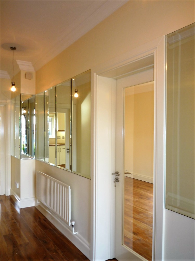 |
First Picture - Before: Above we see the original dark, narrow oak trimmed hall. Second Picture - After: We opened up the hall with glass doors and some mirrors. Now that you can see into the rooms on both sides of the hall (not shown in the photo) the hallway feels much more spacious. MORE ON HOUSE STAGING: The whole point of bringing Marshall in to dress a property which is to be sold is to make it attractive, to make it stand out. He will use colour, not too much, but he will use it. You will not be presented with the current fashion of a grey / fawn monochromatic box. This current fad does not always show up well in photographs. In a few years time, he says, people will wonder about the drabness and total absence of colour which was once to be aspired to. A polished concrete floor, a glass wall and putty coloured units in a kitchen can be all well and good with a splash of "shocking white!" to add drama if this be to your taste. But if every room is a colourless, beige, bland and boring box, the photographs will have the appearance of the inside of a cardboard box! Look at any of the attractive photos of properties, you will generally see a colourful garden beyond the room or at least a very green lawn or you may see a deep blue sky (admittedly not always easy to come across in Dublin) but there will be colour. Even a bunch of flowers in a vase! Without it, the pictures will not pop! Like a person putting on mascara or lipstick; it brings out the facial features. Likewise, your rooms need some colour, somewhere, to enhance their features and to bring them to life. If for no other reason than the colour (however awful you might regard any colour as being) might help make your house that bit more memorable to a prospective purchaser. You want your property to be remembered; not forgotten. The "greyish" houses which are currently on trend tend to be obviously dressed for sale. They can appear somewhat uniform. This also registers in the subconscious of the viewer. Your house has to have some personality and individuality and that's why you have to try to add it yourself or come to Marshall. He will work with the items you wish to leave in the house while it is being sold and he will bring in other items to compliment or contrast with your possessions. Often what you might have considered to be run of the mill might be just the thing that catches the eye of a purchaser. Rooms also have to be shown for what they are. A bedroom needs to have a bed (particularly if it is a small room) otherwise it might look like a little box - too small to hold a bed. People cannot always visualise. This will put off some buyers. With a bed, nicely dressed, in the room the purchaser can see that a bed fits in perfectly well. Purchaser reassured. And an offer on the way! FOOD FOR THOUGHT: This service can be of great benefit and has been carried out by Marshall directly, or by his clients based on his advice, in many properties and the end results have been very dramatic and beneficial. But the results don't always have to be dramatic. Simple is often as good as grand and complicated; in fact sometimes much better! Very often a coat of paint can transform a room. However, his designs can go beyond and into the area of rethinking the functioning of a house. Many property owners have been very happy to have had his advice. You have to remember that a landlord or one of his children may end up living in the house in years to come and the improvements completed now might go a long way to making the house much more suitable for them in the future. The costs of renovating and improving can often be deductible as a revenue or capital expense against rental income for tax purposes. It is essential to establish what you expect from the renovated rooms or building. How do you expect it to perform / function for you. He says, there's nothing worse than arriving at a house "after the event" when the renovations have been set in stone, so to speak, and he has to try to compliment, through gritted teeth, some of the woeful end results of what, otherwise, very clever and successful people have created in their houses. What can he say? "Ah, sure it's grand." In fairness, if the completed job is a success he'll say so. He doesn't have to be the one who designed it for it be good! However, he insists; know your limitations, we can't all be good at everything. Bad design is so very costly. It really is. It's not all about spending money. Sometimes it's as well not to change a room at all. Leave well enough alone. Change for the sake of change is wasteful when it offers no benefit. He understands how houses work. (Everyone thinks they know but, often, they don't.) He will work, mindful of the requirements of his clients and also mindful of the boring fiddly details like the limitations imposed by drains, plumbing, damp proofing or ventilation requirements and any essential repairs that might be needed, alongside the need to preserve special features within the house. With these limitations in mind, he can sometimes still offer a concept which will really uplift and transform a house into something quite special. He is also assisted by a variety of experts in the background and, if needed, they can often work with him to take "his notions" and his "scribbled drawings of coloured little boxes" into reality within a house. One comment that he does not like to hear, "Ah, Malcolm, we should have listened to you". What good is this to him, or anyone else for that matter? He tries to encourage people not to be too fearful of change. He is engaged mostly in making houses work for the next tenants or for a selling campaign. He has also assisted owner occupiers from time to time. Architects, engineers and builders unwittingly impose their tastes and preferences when renovating. (Marshall admits, "I suppose we all do".) And every plumber who ever walked the face of the earth, just loves to plonk his "lovely big radiator" slap bang in the middle of the longest (and sometimes the only usable) wall in the room! Then we have the alarm installation engineer who thinks his control panel will look best slap bang in the middle of the wall just inside the front door. Sure, you wouldn't want to hang a picture there or put up a mirror when you can have a lovely alarm panel there? Right? The requirements of tenants can sometimes be very different to what the landlord thinks is great. Lovely carpets and maybe an en suite bathroom off every bedroom (actually not much more than a toilet in a cupboard) would surely enhance the house? Would it? Really? You can waste thousands and even more thousands on things that are simply not needed. It can be soul destroying to see the completed job being far from an improvement - very often, quite the reverse! Of course, when you've had Marshall's advice and the job is done and dusted, you might end up saying to yourself that you could have easily created the same without any assistance. Why? Because it looks easy and very simple. Sure everything's easy, once you know how! He is sometimes dismissive about his eye for detail saying, "Sure, I spend most of my days tramping through house after house, so I'm bound to have some idea about what works or doesn't work at this stage!" He says that we appear to be back in the grip of another Celtic Tiger and he is finding that some tradespeople are simply too busy to take on new work or have become breathtakingly expensive! (Greedy.) Some arrogance has returned to the workplace, where he feels that it is almost required to go on bended knee to keep some tradesmen content. However, the trades who have worked with Marshall through the good times and the recent not so good times are still available and willing. Having capable and sensibly priced tradespeople available is three quarters of the job! | |